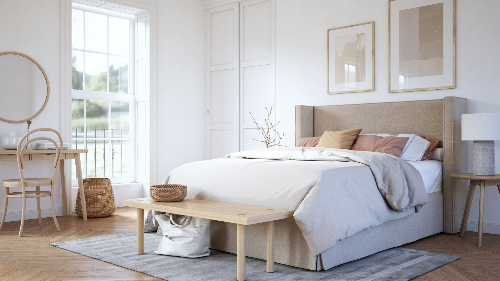
I wait with anticipation for the Pantone Colour of The Year announcement every December, but this year I'm disappointed — is it even a colour?
The Pantone Colour of the Year is usually embraced in the world of design and it pops up everywhere in the year ahead. But will this be the case in 2026?

Bring your dream home to life with expert advice, how to guides and design inspiration. Sign up for our newsletter and get two free tickets to a Homebuilding & Renovating Show near you.
You are now subscribed
Your newsletter sign-up was successful
The start of December not only heralds the beginning of the festive period, but for design lovers it's also the time when the Pantone Colour of the Year is announced. Why does this matter? Because as a global leader in colour creation, whatever colour Pantone reveals will make its way into our homes in the coming year.
Last year's shade was Mocha Mousse, a brave move which no doubt gave brown a status upgrade in terms of our interior paint trends palette.
This year? Well, despite having the whimsical title of "Cloud Dancer", I'm afraid to say it's left me a little underwhelmed. In plain old English, it's simply a shade of off-white and the chances are, you've already got a similar white in your home already.
Article continues belowWhy is Cloud Dancer the Pantone Colour of the Year 2026?
According to Pantone, the Pantone Colour of the Year, Cloud Dancer is: "A lofty white whose aerated presence acts as a whisper of calm and peace in a noisy world."
Expanding further on the decision to choose a shade of white, Leatrice Eiseman, executive director of the Pantone Color Institute says:
“At this time of transformation, when we are reimagining our future and our place in the world, Pantone 11-4201 Cloud Dancer is a discrete white hue offering a promise of clarity.
“The cacophony that surrounds us has become overwhelming, making it harder to hear the voices of our inner selves. A conscious statement of simplification, Cloud Dancer enhances our focus, providing release from the distraction of external influences.”
Bring your dream home to life with expert advice, how to guides and design inspiration. Sign up for our newsletter and get two free tickets to a Homebuilding & Renovating Show near you.
“We are living in a transitional time where people are seeking truth, possibility, and a new way of living," adds Laurie Pressman, vice president of the Pantone Color Institute.
“Pantone 11-4201 Cloud Dancer is an airy white hue that exemplifies our search for balance between our digital future and our primal need for human connection – a liminal space that is a launchpad for creative expression – as individuals and communities are experimenting beyond traditional boundaries, opening the door to increased imagination and innovation.
I'll admit when looking at the interior design trends for 2026 I can see that the Pantone Colour of the Year corresponds with a general leaning towards a calmer world where wellness and nature prevails. And I'm proud to call myself a sky gazer, as who doesn't love looking at a white fluffy cloud? But, can you really class white as a colour?
With so many other rich and sumptuous shades around, it may indeed be easy to use, but lacks a little of the controversy we've come to expect from the annual Pantone Colour of the Year announcement.
Using Cloud Dancer in your home
Perhaps in anticipation of this year's colour being somewhat of an anti-climax, Pantone have also released a series of colour palettes alongside Cloud Dancer, demonstrating which shades it works with.
While they all have their own palette names, including Powdered Pastels, Atmospheric, Comfort Zone and Glamour and Gleam, they're essentially most of the more popular colours grouped together under one theme.
Atmospheric for example includes shades of blue, much like the Dulux Colours of the Year which was a trio of blue paint colours. Others such as Glamour and Gleam, includes shades of red and dark teal, colours already identified as on trend in 2026.
Choosing your shade
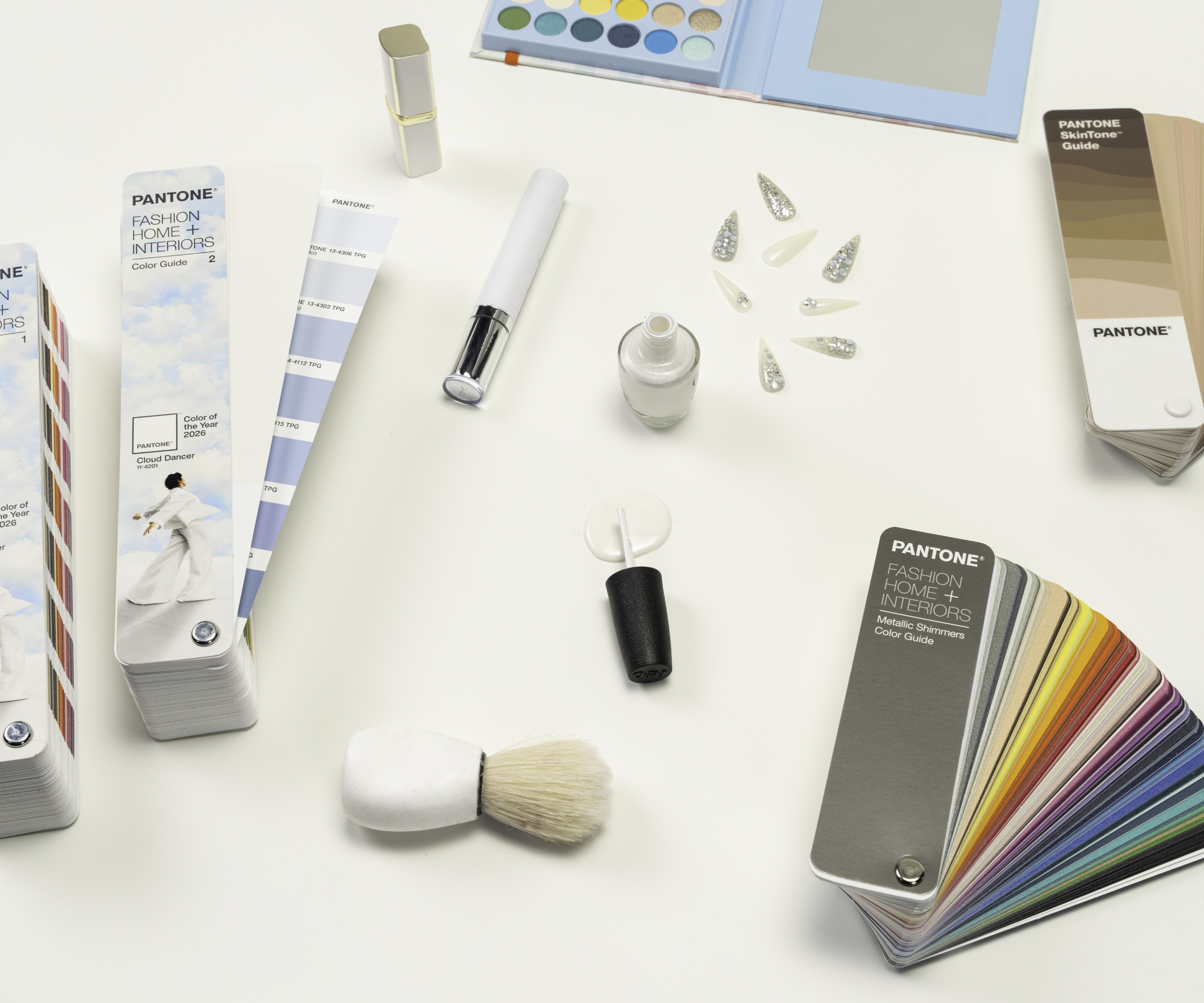
At the risk of sounding overly negative however, it doesn't really take a genius to figure this out. It's a shade of white that's perfectly aligned with most colours on the spectrum, even other whites.
And, while we predicted a while ago that white kitchens are on the rise, white interiors on the whole are also not that easy to maintain when you have a busy home or household.
However, disappointment aside, I do have a penchant for fresh white bedding and agree that there's nothing more contemporary or soothing than an all-white space. So if you're keen to keep up with trends, here's are some of my favourite ways to use white in your home.
White ideas for your home's interior
1. Start with something simple such as living room lighting
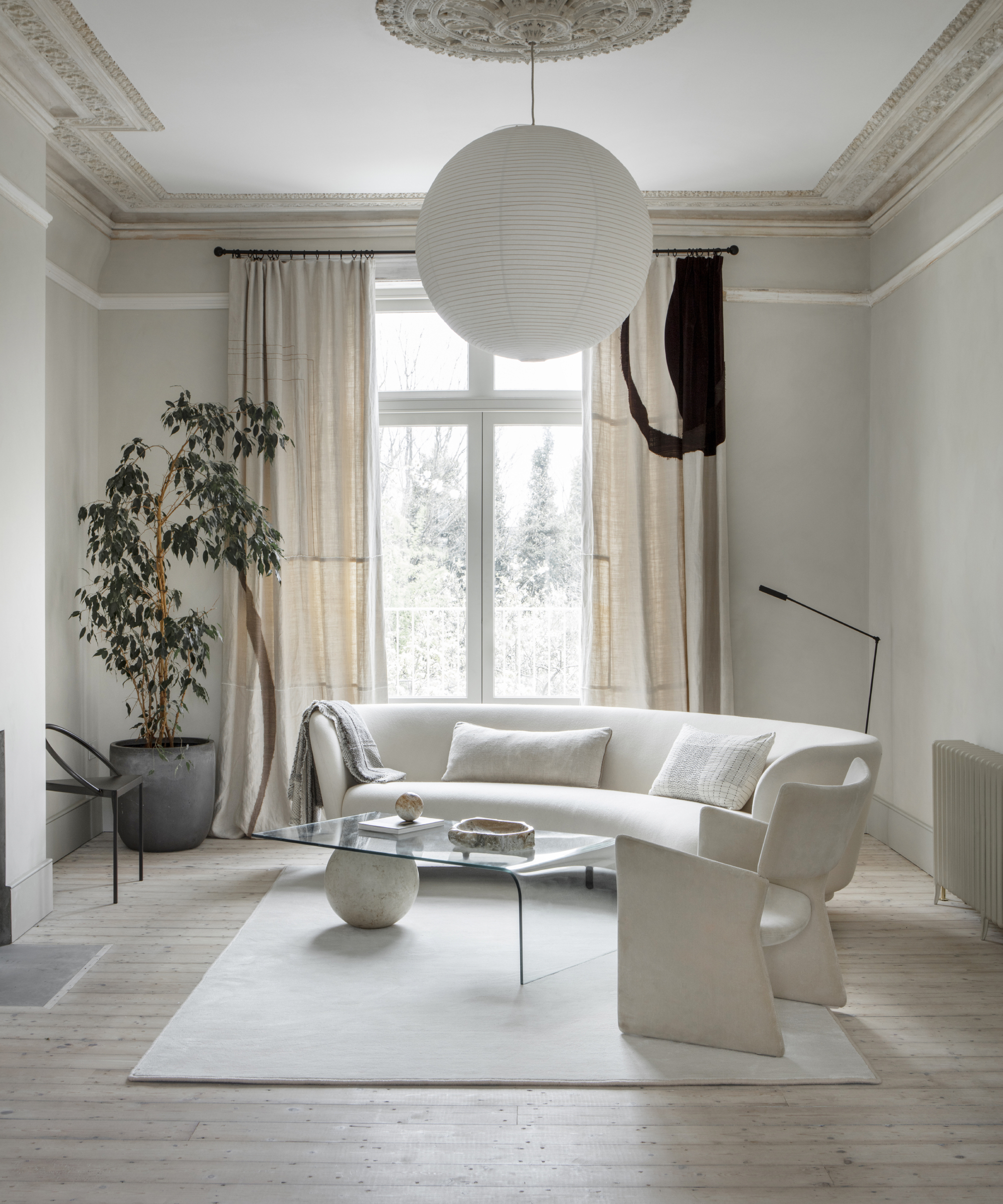
While an all-white modern living room idea can be a brave step, white walls and simple white accessories can be a step towards embracing the trend if you prefer to choose a more practical colour scheme.
You could also look at your living room lighting and opt for a pendant light such as this Pahal Origami Paper Pendant Shade from Dunelm. It's only £12 and would be a great starting point for your scheme.
2. Pair soft oatmeal with white to create a cosy corner
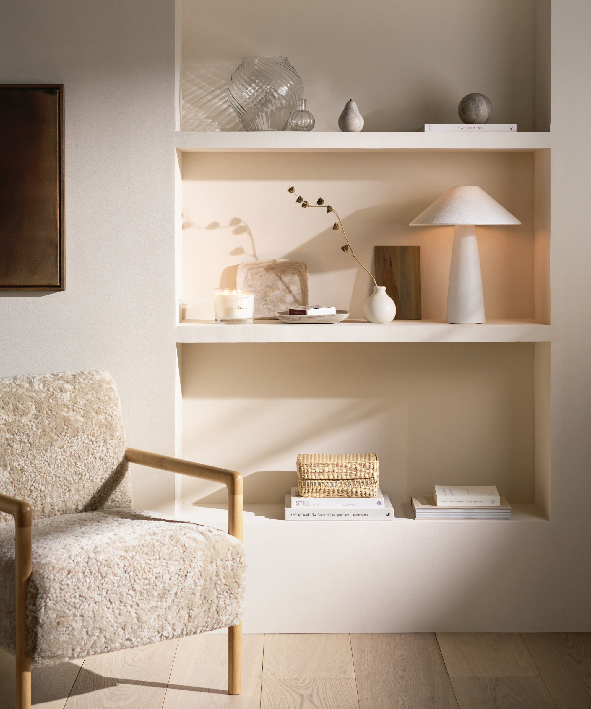
If white appeals, but you're keen to ensure your white rooms don't look too stark, off-white paired with natural shades such as oatmeal and wooden tones are a good combination.
The White Company, the original home of all things white has some great options for creating a cosy white corner in your bedroom or living room. This Sheepskin Chair and Footstool set in Oatmeal is perfect for adding a depth and softness to lighter wall colours.
3. Balance white with pink for some bathroom fun
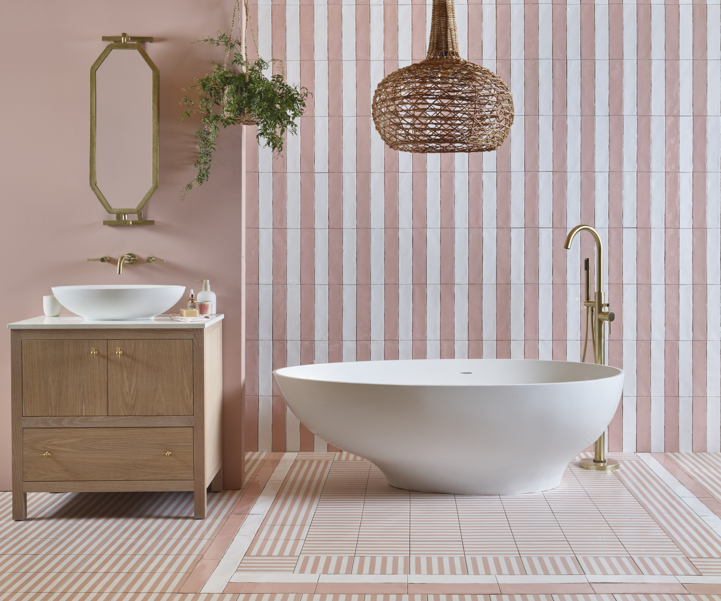
Although white bathroom tiles are a clean, fresh and easy option when tiling a bathroom wall, it's important not to end up with a space that feels too sterile. While shaped or fluted tiles would bring your bathroom up to date, why not add a touch of colour with a pink bathroom idea instead? These Ca' Pietra Deck Chair Porcelain Rose can be purchased at Hyperion Tiles and are a lovely way of creating a focal point around your freestanding bath ideas.
4. Combine sage green with white for a fresh-looking kitchen
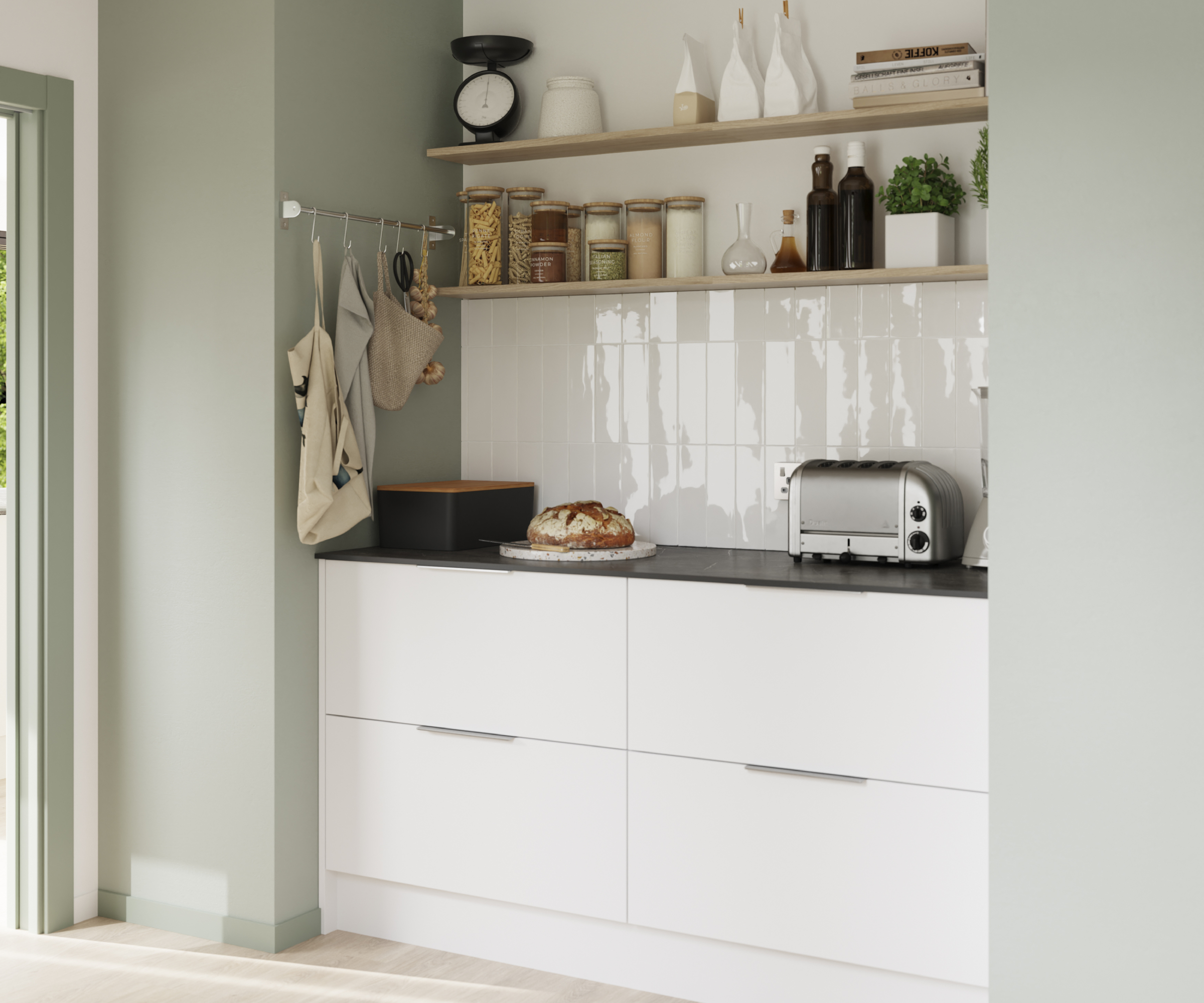
White kitchens are an easy win if you're keen to consider the Pantone Colour of the Year in your culinary hot spot. As well as bringing a light and airy feel to small kitchen ideas, they also give you a long term neutral shade that frees you up to change your kitchen colour combinations, or kitchen decor ideas more frequently (and more cost effectively).
This Balsamita matt white kitchen is from B&Q, but there are plenty of other retailers offering similar kitchens.
5. White and blue in bedrooms is soft and soothing
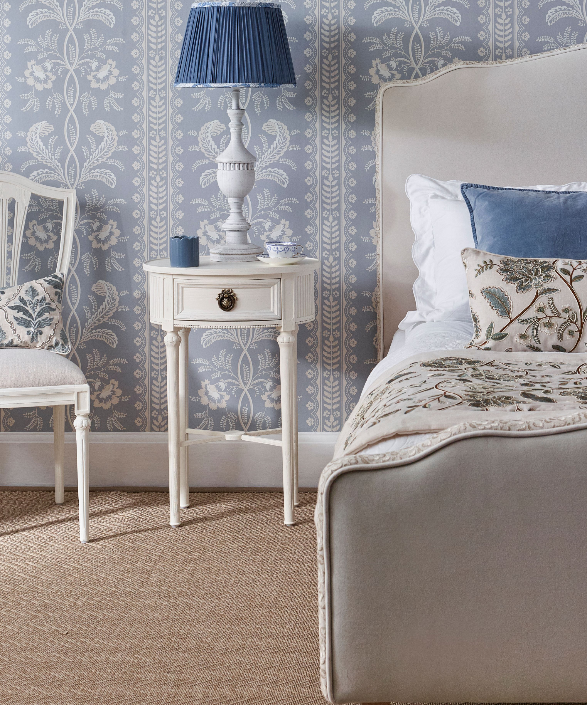
All white bedrooms can be calming, but could feel a little 'cold'. And, while some think blue is a cool colour too, it's all about choosing the right tones.
Some blues are naturally warmers, such as soft porcelain blue or a darker teal. Try the French Bedroom for a whole host of ideas and items to deck out your room, and as with the image shown, make sure you have plenty of patterns, textures and soft fabrics to add to the feeling of warmth.
6. White brings focus and clarity to home offices
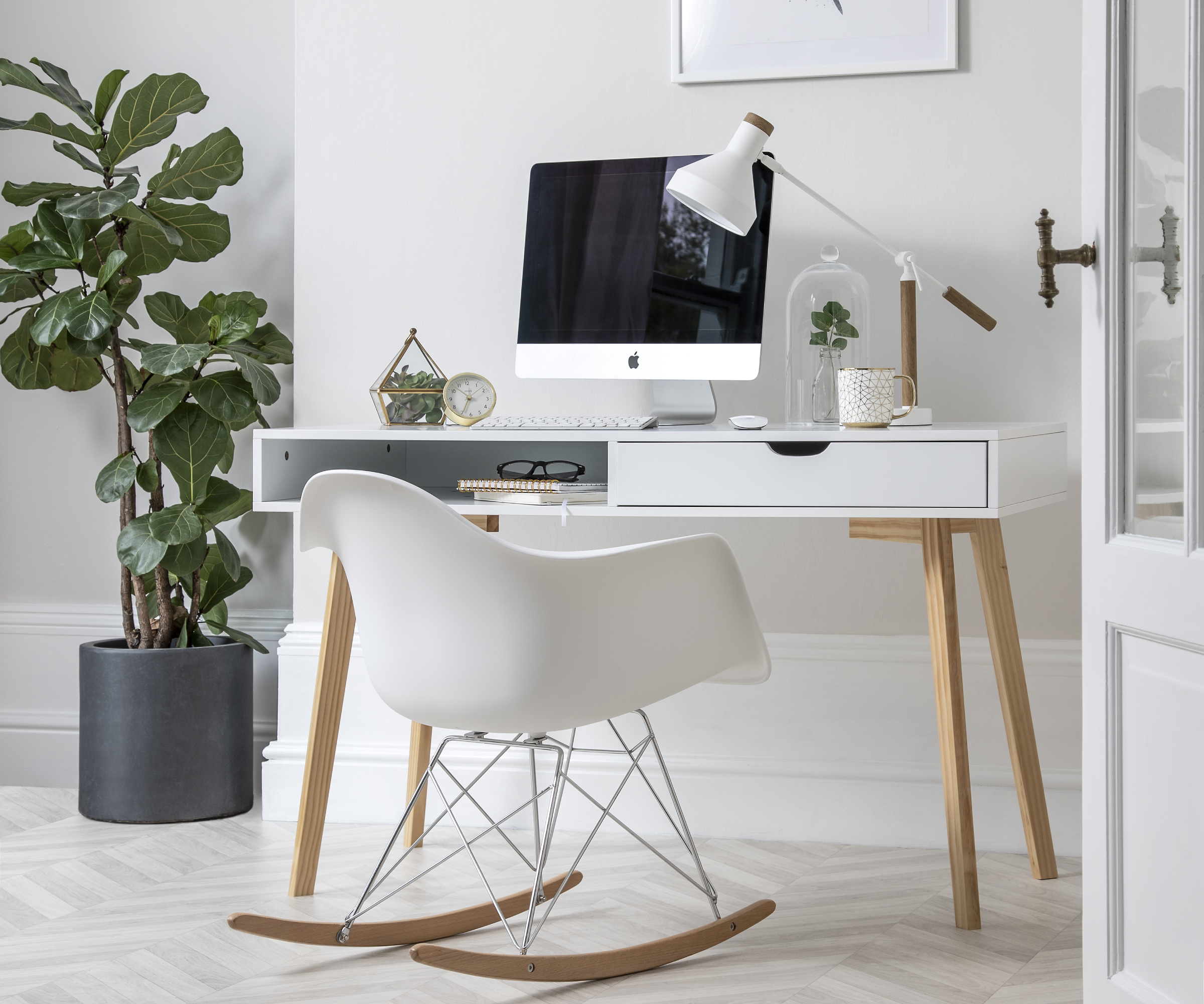
Great for helping you keep a clear and focused mind, home office ideas in shades of white are ideal whether you have a dedicated room, or need to create a corner in your guest room for a spare room office.
This stylish Ludvig Office Desk Computer Table in Classic White and Natural Pine is from Noa & Nani is simple in design, but with the wooden legs feels entirely suitable for use in a residential setting.
Want to know more about the design predictions for 2026? Make sure you're up to date with kitchen trends and bathroom trends. As two of the more costly rooms to tackle when renovating a house, you'll want to make sure that you buy both with aesthetics and longevity in mind.
Perhaps the Pantone team are in fact onto a winning shade when you think of it like this, as if there's going to be a white you pick in 2026, I've no doubt it will similar to this shade for sure.

Sarah is Homebuilding & Renovating’s Assistant Editor and joined the team in 2024. An established homes and interiors writer, Sarah has renovated and extended a number of properties, including a listing building and renovation project that featured on Grand Designs. Although she said she would never buy a listed property again, she has recently purchased a Grade II listed apartment. As it had already been professionally renovated, she has instead set her sights on tackling some changes to improve the building’s energy efficiency, as well as adding some personal touches to the interior.
