Blues, greens and unexpected pairings — we lift the lid on the 2026 paint trends and how to use them in your home
From mossy green to bold burgundy, this year's paint trends and colour styles are generally soothing, with a splash of adventurous on the side
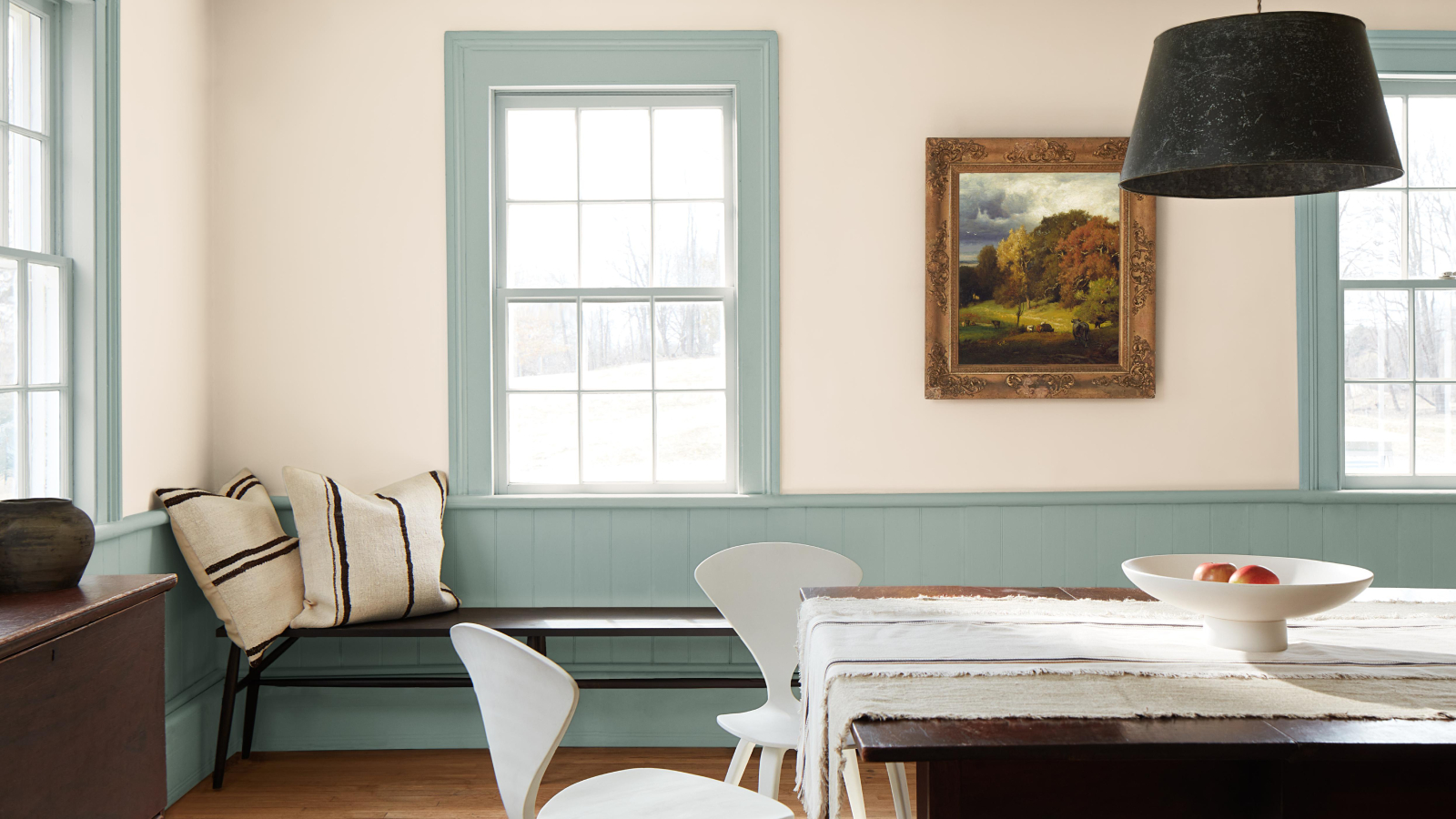
While white may be Pantone's Colour of the Year, the majority of the 2026 paint trends are far more colourful. And, while nature and embracing wellness related shades are a popular theme, don't worry if you prefer something a little bolder.
From burgundy to pink, bolts of blue and pops of yellow, there's something for everyone in this year's trends, along with a host of ideas for using the shades that can be adapted to most homes.
After all, although colour choice is personal, understanding paint trends isn't just about selecting a hue. It's also about looking at ways colour can be used to highlight and accentuate the architectural details of your home. Find out what's on offer and how to make sure you've picked the perfect palette when painting a room.
6 paint colours that are trending in 2026
1. Earthy and muted tones are at the core of paint trends
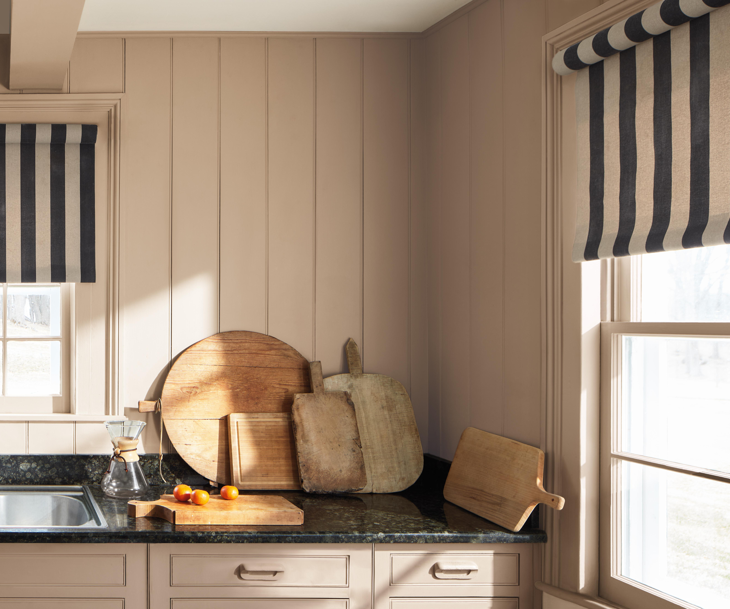
Of all the experts we spoke to, one message was loud and clear when it comes to the 2026 paint trends. The nature-based shades which we saw grow in popularity in 2025, are here to stay.
"The appeal for earthy, muted heritage shades will remain strong across both interior and exteriors," says Anna Hill, brand director and colour consultant at Fenwick & Tilbrook.
"Timeless tones with natural depth, and mid neutrals with warm undertones will be used to define calm, comforting spaces. We’ve seen these shades dominate our top 20 colours recently, which we’re taking as a sign that timeless shades aren’t going anywhere."
So why are we still leaning towards nature for our paint trends inspiration?
Bring your dream home to life with expert advice, how to guides and design inspiration. Sign up for our newsletter and get two free tickets to a Homebuilding & Renovating Show near you.
"As the interiors landscape has seen a shift towards slower living, wellness and reconnecting with our surroundings, homeowners are looking to reflect these elements in their colour palettes, to seek more comfort and connection with the natural world," says Bailey Williams, Colour Expert at Earthborn.
“Earthy interiors aren’t just about colour; it’s about creating an atmosphere that feels grounded, warm and restorative, and using paint thoughtfully can make a huge impact," she adds.
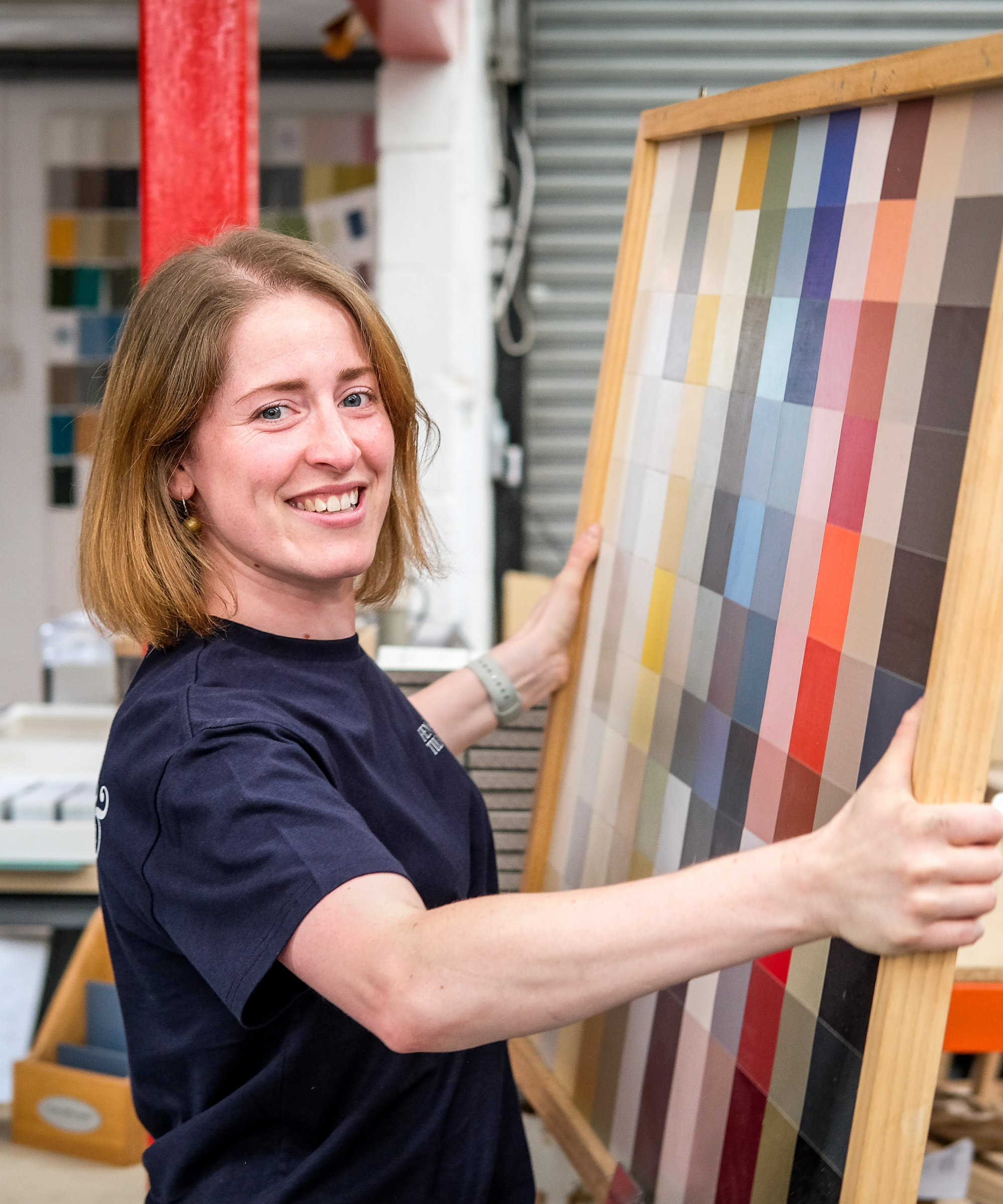
Anna returned to head up the family business after gaining valuable experience in merchandising. She now uses her creative skills and strong eye for design to help the company produce its renowned range of pigment rich paints.

With a passion for all things creative, colour expert Bailey Oates brings a wealth of expertise to the eco-friendly paint company Earthborn. Specialising in interior design and photography, Bailey's keen eye for colour and design shines through in everything she does.
Shop for nature inspired paint trends
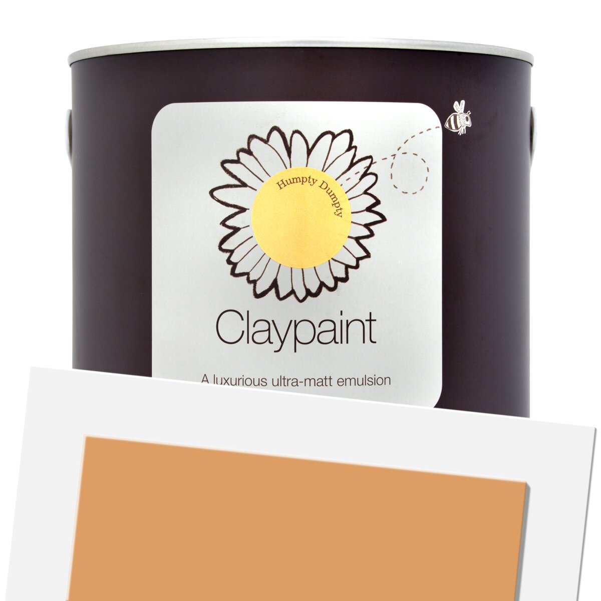
Earthborn's Colour of the Year, Freckle will warm up your home with its soft earthy tones

Try a sample of this soft muted shade, perfect for walls or ceilings

An ultra-matt wall paint but one that's still scrubbable and easy to clean
2. Bold burgundy will add depth
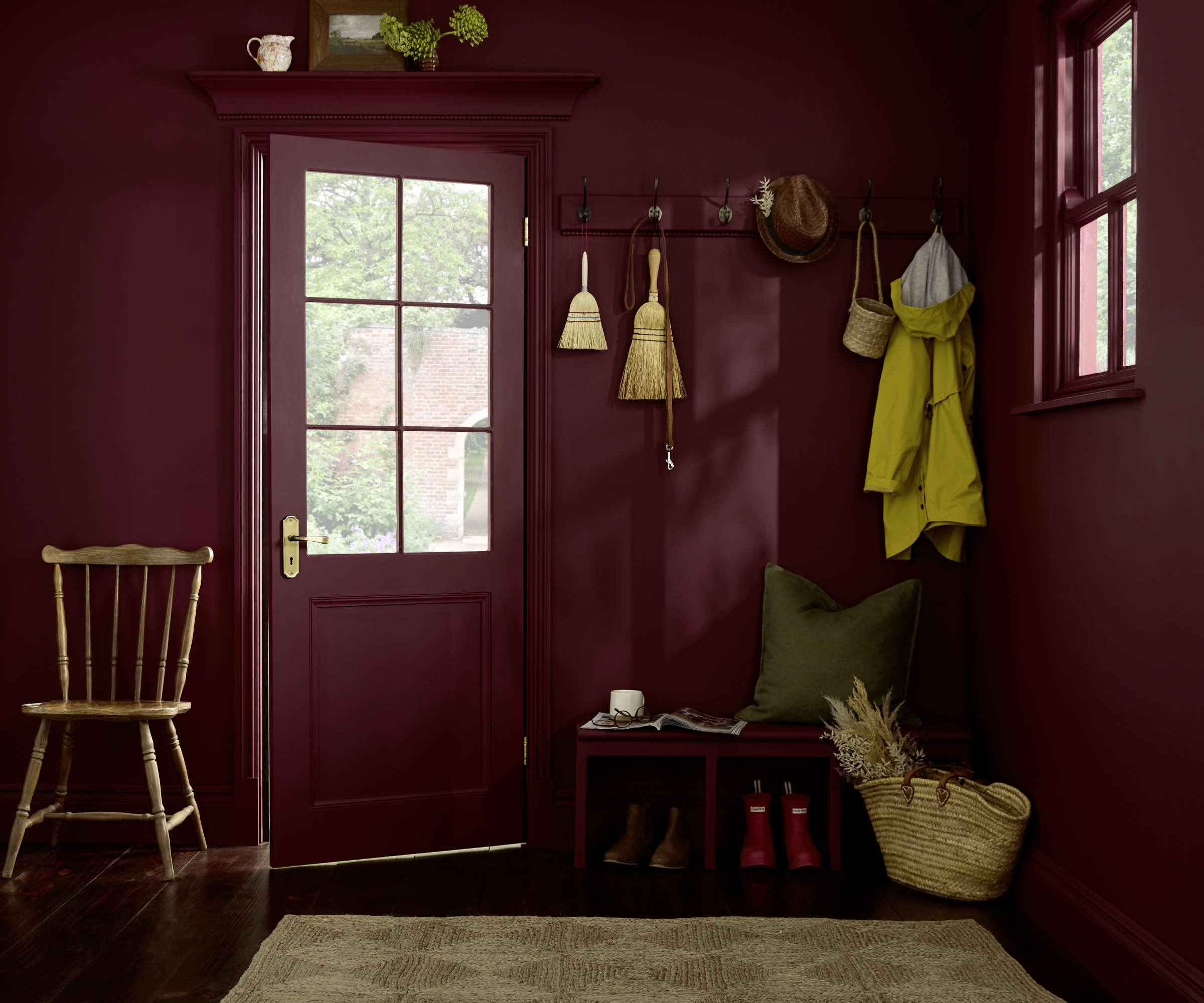
Burgundy featured as a hot favourite in the fashion industry last year, and as is often the case, made its way into interior design trends as well. The perfect shade for adding drama to a natural palette, its deep rich tones can be used across the home.
"Burgundy and red tones are great for interior and exterior palettes," says Anna Hill, "offering a sense of warmth, depth and sophistication in our homes.
"They bring a rich, timeless look that’s reminiscent of heritage architecture and natural materials, yet they’re being reimagined in fresher, more versatile ways for 2026," she explains.
"Deep burgundies help to ground rooms with elegance, working beautifully on doors, cabinetry and feature walls where they can anchor a space with understated drama."
Feeling brave? Opt for a colour drenching effect like this idea where a boot room becomes a warm and welcoming space from the minute you walk through the door. From a practical sense, it can also be more forgiving on dirt.
For the same look, use the Divine Damson paint from Graham & Brown.
3. Blue will be boundless in 2026 paint trends
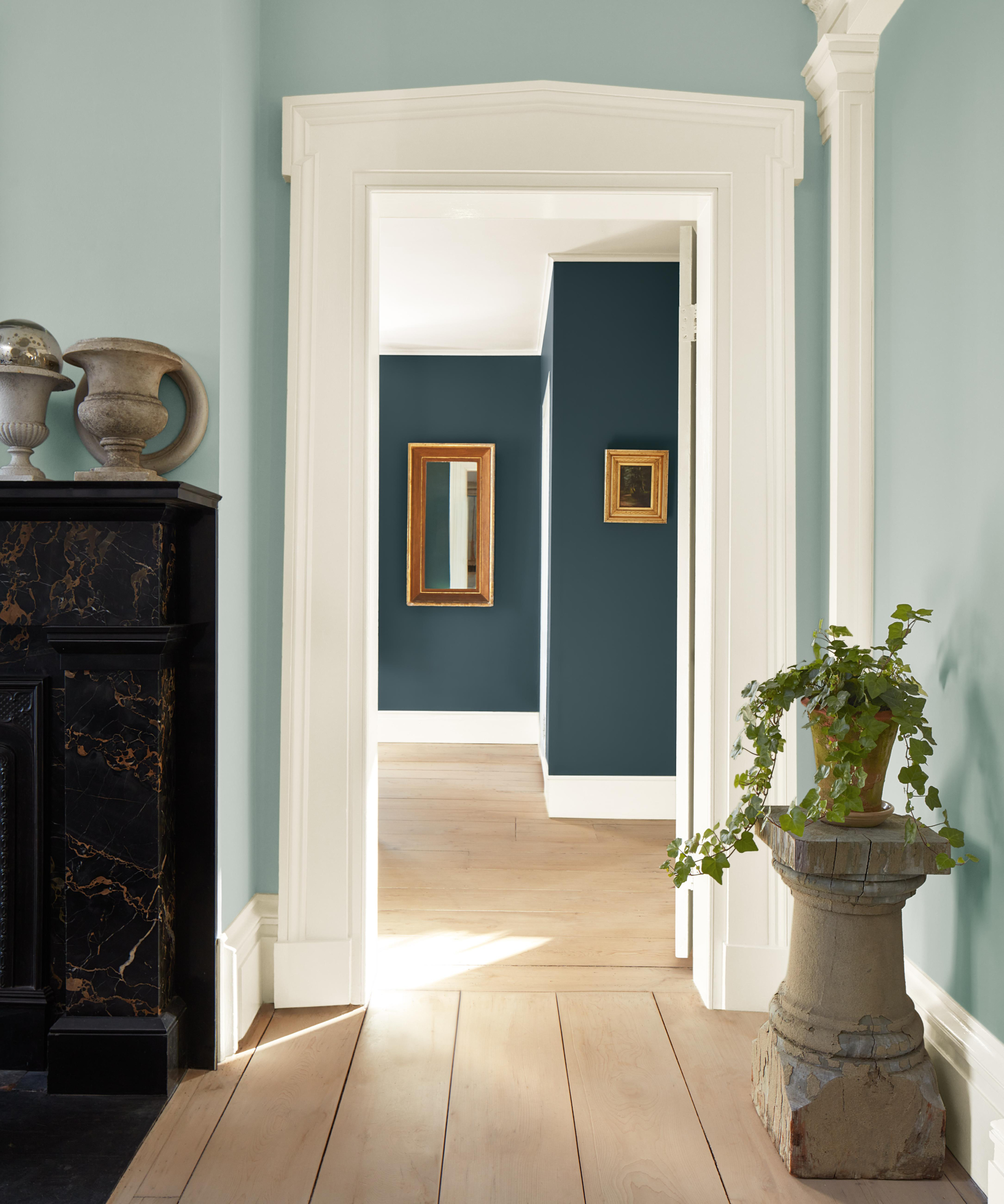
Although some interior experts say using blue carries the risk of making your home feel too cool, when the Dulux Colours of the Year 2026 were revealed to be a trio of blue shades, it confirmed we no longer need to see blue as a shade to shy away from.
It's perhaps no real surprise given the trend to lean in and embrace nature in all its glory, but how and where you use it will often come down to personal preference.
Here, shades of blue are used to draw the eye from one room into another. It's a clever way of picking a colour palette and really leaning into it, without it feeling too overpowering or too cold. Be sure to also think about the natural light in the rooms you are planning on using blue, as rooms lacking in daylight will need warm, rather than cool tones, in order to avoid feeling too cold.
4. Pick any shade of green and you won't go far wrong
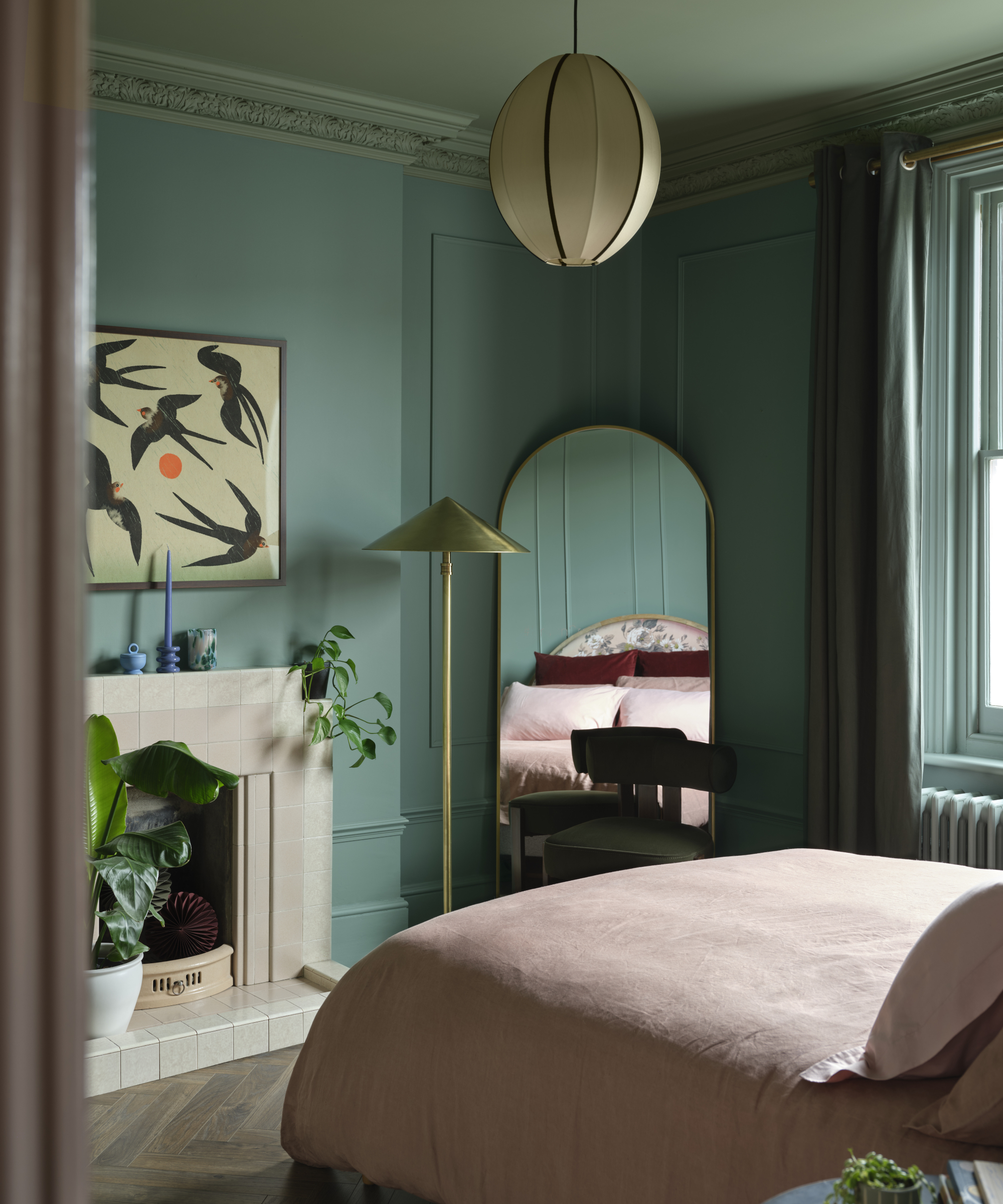
Whether you have the urge for vibrant wall panelling or want to create a soft and soothing guest bedroom idea, green – a perennial favourite in paint trends – is your friend in these situations.
"Along with blue, shades of green will continue to remain staple favourites for 2026," confirms Anna Hill. "Greens evoke a feeling of nature, growth and renewal, which is perfectly in line with the shift towards nature-inspired colours. We expect these shades to be used as foundational colours, helping to define entire rooms and not just as accent colours," she adds.
"Khaki greens will steal the show in 2026," predicts Sara D’Souza, content strategist & Creator at Frenchic Paint. "Whether it's the warm earthy neutral of Funky Dora to the mid-tone greenish brown of Olivia, both look perfect paired with metallics," she suggests.
"To go darker, try a full colour drench in the British racing green of Victory Lane, it works with every style – botanical, jewel, earthy, classic or vintage," advises Sara. "Verdigris also works perfectly to cocoon a room to cosy – it’s the perfect deep smoky blue with cool greenish undertones. Or, another fabulous green-blue with cool undertones is Scotch Mist."
5. Pick pink for a rosy glow
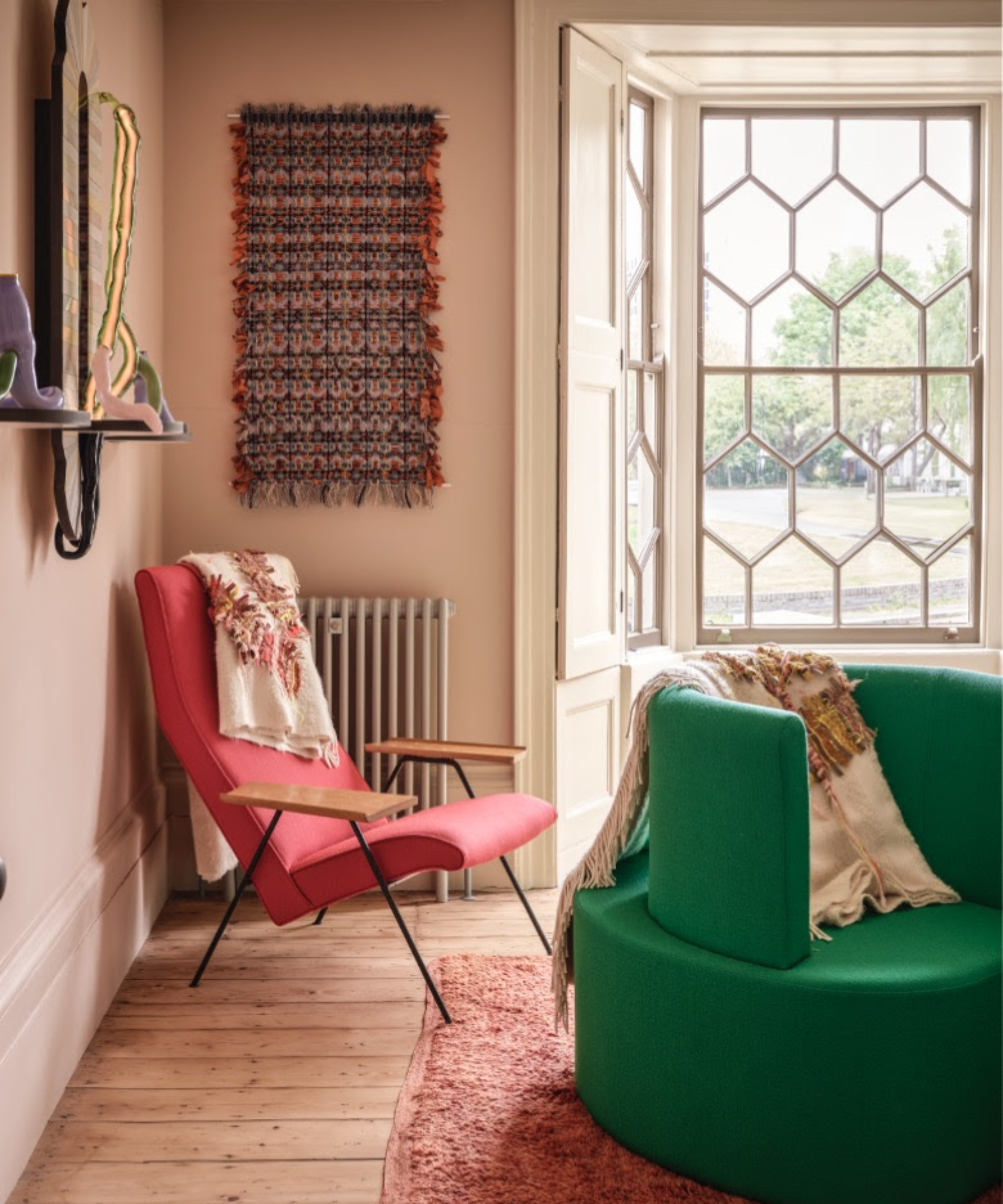
No stranger to the appeal of pink, having already delighted in sharing pink bathroom ideas that are fun but stylish, we're happy to see pink stay on the list of paint trends for 2026. Why? Because there's no doubt that the right shade of pink is a warm and comforting paint colour, that's rooted firmly in wellbeing, wellness and positive thought.
"We expect warm pinks to hold their place as a soft and uplifting accent, offering a subtle warmth that complements both neutral and nature-inspired shades," says Anna Hill.
And, while some critics may say pink is too sweet and sickly, it's about choosing the right shade. One that adds a, "nuanced emotional depth, brightening spaces without overwhelming them and creating a sense of intimacy and calm," she explains.
Anna shares how, "sales of our pink tones have already gone up by 48% with dustier shades like our Marrakech, Vintage Peony and Dusky Linen being stand-outs amongst homeowners and designers alike."
As with most of the lighter shades in 2026's paint trends, "the colours gaining momentum suggest a collective desire to create spaces that nurture us, spark joy and reflect a deeper sense of harmony," agrees Kate Palmer, creative director at The Painted Furniture Company. "It’s not just about what looks good, it’s about what feels right.
"These colours feel like a gentle embrace, offering comfort but also a hint of creativity and confidence. It’s as if we’re ready to welcome a little more personality back into our lives, but in a way that still feels considered," she adds.
6. Brown gets an upgrade with a dash of grey
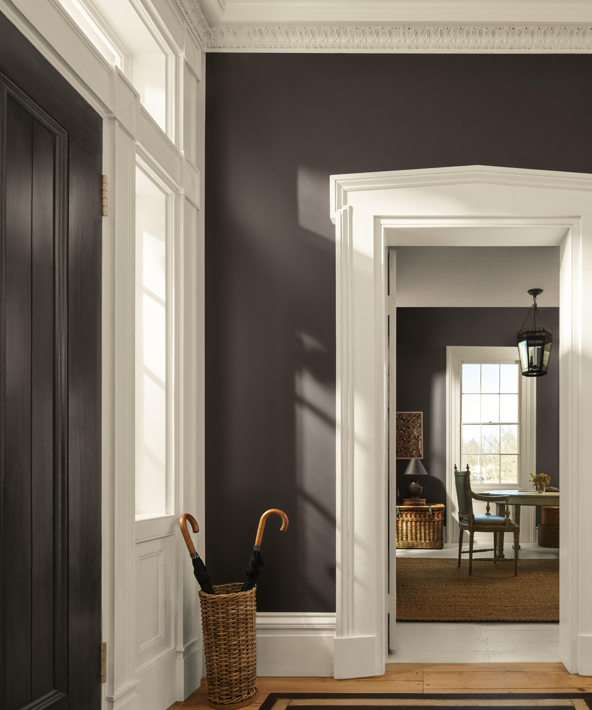
While 2025 may well have been the start of our love affair with brown paint in our homes, 2026 sees the arrival of a new, darker shade. And one that's been created by adding a healthy infusion of modern charcoal grey.
Silhouette AF-655 is Benjamin Moore's colour of the year and we love it for the fact it gives us a softer alternative to the traditional darker feeling of black and grey.
"This move towards more nuanced neutrals reflects growing interest in colours that have a distinctive presence and staying power, without shouting for attention like the maximalist palettes of years gone by," says Helen Shaw, director of marketing (International) at Benjamin Moore.
"All of our 2026 colour trends hone in on this idea, with a palette that we’ve named ‘Tailored Classics’," explains Helen. "It's led by Silhouette, an alluring mix of rich espresso hues with subtle notes of charcoal that can be used in a variety of styles and spaces.
"This brown-grey hue creates a perfect backdrop when colour drenching a space," she suggests, "or a moment of contrast when used with a lighter colour. And, similar to a tailored touch in fashion, it can elevate a design and take it from expected to exceptional.”

Helen Shaw is part of Benjamin Moore's UK division. A colour expert and international marketing director, Helen is no stranger to the paint industry and benefits of colour, having also previously founded a paint company with her husband, Craig.
8 ways to use the 2026 paint trends in your home
1. Combine blue with metallics
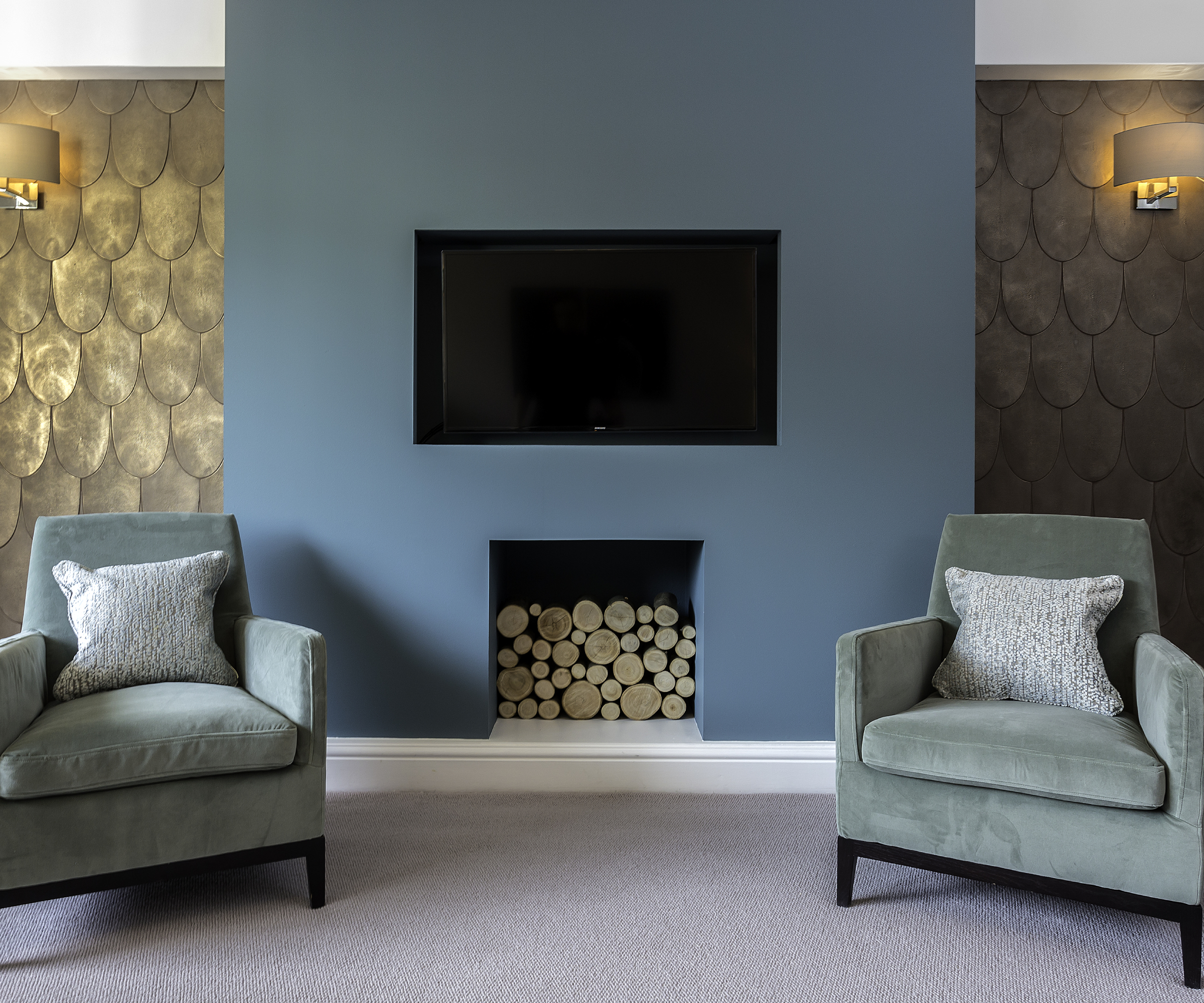
The Mylands Colour of the Year for 2026 is a shade called Burlington Arcade No.216, and although it's blue, it has a distinct tone and was chosen for a reason, explains Dominic Myland, CEO of Mylands.
“Homeowners are moving toward richer tones that feel grounding and restorative, and the complexity of this blue green shade means it can bring warmth rather than coolness," he says.
"Its depth works for colour drenching, cabinetry and cocooning rooms, and the reassuring mid tones balance heritage character with a modern, considered look.”
But, to avoid your preferred shade of blue feeling on the cool side, adding some gold or bronze metallics, either in the form of paint or wallpaper will bring warmth to your walls. Or, if cool is your calling, add silver or chrome instead.
2. Make sure your paint trends feature outside
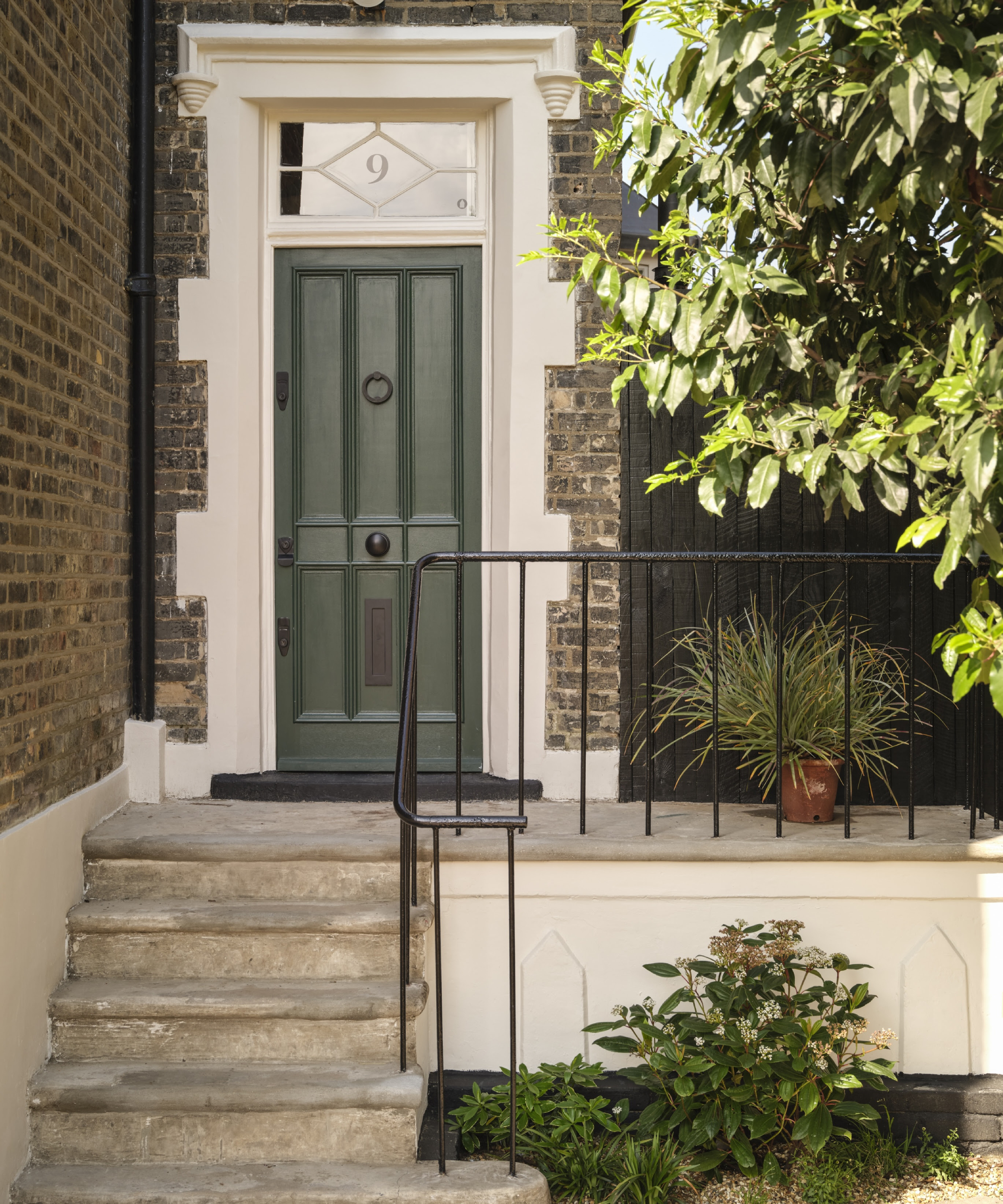
If you're keen to set the tone for how the rest of your home will look, there's no better place to start than by embracing paint trends outside your home, as well as inside. But, with enough of a difference so that your home stands out from the crowd.
"For outdoors, we expect paint trends to embrace slightly bolder versions of indoor favourites, helping to create a seamless transition between interior and exterior spaces, all while adding an extra layer of kerb appeal," states Anna Hill.
"Homeowners are increasingly being drawn to colours that make a statement from the street yet remain harmonious with their overall design scheme. Stronger greens inspired by lush foliage and natural landscapes will become more prominent on shutters, trims and garden walls, while deep burgundies will emerge as a striking choice for front doors, offering a rich and sophisticated contrast to neutral facades," she predicts.
"These colours will not only enhance visual impact but allow personality to shine through, bringing a more thoughtful approach to outdoor design that balances boldness with timeless appeal.”
3. Swap white for colour when painting woodwork
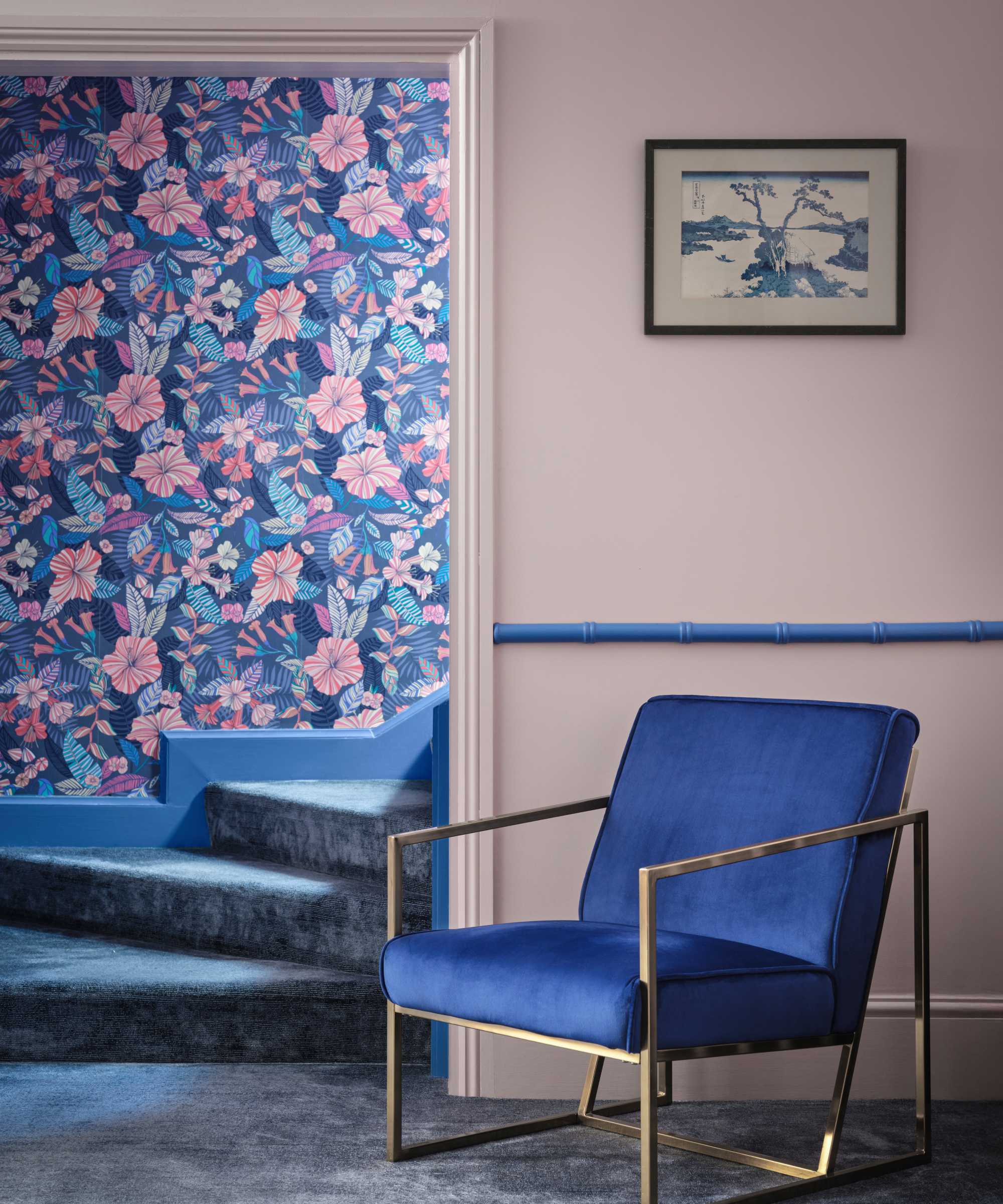
Although a fresh coat of white paint on woodwork can boost even the dullest of interiors, it can also be a little bland. Instead of following the same tried and test formulas, use this years paint trends as an opportunity to try something new.
Choosing different colour window frames can be one structural change you can make or, for something a little less expensive, turn your skirtings and door frames into a feature by coating them in the same colour as your walls, then add a pop of visual interest with a dado rail in a totally different colour.
4. Or, use paint to create architectural detail instead
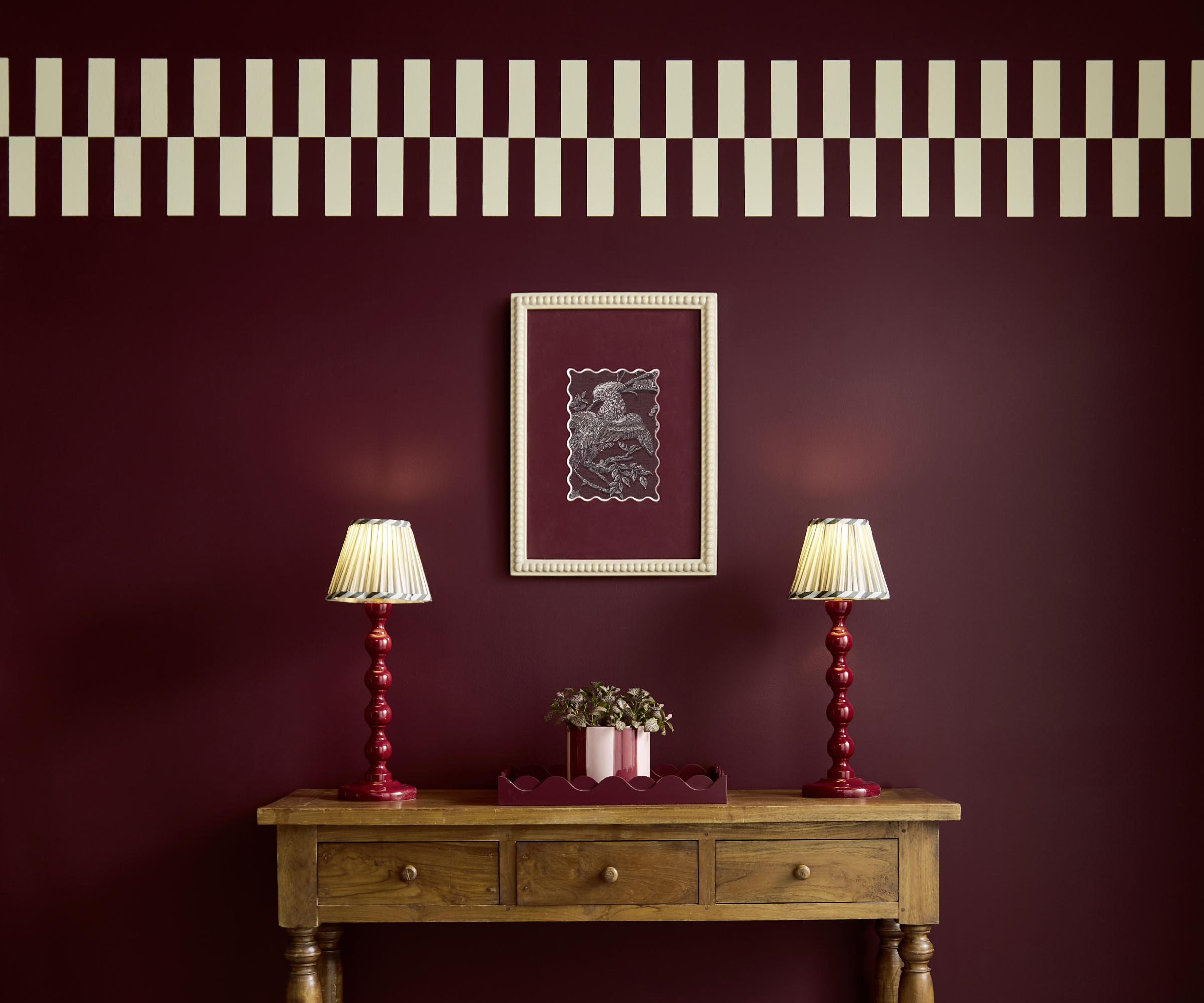
When it comes to the finishing touches in your interior design, before you head to the shops to buy decorative items to add to your home, the boldness of some of this year's paint trends make it possible to consider your walls as a canvas in themselves.
Add frames and artwork directly to the wall, contrasting a lighter frame with your dark wall to create a ready made picture mount, or even try unleashing your creativity to paint borders using contrasting shades for a fun effect.
Stock up on the best paint kit for trying new trends
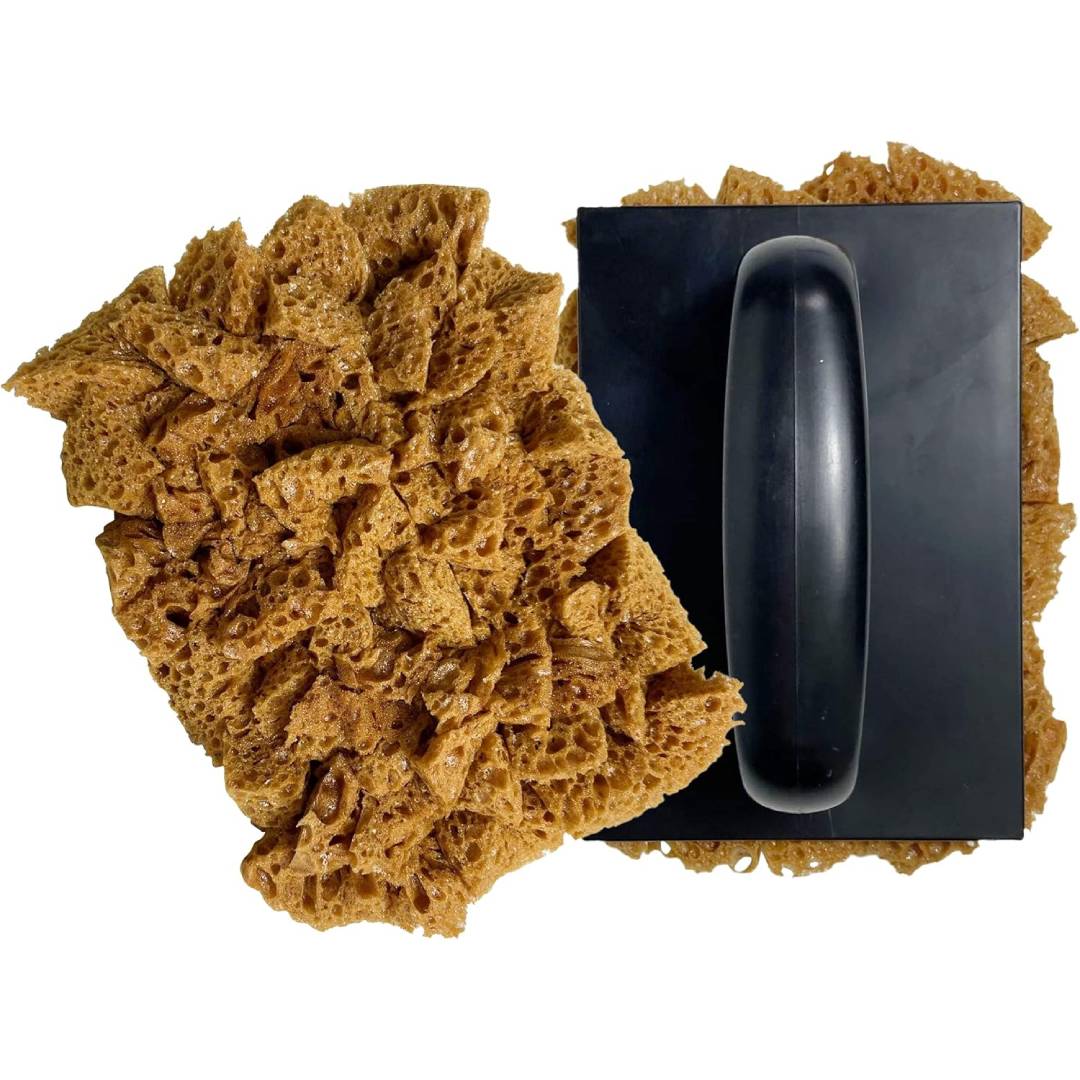
A large sponge roller perfect for using on your walls
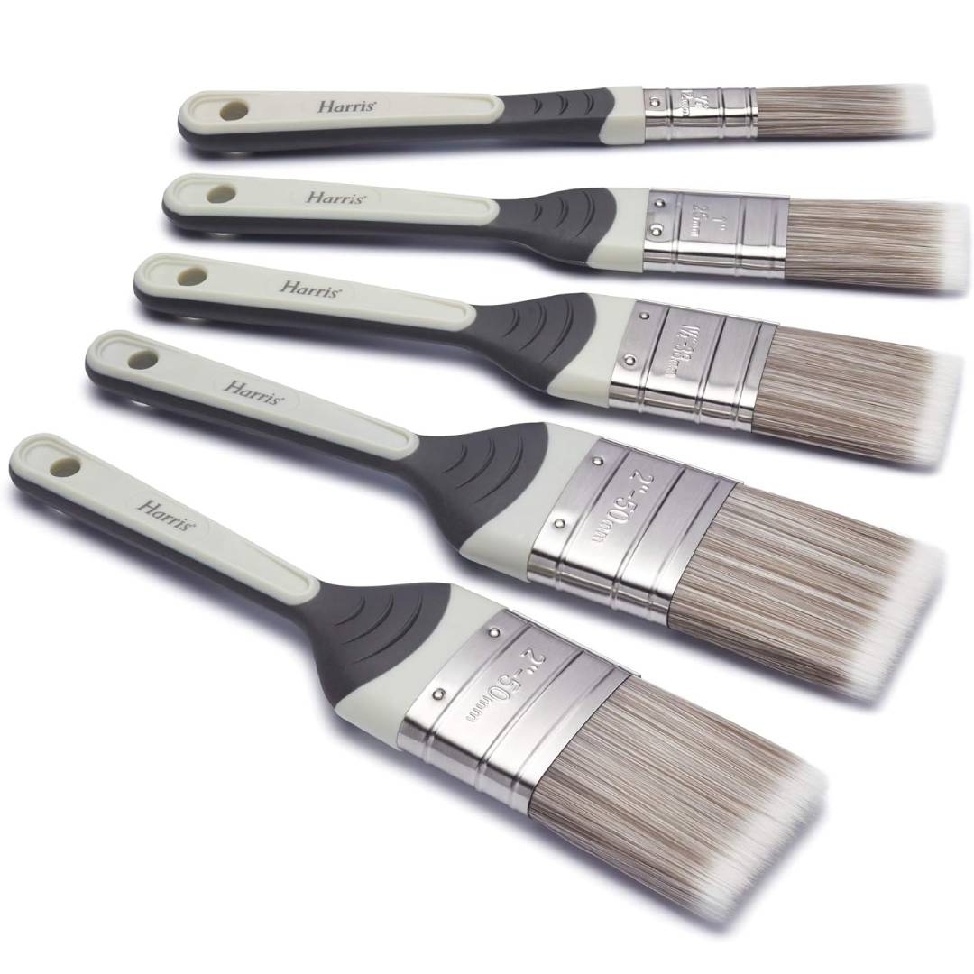
Paint all types of surfaces with this set of five brushes

Perfect for reaching ceilings in order to colour drench them
5. Pair blue and red
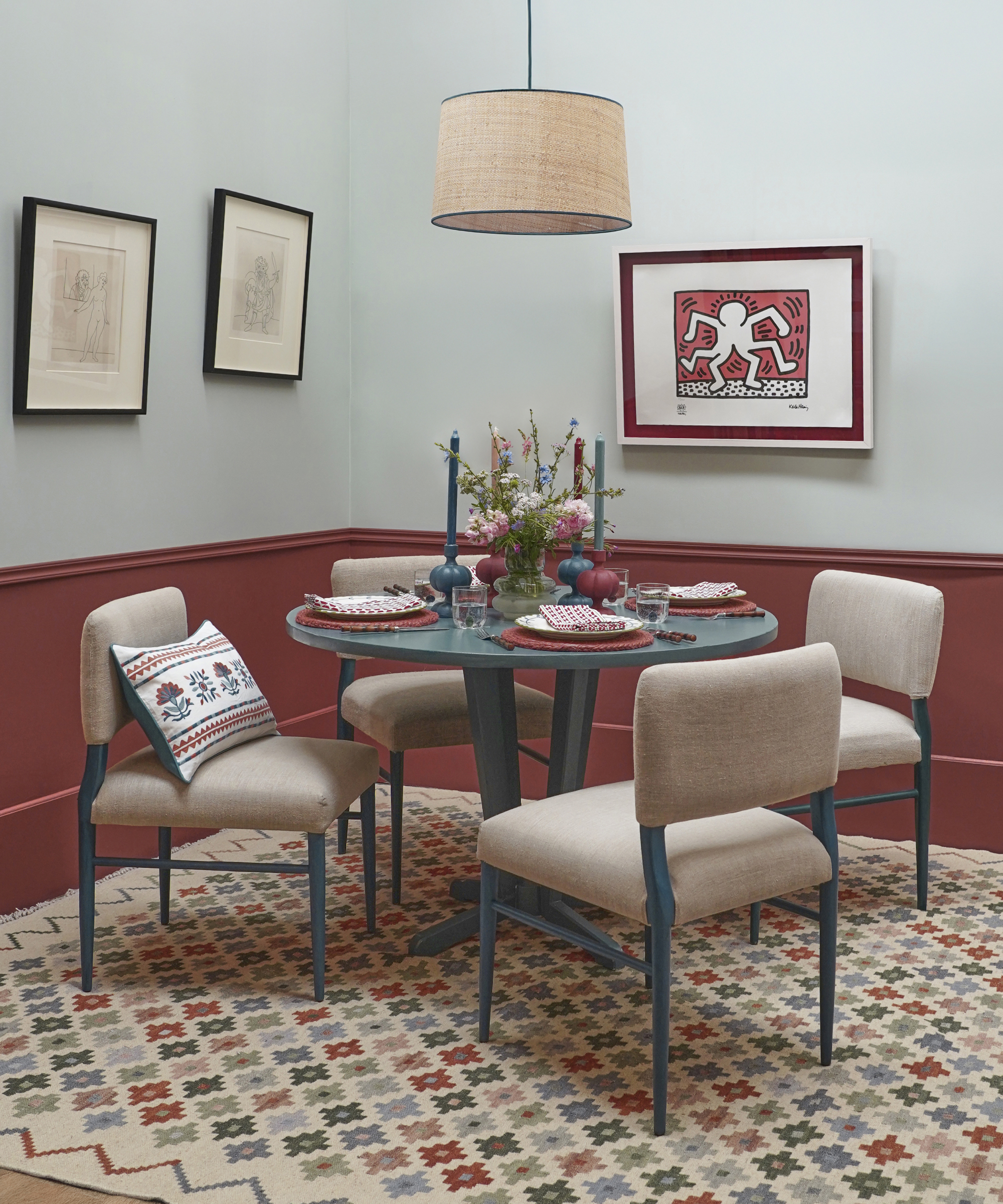
Sometimes, there's a colour combination that on paper doesn't seem like it will work, but in reality it does. Both blue and red are strong players in this year's paint trends, but not just as colours in their own right. Combining them together also works surprisingly well, providing the perfect balance of cool and warm tones for an end result that you can imagine working well anywhere in the home.
"These subtle yet strong shades allow people to build schemes that feel crafted and lived in, and they pair easily with texture and natural materials," explains designer, Birdie Fortescue.
"The focus is shifting toward paint that supports atmosphere rather than dominates it, creating rooms that feel timeless and allow for layering additional colour through rugs, cushions, and furniture.”
So whether you're searching for bedroom colour inspiration or a fresh new finish in your kitchen renovation, don't be scared to give this particular combination a try.
6. Combine darker colours for dramatic effect
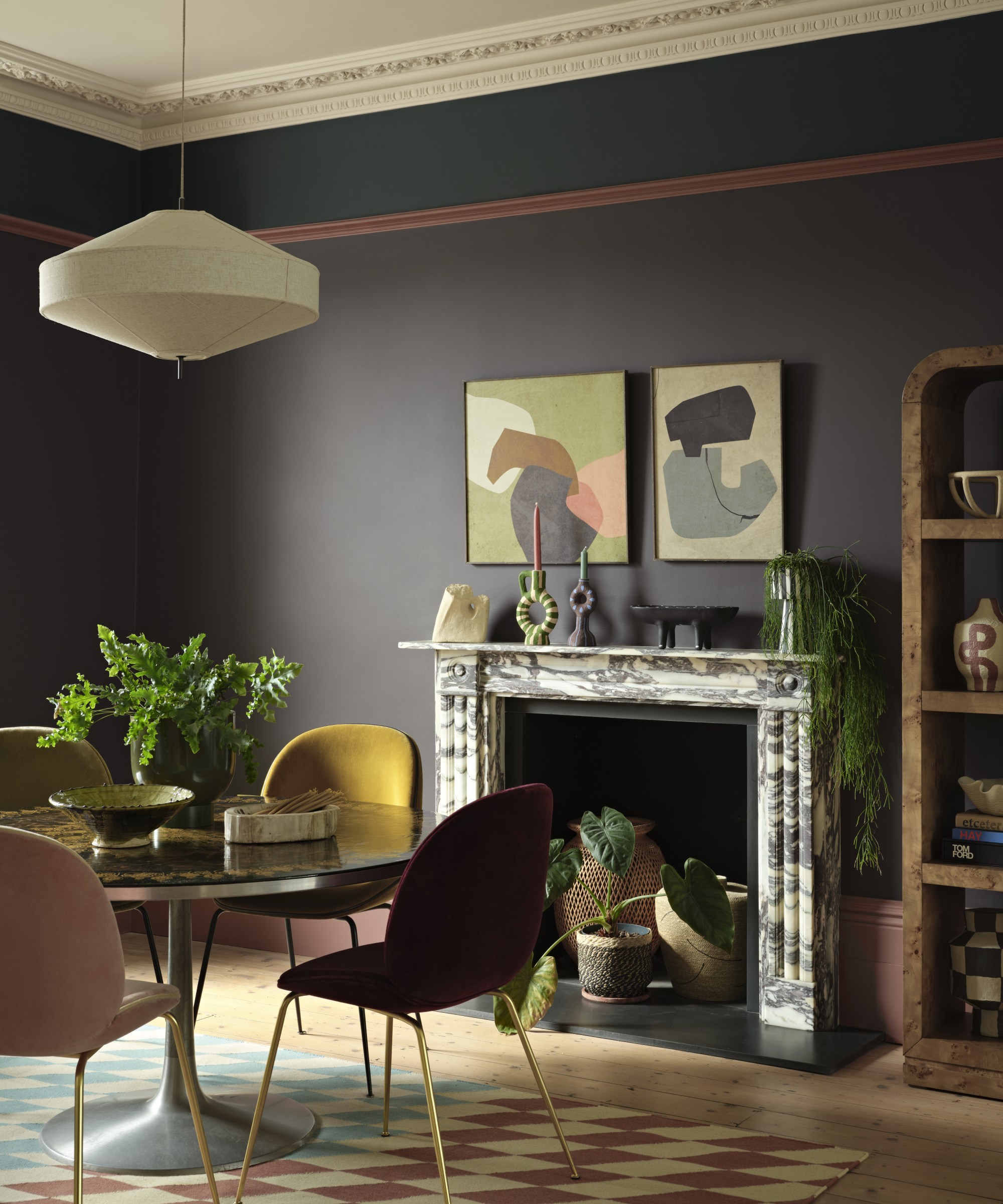
Although the paint trends of colour drenching and colour capping rely on using one colour in which to douse a room, there's a little more creativity on offer for the 2026 paint trends.
It's about picking a palette, be it heritage shades or paler neutrals and using different colours to draw out the architectural features of your home.
“From statement walls to cocooning colour drenching, thinking outside the box and being playful with paint remains a powerful tool to add interest in your home, and a popular paint trend in 2026," says Bailey Williams.
Paint picture rails and skirting boards in one shade, your walls in another, then add a surprising contrast with a bold border. Have fun and use your paint trends for more than just adding colour to your walls.
7. Try pink and green but with an extra edge
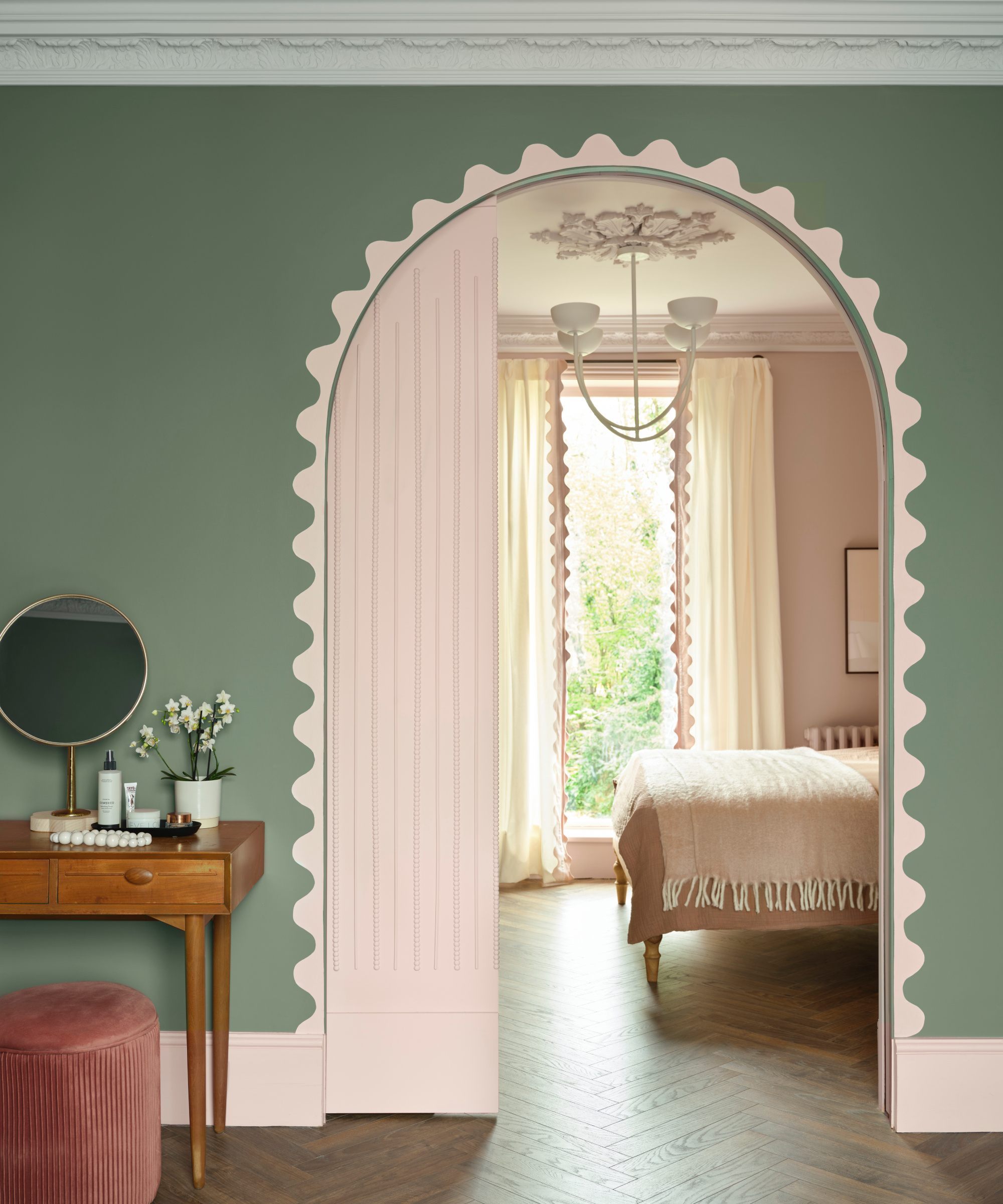
Keen to add some easy DIY projects into your plans in 2026? Take inspiration from this pretty pairing of green and pink in this bedroom and dressing room idea. A subtle green is used on the dressing room walls, and while the bedroom beyond is coated in pink and separated with an arched pocket door, pink skirting and a scalloped designed painted around the door frame helps to unite the two rooms.
To replicate this colour palette, you need Dream Whip and Grenadier Pond – both from Benjamin Moore.
8. Opt for a 50:50 technique

Given we've already seen 10 new shades of paint from Fenwick & Tilbrook this year to mark their 10 year anniversary, it's fair to say you could be spoilt for choice when browsing for paint colours in 2026.
The good news is, playing with paint isn't restricted to choosing just one shade. How and where you use them can be as simple or as extravagant as you like. Here, two of the new shades from Fenwick & Tilbrook provide a sharp contrast and an almost night and day approach to decorating.
"A split colour approach where you paint the top half in a lighter colour and the bottom half in a darker colour, can make a room seem larger too," says Bailey Oates.
“And for homes with an open-plan layout or larger rooms where it can feel cold and impersonal, earthy shades are especially effective to anchor a space and make it feel cosier and inviting. A warm berry or clay coloured wall in a bedroom or living room promotes relaxation and comfort,” she adds.
Of course, for a finish like this, you need a steady hand and the right kit too. Find out if masking tape or painter's tape is the best option when trying out these paint trend ideas.
If you're feeling inspired to start upgrading your walls, ceilings or even furniture with 2026's paint trends, preparation is the key to the best end result. Make sure you know how to strip paint off walls correctly, and how long to leave between coats of paint to ensure your fresh new finish lasts you for years to come.

Sarah is Homebuilding & Renovating’s Assistant Editor and joined the team in 2024. An established homes and interiors writer, Sarah has renovated and extended a number of properties, including a listing building and renovation project that featured on Grand Designs. Although she said she would never buy a listed property again, she has recently purchased a Grade II listed apartment. As it had already been professionally renovated, she has instead set her sights on tackling some changes to improve the building’s energy efficiency, as well as adding some personal touches to the interior.

