The stylish colour tricks designers use in small kitchens
In a compact kitchen, square footage may be limited, but your colour palette doesn’t have to be
Bring your dream home to life with expert advice, how to guides and design inspiration. Sign up for our newsletter and get two free tickets to a Homebuilding & Renovating Show near you.
You are now subscribed
Your newsletter sign-up was successful
Having a compact kitchen doesn’t mean your colour palette has to shrink with it. When designing a kitchen, colour is one of the most powerful tools you have at your disposal – capable of stretching walls, lifting ceilings and completely transforming how the space feels.
In small kitchens especially, every design decision has to work that little bit harder. Cabinetry, layout and storage all matter, of course, but the right kitchen colours can make a tight footprint feel much more intentional and surprisingly spacious.
Below we share expert advice on nailing this aspect of design, from light-reflecting neutrals to bold shades used with confidence. These small kitchen colour ideas are anything but restrictive.
Article continues belowSmall kitchen colours
1. Find the right white for your space
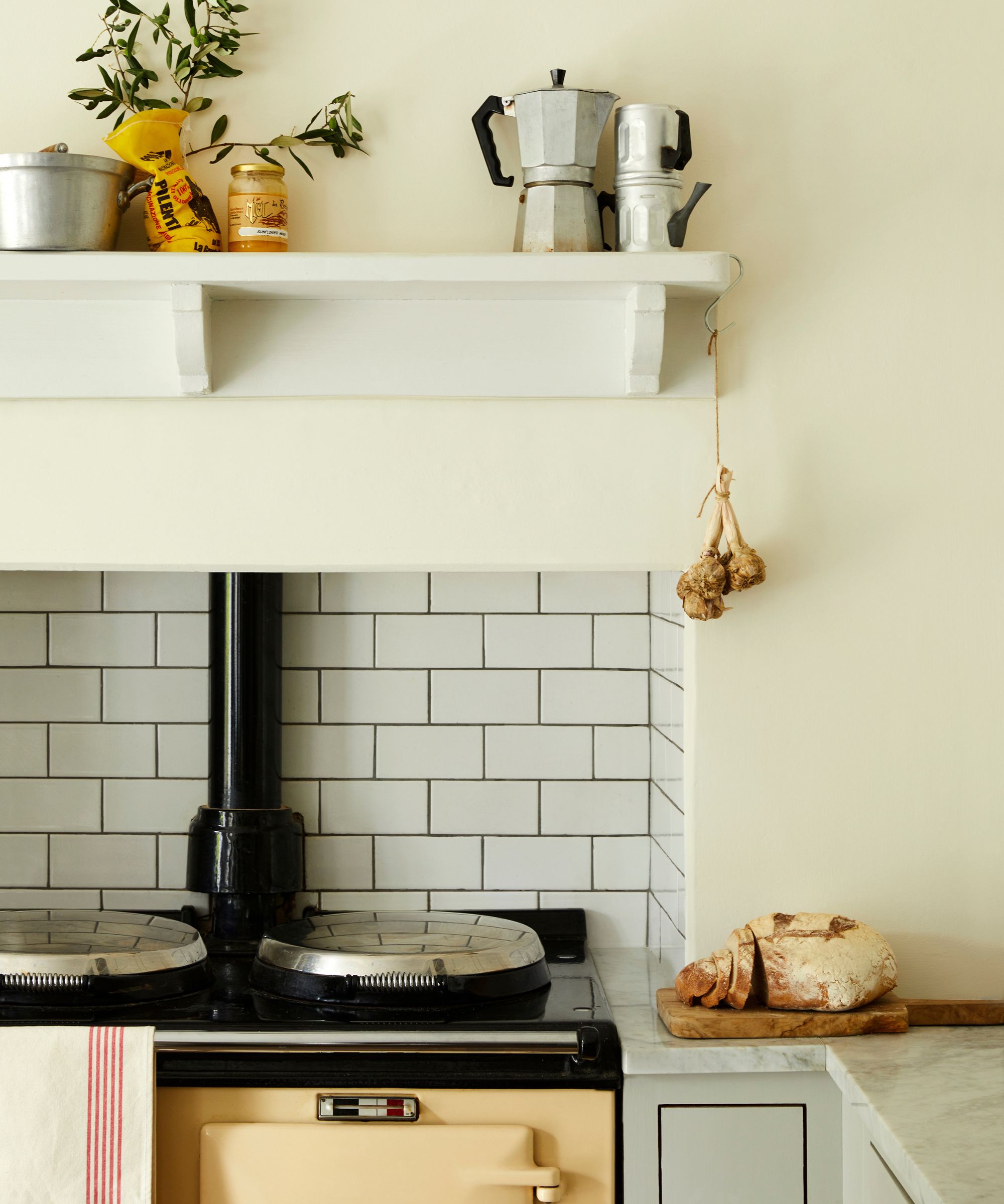
When deciding on small kitchen wall colour ideas, don't be tempted to choose the lightest shade on the paint chart and call it a day. According to Camilla Masi, interior designer at Otto Tiles & Design, the real secret lies in understanding paint temperature and tone, and how it interacts with the light in your space.
“In small kitchens, it’s less about defaulting to the lightest, most neutral colour and more about choosing the right temperature and tone to work with the quality of light in the room,” she explains.
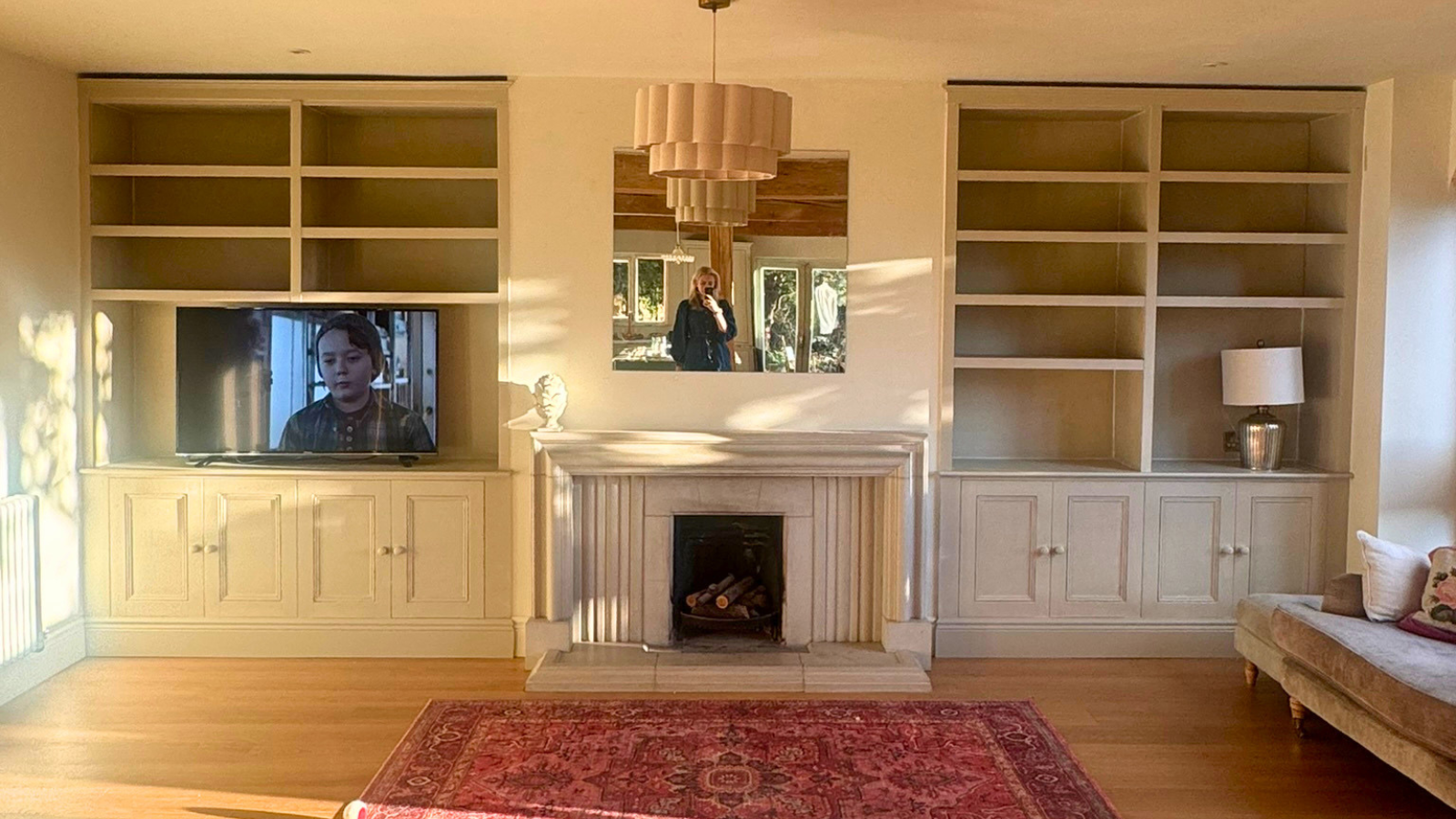
For example, in north-facing kitchens, where daylight tends to be cooler and more subdued, warmer chalk-based tones – such as pale limestone, soft oat or light putty – can counteract grey undertones and restore balance. The result is a space that feels brighter and far more inviting.
By contrast, south-facing kitchens can comfortably carry cooler shades. “Stronger natural light prevents these colours from feeling cold or lifeless,” Camilla explains. "Soft greys, off-whites and muted mineral tones will still read as bright, but with a crisp, contemporary edge."
Bring your dream home to life with expert advice, how to guides and design inspiration. Sign up for our newsletter and get two free tickets to a Homebuilding & Renovating Show near you.

Camilla is an Interior Designer at Otto Tiles & Design, where she works closely with clients to create characterful spaces built around beautiful tile and surface choices. With a strong eye for colour, pattern and proportion, she blends timeless design with modern detail, offering practical yet style-led guidance for kitchens, bathrooms and beyond.
Shop white paint
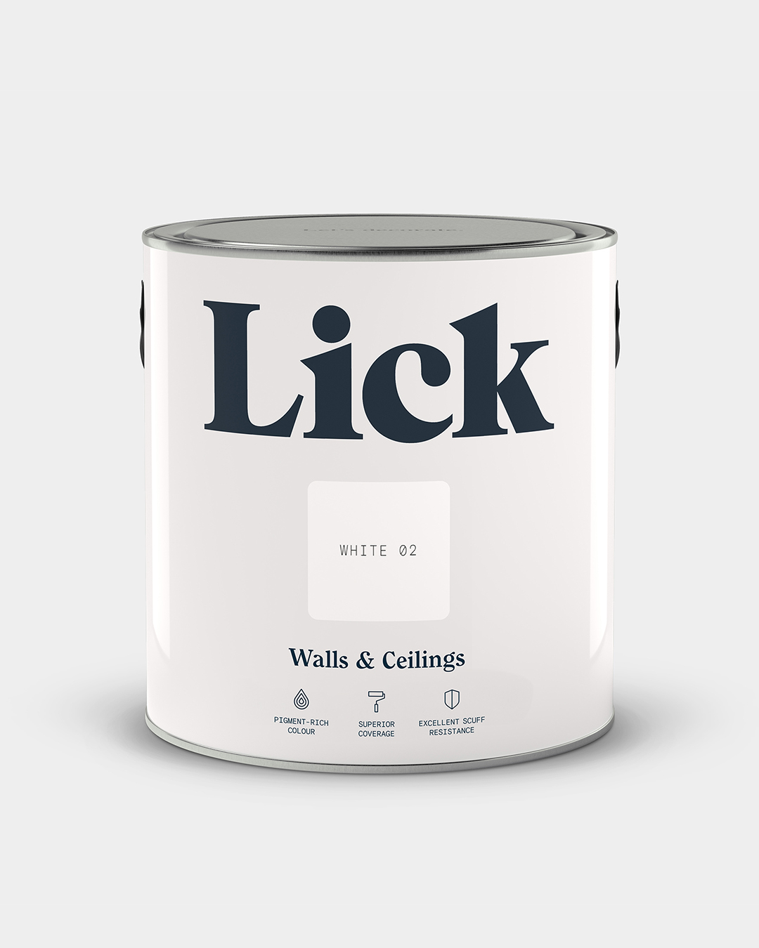
White 02 by Lick is an off white paint with grey undertones - not too bright and just cool enough. This colour brings helps make small spaces feel clean and sophisticated.
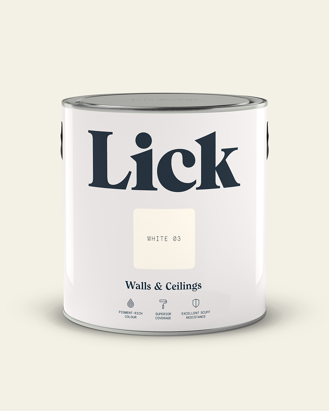
White 03 by Lick is a warm white paint with yellow undertones. It's a soft, uplifting neutral designed to soak up rays of sun before reflecting them back into the room.
2. Opt for soft, muted shades
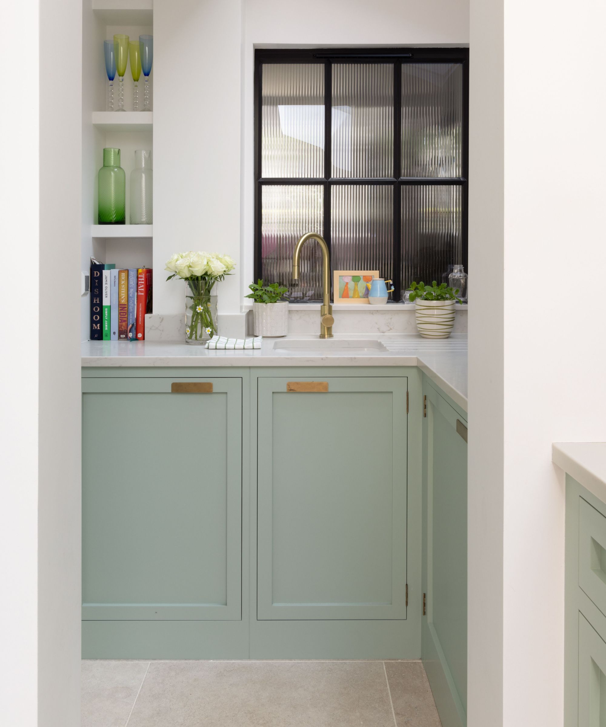
If white kitchens feel a little bit predictable but bold colour feels too risky, softer hues strike the perfect middle ground.
“Muted, mineral-based colours are often overlooked in small kitchens, yet they can be incredibly effective,” explains Camilla Masi. "Soft greens such as pale sage or olive, clay-based pinks, gentle mushroom tones and pale terracotta all sit comfortably between neutral and expressive."
Tamsin Holland, product development Manager at Paula Rosa Kitchens, agrees. She points out that muted pastels are often overlooked but they work well in small kitchens. The key is choosing today’s chalkier, more understated versions – not sugary brights – for a finish that feels grown-up and effortless.

Tamsin is Product Development Manager at Paula Rosa Kitchens, where she helps shape beautifully designed, environmentally conscious kitchens, bedrooms, and bathrooms for homes across the UK. With a focus on thoughtful details and sustainable design, she brings fresh ideas to every stage of the product journey.
3. Use earthy, nature-inspired tones
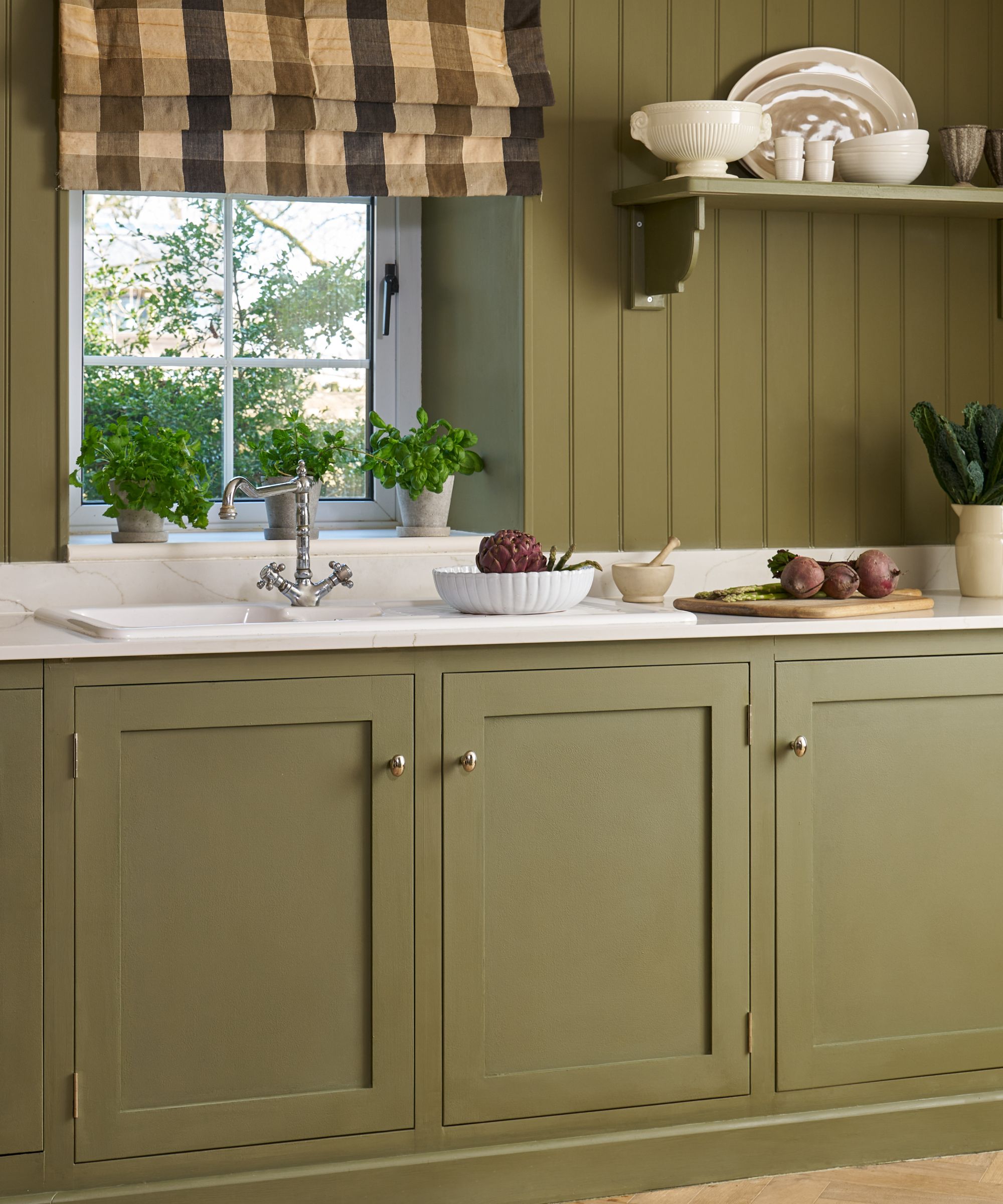
Earthy palettes continue to dominate kitchen trends, and for good reason. Nature-inspired tones are a fantastic way to inject a little warmth and rustic charm into small spaces.
“The most calming kitchens tend to feature earthy, nature-inspired tones such as sage, mushroom and warm neutrals,” says Charlotte Tilby, head of marketing at Woodstock Co.Used strategically, Charlotte says these shades can either enhance a cocooning feel or help a compact space feel more expansive: "Lighter, softer neutrals create a sense of airiness and balance, while deeper earthy hues lean into cosiness, wrapping the room in warmth without feeling oppressive."
“These colours also pair beautifully with natural materials and soft, layered kitchen lighting,” she adds, “adding depth and warmth without overwhelming the room.”

As Head of Marketing at Woodstock Co. – the parent company of LochAnna Kitchens, Calypso, and Veldeau – Charlotte stays closely attuned to the latest in kitchen and bathroom design. Working across multiple brands means she’s always on top of emerging trends and exciting new product launches, with a sharp eye for what’s next in modern interiors.
4. Stick to light, reflective tones
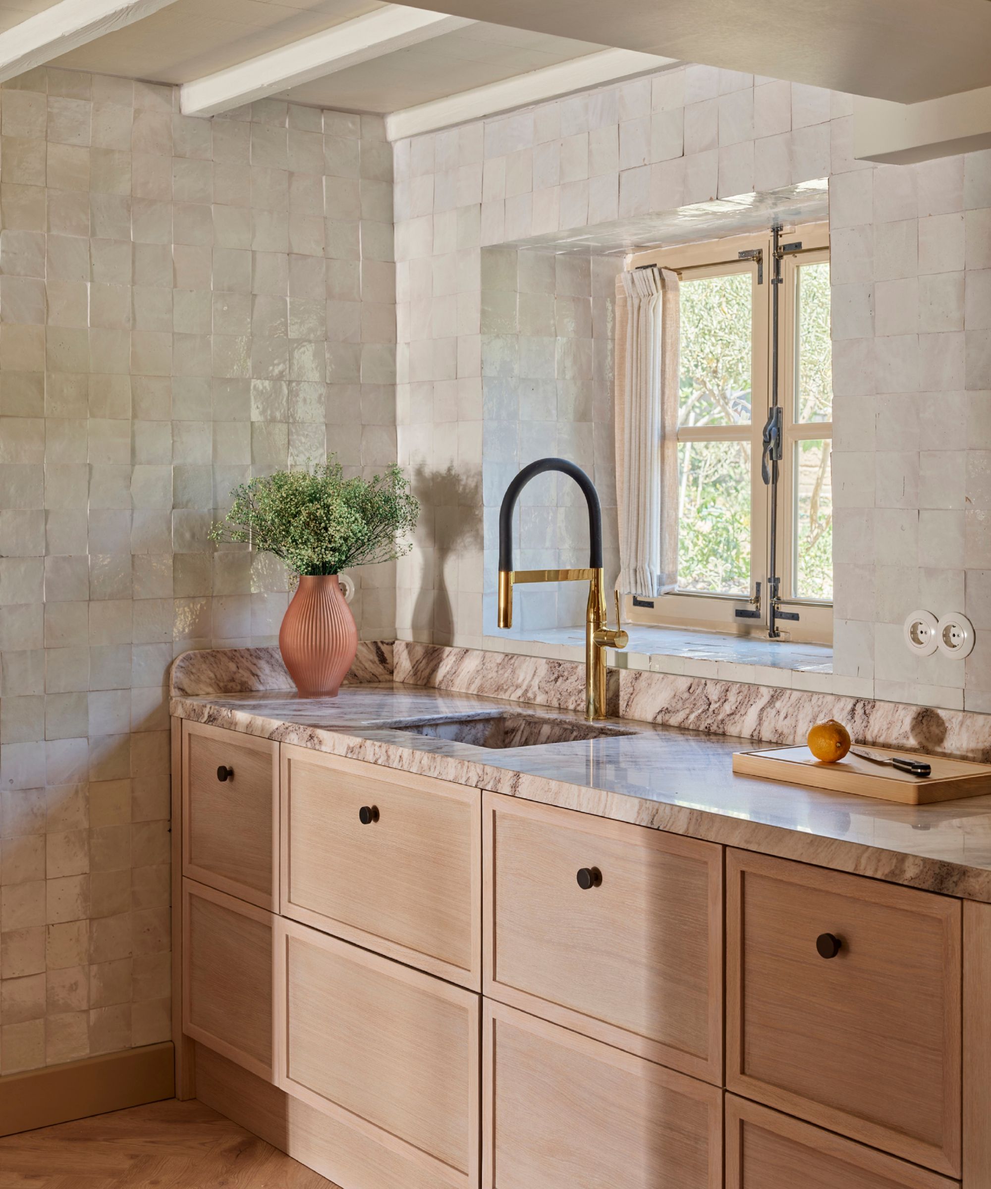
Light-reflective shades remain one of the simplest ways to make a compact kitchen feel more expansive, but bright whites aren’t your only option here.
“To open the space up, stick to light, reflective tones,” says Will Frankling, co-founder of Kitchen Makeovers. Soft creams, warm cashmeres and pale greys can deliver the same space-enhancing effect without feeling clinical.
The trick is choosing hues that gently bounce light around the room while adding a touch of warmth in the process. Will Frankling also recommends painting walls and cabinetry in the same tone to "blur visual boundaries". When contrast is reduced, he says "the eye reads the space as larger and more seamless."
Tamsin Holland agrees, noting that pale neutrals such as ivory, cream and light greige remain enduring favourites for good reason – "they keep a kitchen feeling bright and calm, without the starkness that can come with pure white."

Will Frankling co-founded Kitchen Makeovers in 2018. With over 30 locations across the UK, their kitchen makeover service is a cost-effective, sustainable solution providing a quick and efficient way to update the heart of your home.
5. Try soft mineral blues for a calming effect
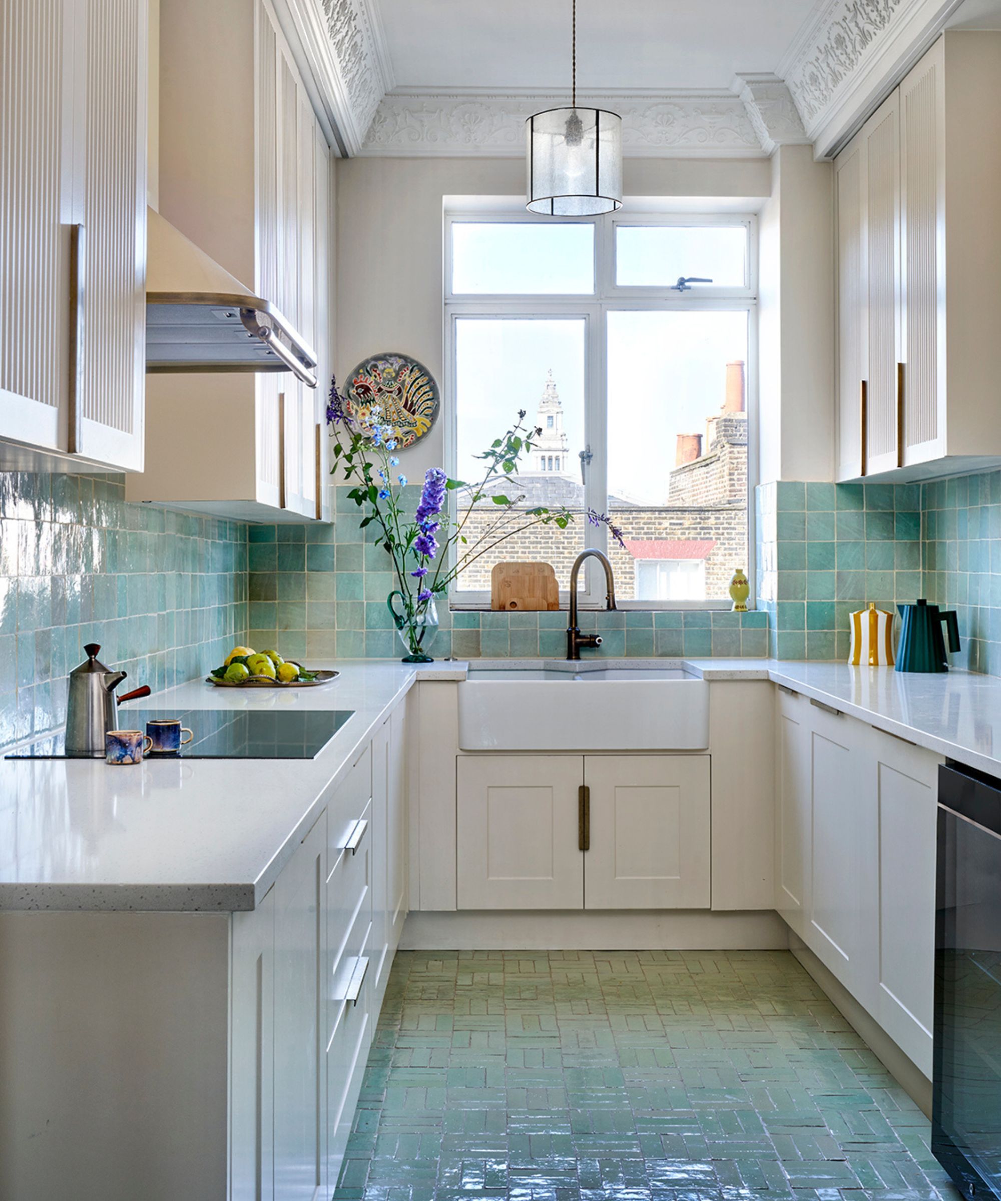
Can the colour blue work in a small kitchen? Absolutely – if you choose the right version.
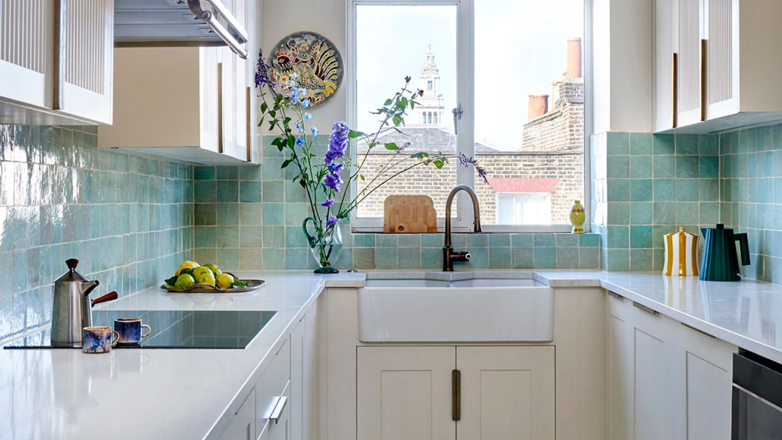
“Soft mineral blues can work beautifully when handled with care,” says Camilla Masi. “For example, a mineral blue with a grey or chalky undertone can feel airy rather than cold, particularly in well-lit kitchens.”
“Used across walls or splashbacks, these tones can make a space feel more intentional and cohesive, rather than simply “small but white,” she adds. "They also tend to age better, as they are less reliant on contrast and sit more comfortably alongside natural materials such as timber, stone and metal finishes.”
6. Lean into the cosiness of small spaces
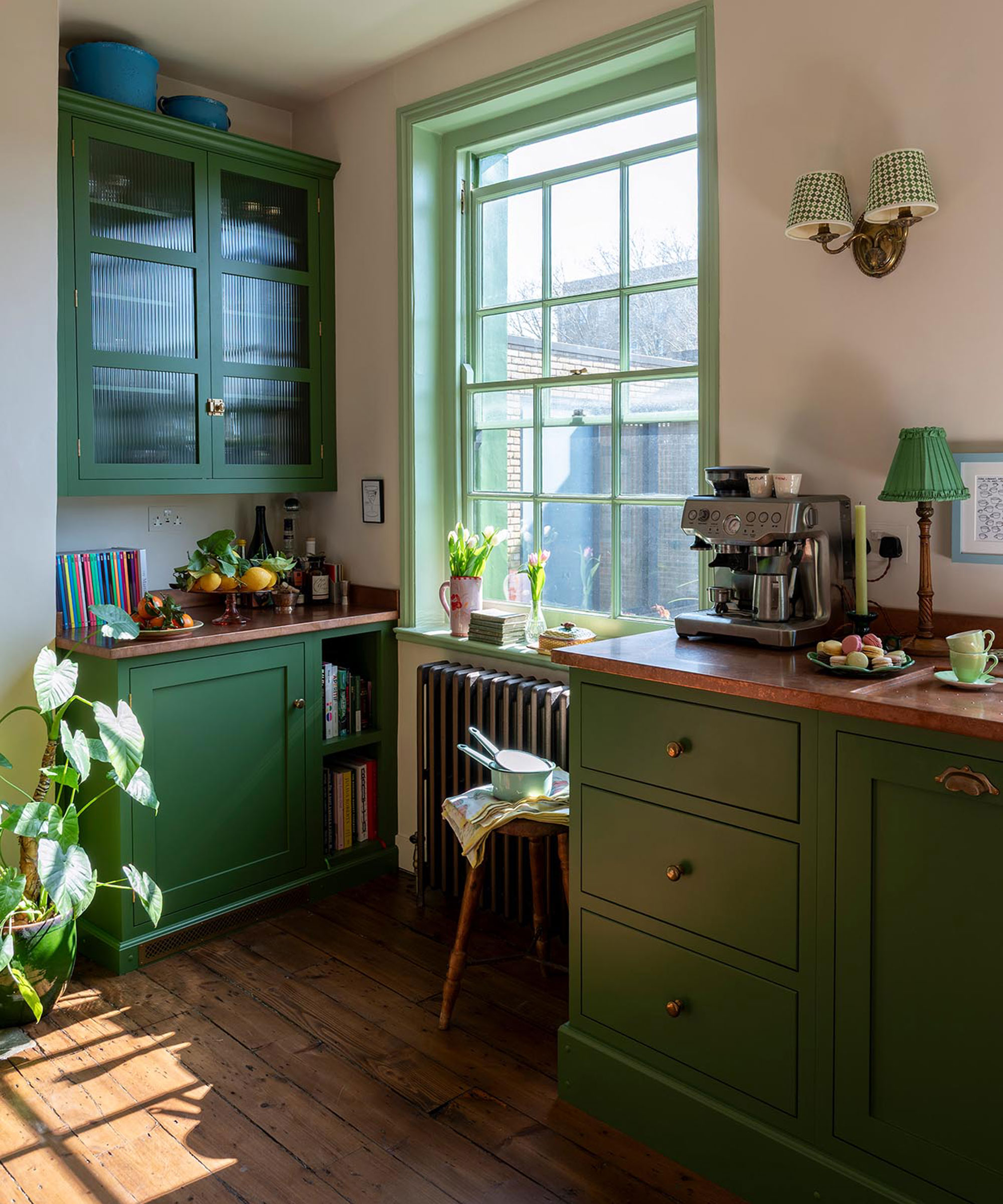
Not every small kitchen needs to fight for airiness. Sometimes, the smartest move is embracing its scale and turning this into a feature in and of itself. Will Frankling explains: “If you accept the kitchen is small and want to make it a ‘jewel box’, go for dark, dramatic colours like navy blue or hunter green."
Deeper shades have the ability to wrap the room in richness and intention, but they work best when you have good kitchen lighting – particularly under-cabinet lighting –to prevent the scheme from feeling heavy or confined.
Shop strip lighting

The 3-metre Philips Hue Solo lightstrip is easy to install and delivers 1700 lumens of brilliant light to brighten under your kitchen cabinets. Designed with safety in mind, it allows for comfortable, worry-free interaction. Every Philips Hue lightstrip is also backed by a 2-year guarantee.
7. Concentrate on creating continuity
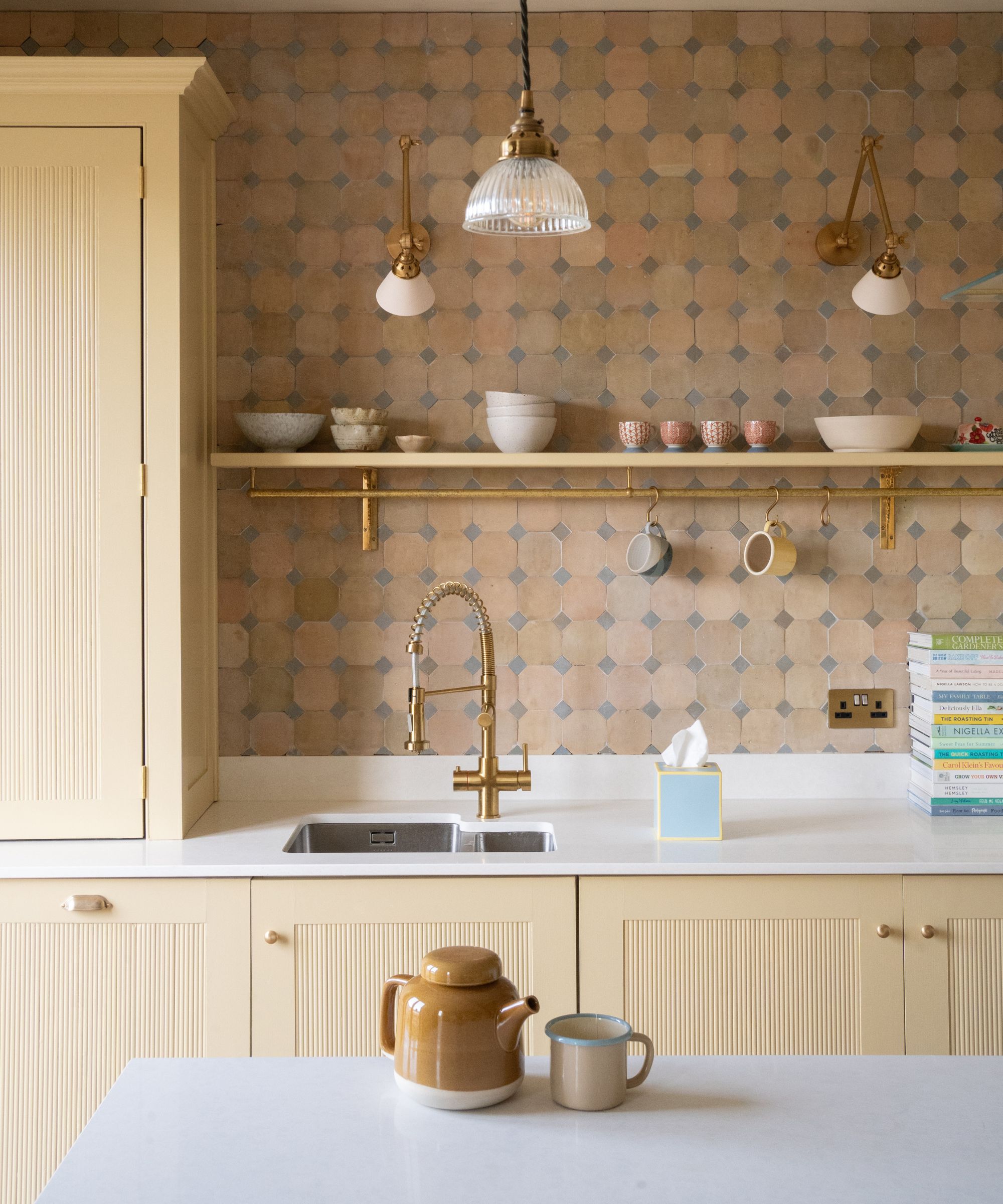
“One of the most common mistakes in small kitchens is using too many contrasting colours, which breaks up the space visually and makes it feel smaller than it is,’ warns Tamsin Holland. “Trend-led colour combinations can be tempting, but in compact rooms they often create unnecessary visual noise.”
Instead, she suggests thinking about how colour can gently connect the room from one surface to the next. “In most small kitchens, using closely related shades across cabinetry, walls and even flooring creates visual continuity, which helps the space feel calmer and more expansive,” Tamsin explains. “And that doesn’t mean everything needs to be the same colour. Contrast can come through texture rather than tone, whether that’s timber, stone or a tiled splashback.”
8. Bring bold colour to unexpected surfaces with tile
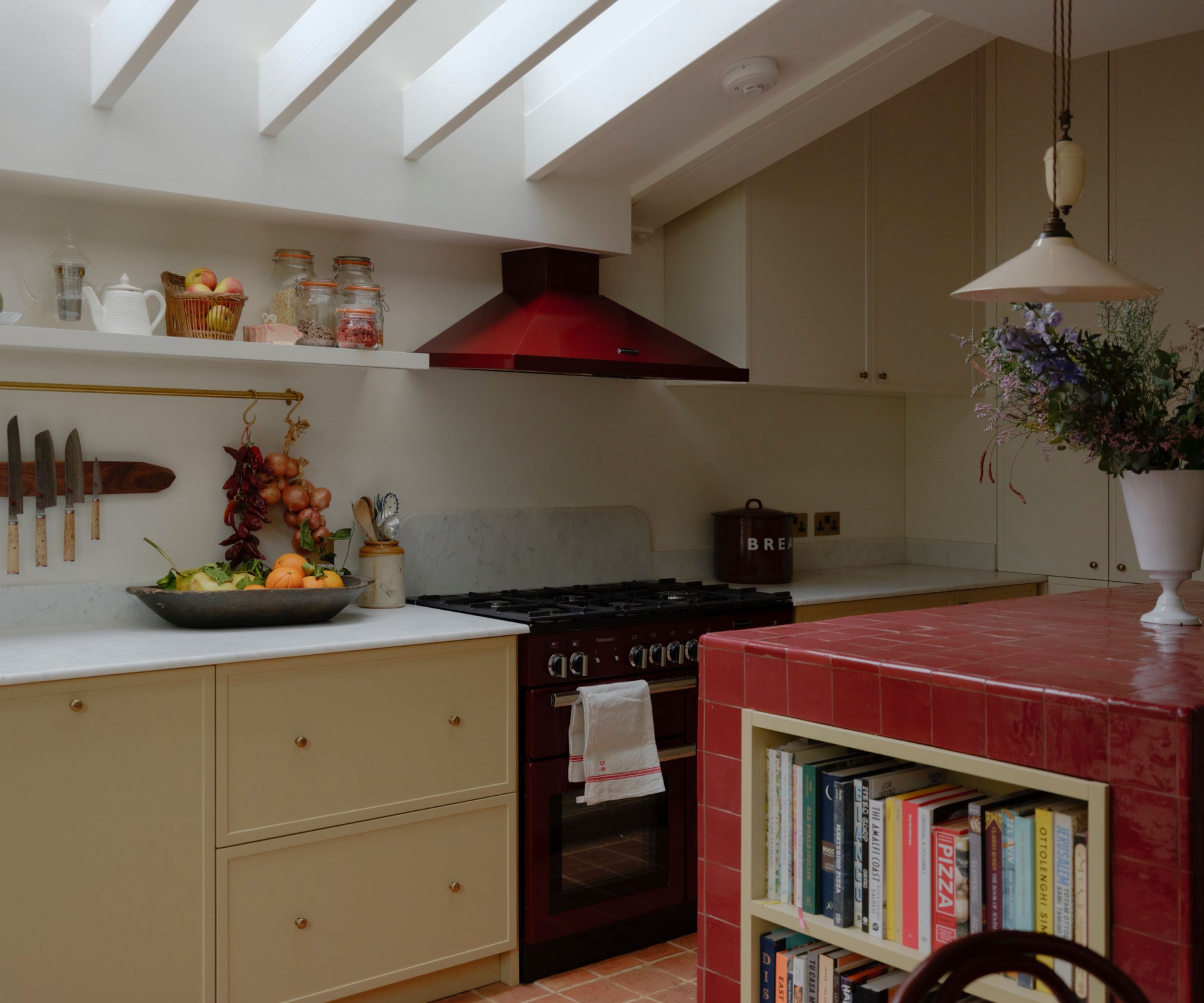
If committing to a full wall of colour in a small space feels too risky, tiles offer a contained way to experiment with different shades. Tiling a kitchen splashback or island brings a playful hit of colour, while bold kitchen floor tiles create impact without ever reaching for the paintbrush.
“Even highly expressive tiles, such as colourful mosaics, can work beautifully in small kitchens when they’re given a clear role,” explains Camilla Masi. She suggests framing neutral cabinetry or shelving with small contrasting wall tiles, or using patterned floors to ground the room. “In these cases, colour becomes a focal point rather than visual noise and can actually enhance the sense of space rather than diminish it.”
9. Try mixing up shades and colour blocking
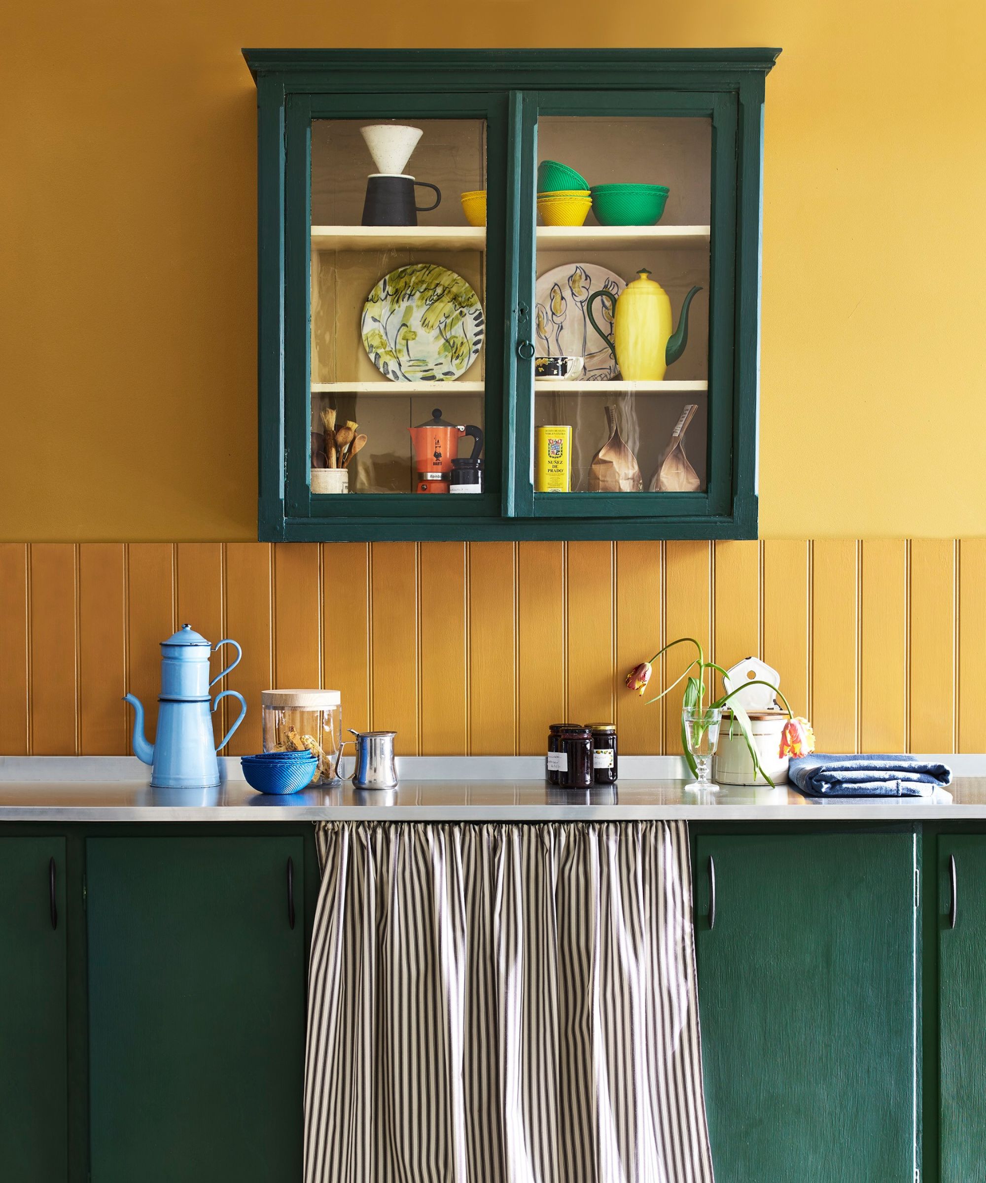
Who says a small kitchen has to play by one-colour rules? If you’re wondering whether you can mix and match colours in a kitchen without it feeling chaotic, the answer is yes – but balance is everything.
“Mixing colour can work extremely well in small kitchens when it’s done with intent,” says Camilla Masi. “Rather than thinking in terms of ‘one colour versus many’, it’s more useful to think about how colour is distributed across the space.”
In practical terms, that could mean colour blocking cabinetry or pairing contrasting floor and unit shades. “Graduated approaches – such as using a deeper tone at lower level and a lighter or softer colour above – can ground the room while still keeping it feeling open and light,” Camilla adds.
10. Don't be afraid to play with darker tones
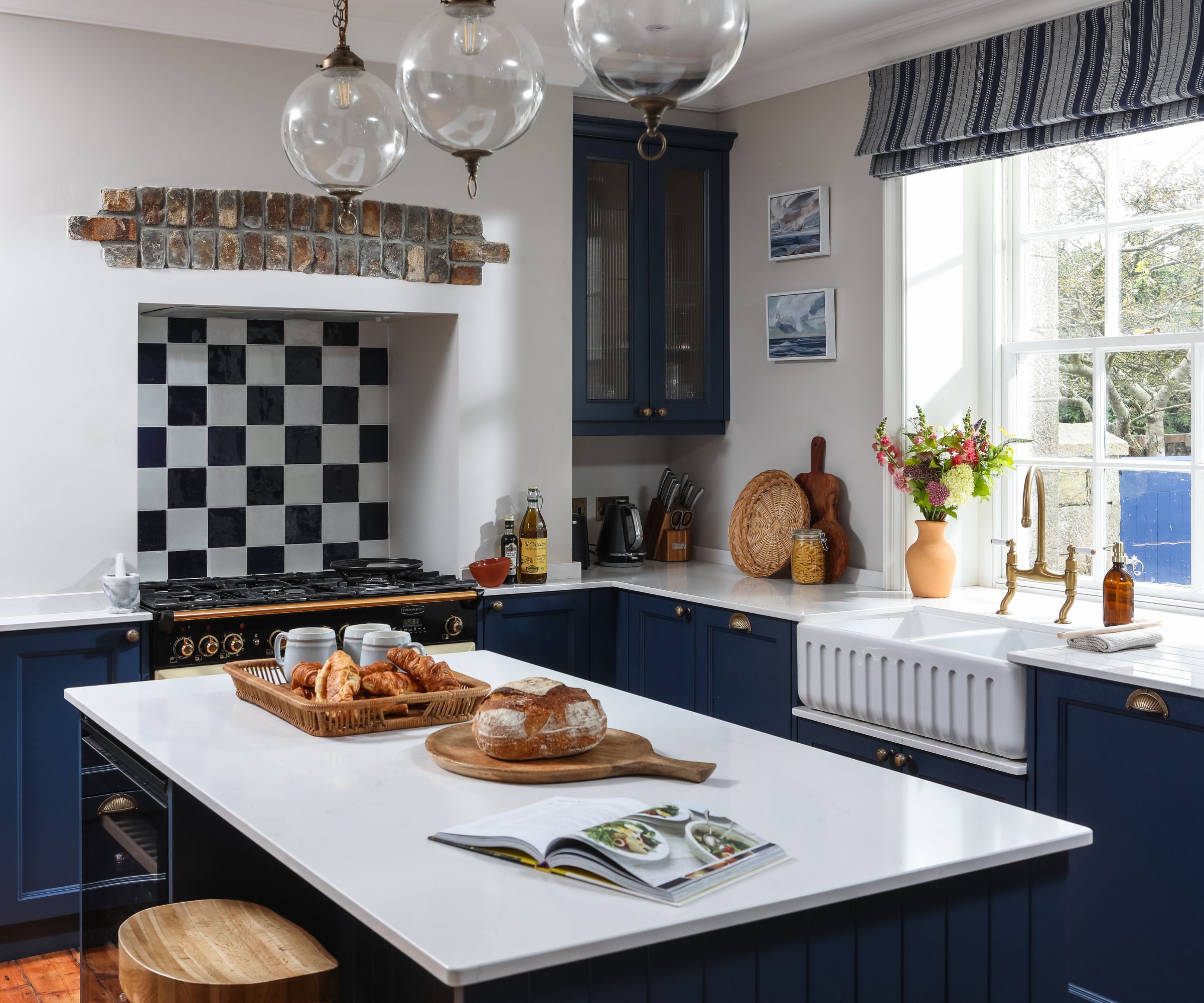
“Darker colours can work well in small kitchens if they’re used with restraint and intention,” says Tamsin Holland. “A common approach is to keep deeper tones to lower cabinetry or an island, which grounds the space without closing it in."
"Blue is a particularly versatile choice for this, from deep navy through to softer blue-greys," she adds. "Likewise deeper tones such as forest greens and charcoal greys are also being used more confidently and can add depth and sophistication when balanced correctly”.
Tiles offer another route to introducing drama without enclosure. “Darker or bolder tiles work best when used selectively to create depth rather than enclosure in a compact kitchen,” explains Camilla Masi. “In some kitchen layouts, using darker tiles on the wall furthest from a window can also enhance the perception of depth by subtly drawing the eye through the room.”
11. Keep in mind that finishes are just as important
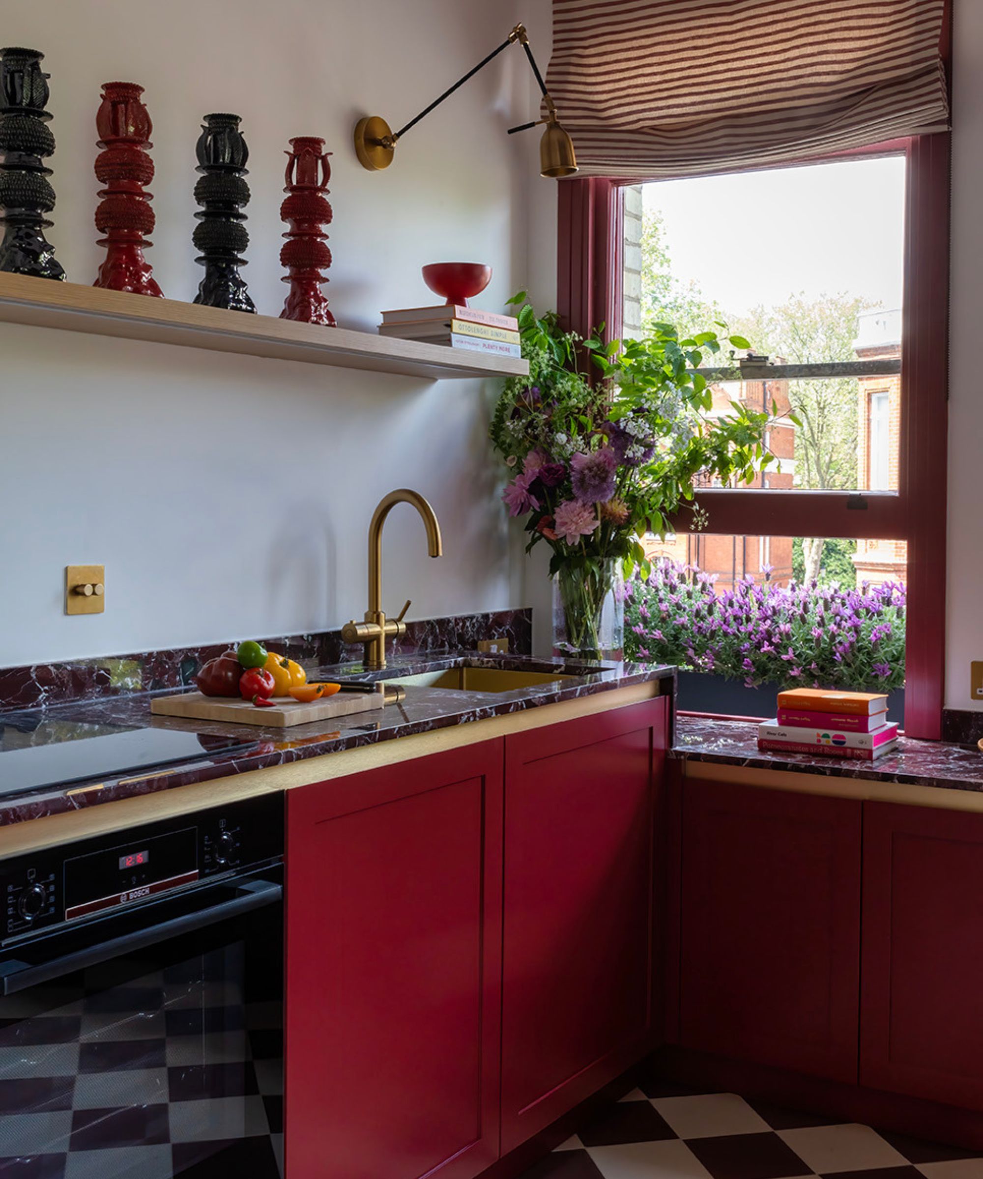
Colour may set the tone of a kitchen, but your choice of finishes will give it presence. In a small space, the way light interacts with surfaces can completely change how a shade reads and how the room feels.
“Semi-gloss finishes subtly reflect light and prevent the space from feeling flat,” explains Tamsin Holland. That slight sheen can help kitchen cabinetry feel brighter and more dynamic, especially in tight galley kitchens.
And tiles deserve the same consideration. “Matt or softly textured tiles tend to absorb light more gently, avoiding the sharp reflections of high-gloss surfaces that can make compact spaces feel busy or overstimulating,” adds Camilla Masi.
12. Use samples and visualisation tools to find the perfect match
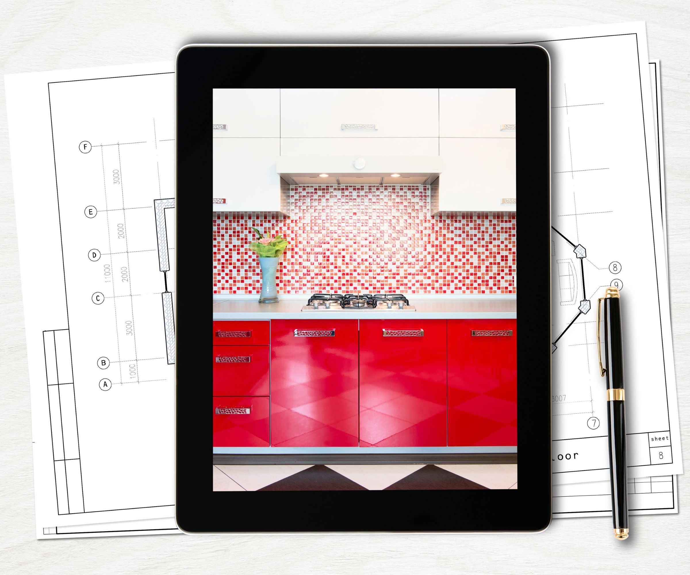
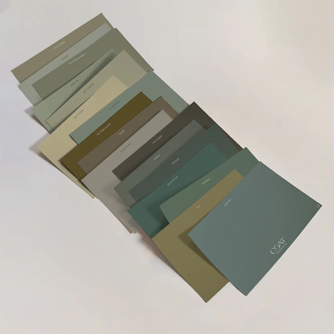
Colour works best when it’s considered from the outset. So, if you’re drawn to a particular family – green, for example – explore how that tone translates across different materials and paint finishes rather than choosing a single sample in isolation.
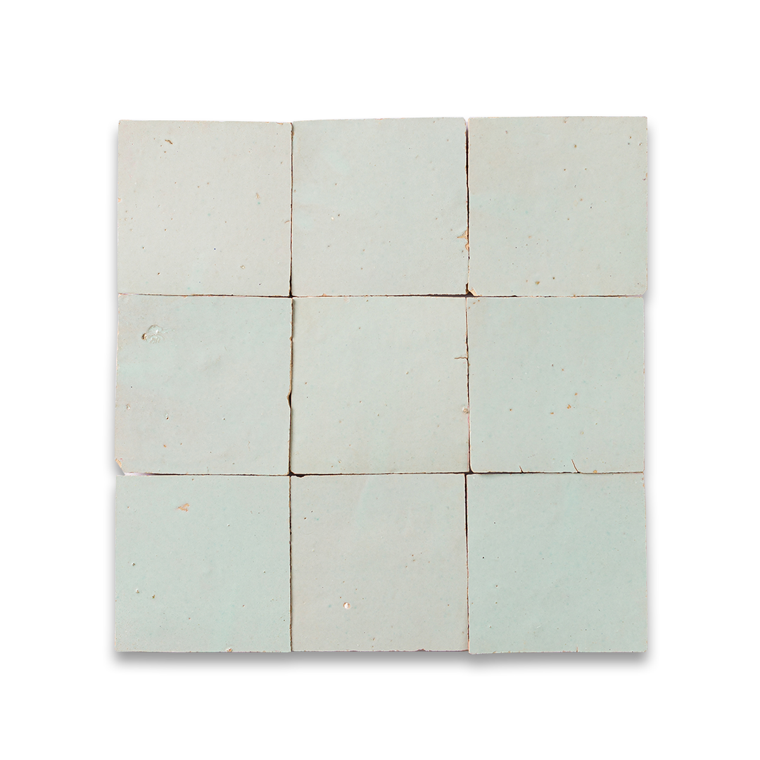
“What’s key is visualising how these elements work together before installation,” says Camilla Masi. The same shade can read entirely differently in ceramic, cement, stone or zellige, and what looks perfect on a swatch may fall flat once paired with cabinetry and worktops. When planning a kitchen mock-up renders and kitchen design apps can help you understand how surfaces, materials and colours interact in three dimensions.
“Colour should also be assessed in context,” Camilla adds. “Tiles and paint shades that look balanced on a showroom sample board can behave very differently in a kitchen, where light levels, sightlines and surrounding materials have a much greater influence.”
Looking for more kitchen colour inspiration? Explore these navy kitchen ideas for a bold yet timeless look, and if you’re planning a renovation, our painted kitchen cabinet ideas are packed with stylish options to consider.

Gabriella is an interiors journalist and has a wealth of experience creating interiors and renovation content. She was Homebuilding & Renovating's former Assistant Editor as well as the former Head of Solved at sister brand Homes & Gardens, where she wrote and edited content addressing key renovation, DIY and interior questions.
She’s spent the past decade crafting copy for interiors publications, award-winning architects, and leading UK homeware brands. She also served as the Content Manager for the ethical homeware brand Nkuku.
Gabriella is a DIY enthusiast and a lover of all things interior design. She has a particular passion for historic buildings and listed properties, and she is currently in the process of renovating a Grade II-listed Victorian coach house in the West Country.
