Have you heard of colour capping? Here's how to nail this bold new paint trend
First there was colour drenching, and now comes this more graduated way to decorate walls and ceilings
Bring your dream home to life with expert advice, how to guides and design inspiration. Sign up for our newsletter and get two free tickets to a Homebuilding & Renovating Show near you.
You are now subscribed
Your newsletter sign-up was successful
By now, you’re probably familiar with the term colour drenching – covering everything from walls to ceilings (and even radiators and furniture) in the same, usually dark and moody, shade. But just as we've gotten to grips with one paint trend, another has come along in the form of colour capping.
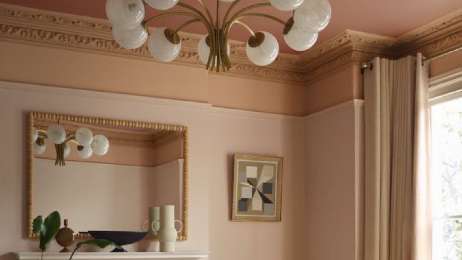
Instead of immersing a room in a single solid tone, colour capping builds intensity as it rises – deepening as it moves up the wall, and reaching its richest shade across the ceiling. Done well, it can make a room feel feel larger and loftier, cohesive and classy. Done badly… someone might think you ran out of paint and decided to improvise.
To help you avoid embarrassment, we've asked the experts how to pull off the method of colour capping without mess or stress, and to understand where this look truly shines (think hallways, stairwells, lofty living rooms). We’ll also flag where to tread carefully, and address whether you really need to paint your skirting boards to perfect the effect.
What is colour capping?
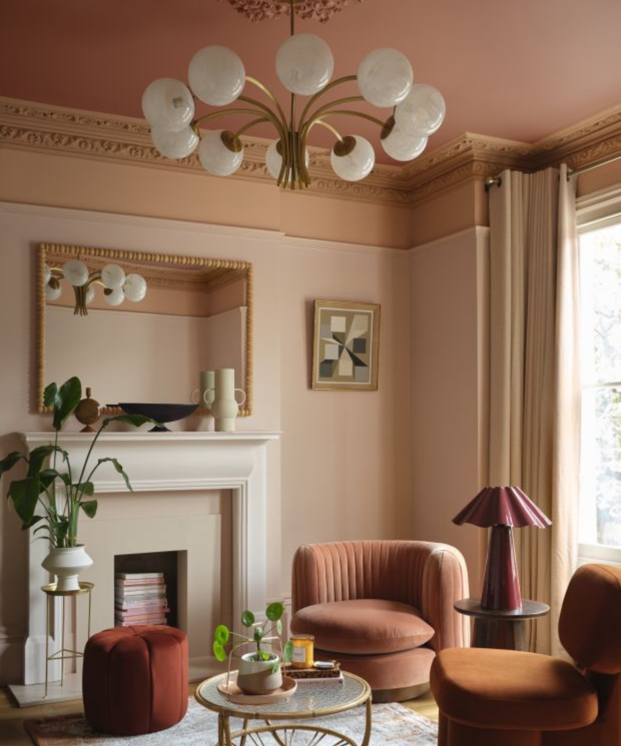
"Colour capping is a trend I am 100% on board with, as it focusses on the part of a room that I think has been overlooked for too long: the ceiling," says Marianne Shillingford, creative director and colour expert at Dulux. "This decorating technique is a variant on the ever-popular colour drenching trend – ‘colour capping’ makes it slightly more interesting by using different tones of the same colour, with the deepest tone on the ceiling, giving it a ‘capped’ effect."
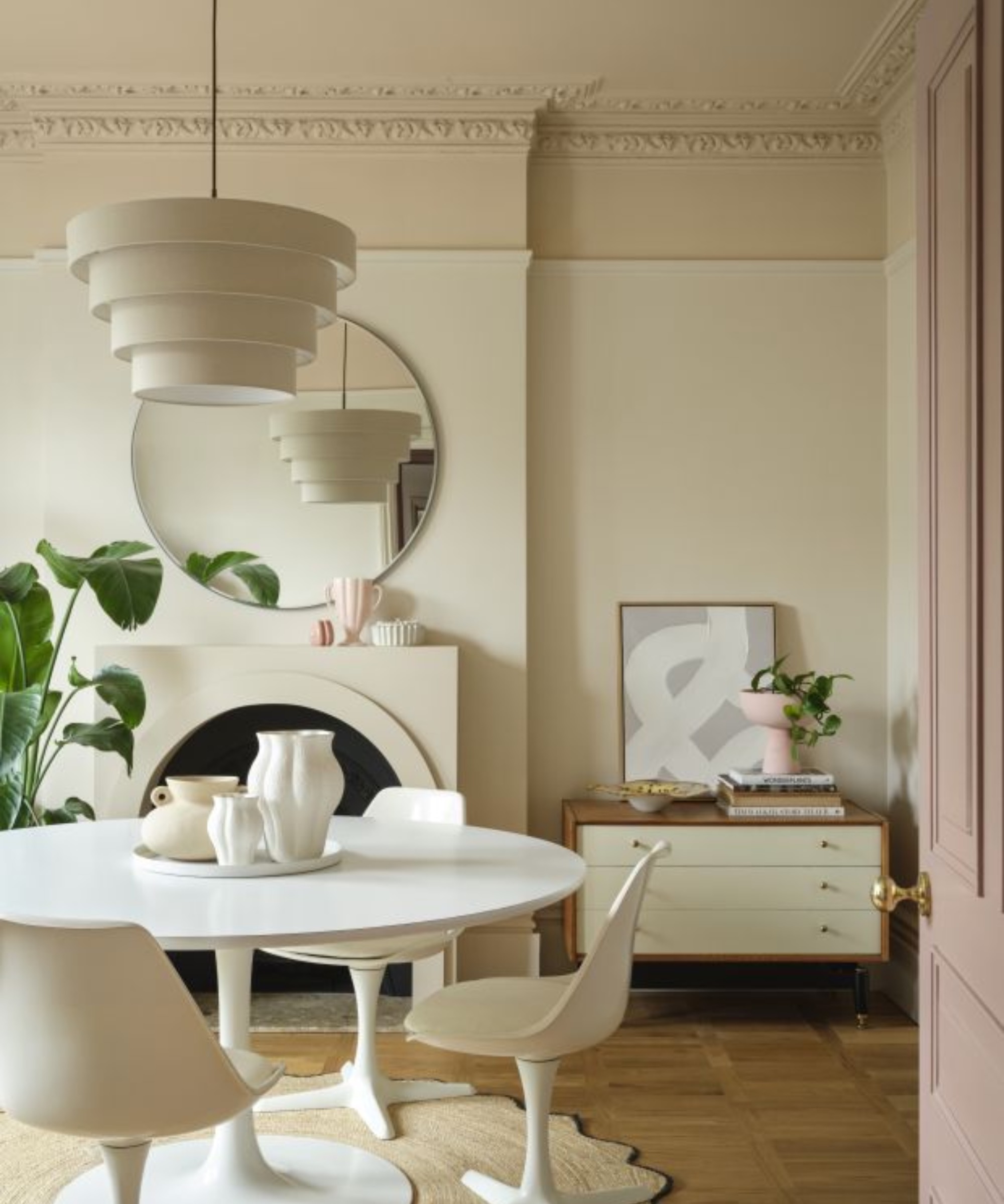
"It's a clever way to achieve a high-end look with just a few tins of paint," explains Helen Shaw, Director of Marketing (International), Benjamin Moore. "It involves enveloping a space in a tonal wash that gradually deepens the further up it goes, incorporating the ceiling into the design." In the main, the idea is to paint your ceiling in the deepest, darkest shade, then your cornicing and/or the wall above the dado rail in your chosen mid tone, before covering the middle and lower parts of the walls in your lightest shade.
"By bringing the often-overlooked ‘fifth wall’ into the scheme, it creates a seamless flow and a greater sense of space," says Michael Rolland, managing director at The Paint Shed. "I think, especially as more people live in smaller new-build homes, this is a brilliant way to add personality to what might be a 'boxy' space and create the illusion of openness."

Marianne is a decorating expert who is passionate about the power of colour to change lives. As well as her current role as Creative Director at Dulux, she is the founder of the Colour in Design Award, which encourages a new generation of colour-forward design talent.

Helen Shaw is part of Benjamin Moore's UK division. A colour expert and international marketing director, Helen is no stranger to the paint industry and benefits of colour, having also previously founded a paint company with her husband, Craig.

Michael Rolland is a painting expert and Managing Director of The Paint Shed. Michael has years of experience within the painting industry, using this expertise to influence his own DIY projects using the best possible tools and materials.
How can colour capping enhance a room?
Helen Shaw thinks colour capping is a smart way to make your room look that bit more personalised. "It adds depth and nuance to an otherwise simple palette and is also a great way to build colour confidence.
"By using paint in varying tones from the same colour family, you can completely transform the mood and proportion of a room," she says. "This layered approach draws the eye upward and creates a sense of intention and polish."
“In older properties, it can highlight architectural features such as cornices and picture rails whereas in newer or more minimalist spaces, it adds dimension, making flat surfaces feel more dynamic and visually interesting."
“Colour capping is a successful decorating style for several reasons," says Michael Rolland. "Firstly, opting for the same tonal gradient from wall to ceiling works to create a cohesive and sleek look in the home. Secondly, using this style also helps to make your home feel more spacious, whilst at the same time adding depth and creating a sense of relaxation.”
Bring your dream home to life with expert advice, how to guides and design inspiration. Sign up for our newsletter and get two free tickets to a Homebuilding & Renovating Show near you.
What rooms are particularly suited to colour capping?
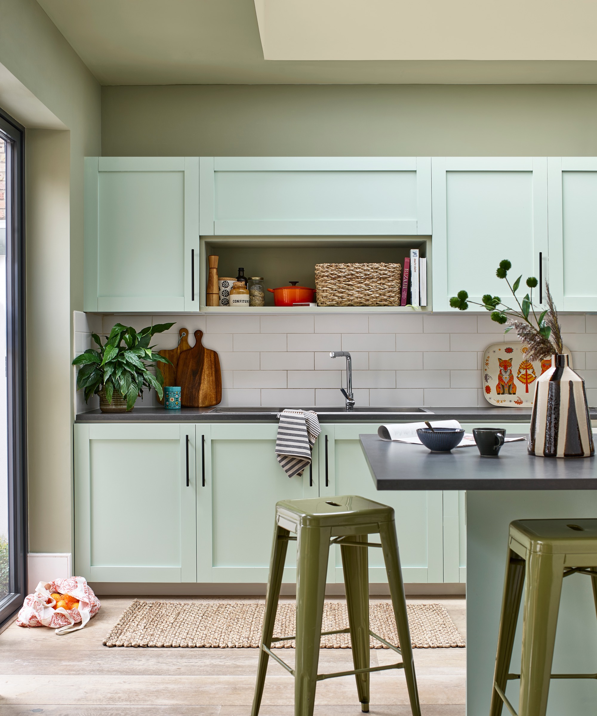
“Colour capping is generally safe for a multitude of areas in the home, from living rooms to kitchens and hallways," says Michael Rolland, "I would recommend trying this trend in kitchens, particularly with green or blue shades, and I love the idea of extending these colours onto cabinets to tie everything together. It can really bring a small space to life.”
"Colour capping works beautifully in living rooms and bedrooms because it enhances the sense of intimacy and comfort these spaces demand," adds Helen Shaw. "By carrying colour onto the ceiling in a slightly deeper tone, the room feels cocooned and inviting, perfect for relaxation."
When is colour capping less successful?
"You may find that the colour capping trend doesn’t work practically in really small spaces such as utility rooms, or rooms that are already very dark," says Michael Rolland. "Darker colours can make an already dim room appear lifeless and more closed-in, which certainly isn’t the vibe you want to achieve with this trend.”
Marianne Shillingford agrees: "Even though colour capping can work for rooms you want to visually enlarge, this may be tricky to achieve in spaces that don’t receive much natural light. Closing off an already-dark room with a dark ceiling may make it feel even more enclosed."
"As well as this, any rooms that already feel quite busy with different textures or architectural features like intricate doorways or architraves may not be the best fit for colour capping. Introducing different hues here, even if they are tonal and complementary, could make the space feel a bit overwhelming," she tells us.
What are the best colour combinations for colour capping?
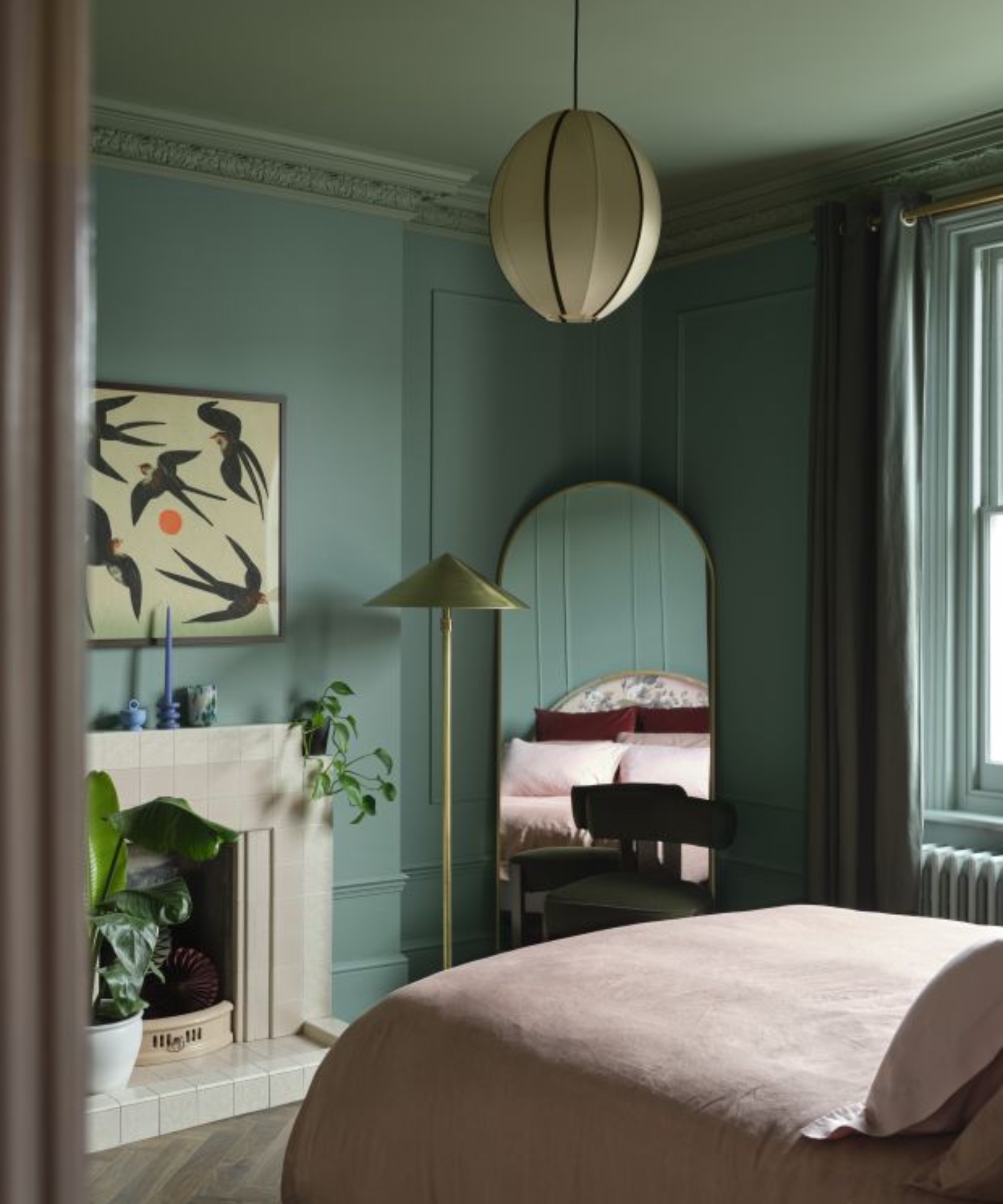
“I have seen a lot of great shades be used in colour capping, but my favourite will always be green or blue tones," says Michael Rolland. "Both of these are classed as ‘receding colours’, which create the illusion of more space and depth within the home – perfect for anyone wanting to embark on this trend."
"To colour cap successfully, start with a single colour family - and combine two or three different shades. I would suggest that those keen to explore green consider Farrow & Ball’s Green Ground, with Green Blue and Yeabridge Green. Those seeking blue shades might find that Benjamin Moore Blue Dusk works well with Blue Spruce and Van Deusen Blue."
Marianne Shillingford suggests Dulux's luxurious Heritage range on the basis that "the colour capping trend is all about making the rooms of your home feel that little bit more palatial".
"What’s even more helpful, is each colour’s page on the Dulux Heritage website offers tonal suggestions to help you plan a perfectly cohesive room," she adds. "For example, the rich purple Wild Blackberry is the perfect punctuation point for walls painted in a purple on the softer side, like Violet Night – their combined inky plushness making for a perfect bedroom combination to curl up amongst."
"Alternatively, Mallard Green gives the feeling of resting under a forest canopy when used on the ceiling, and is complemented gorgeously by Green Oxide on the walls. As green is a colour known to aid concentration, this pairing works brilliantly in home offices."
How to paint using the colour capping technique
1. Prep your space
"As with any paint job, preparing your room is key – but precision is particularly important this time around, as more than one colour is involved," says Marianne Shillingford. "Make sure the room is as clear as possible and all surfaces you don’t want painted are protected."
2. Get the right equipment
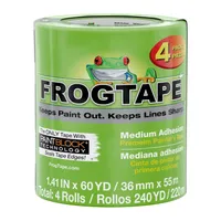
"If you are looking for the clean-line aesthetic, most commonly used with colour capping, then masking tape is the perfect way to ensure a crisp edge," says Michael Rolland. "Should you wish to adopt a softer transition in your interiors, try feathering the edges with a dry brush or sponge while the top colour is still slightly wet, so the two shades merge together."
"Once you have selected your shades, grab some masking tape and a spirit level or laser and mark where your two or three sections of colour will start and finish," he adds. "Ensure to press down firmly on the tape to ensure you have a tight seal to begin painting."
I always recommend Frog Tape if you want to create a clean line with no paint bleed. This four pack represents good value, saving you more than £10.
3. Start with the ceiling
“To prevent unnecessary mess and the hassle of having to repaint, always paint from the ceiling downwards. So, in the instance of colour capping, this would begin with your darkest shade," advises Michael Rolland. "That way, should you make a mess, it is much easier to rectify than if you were to have painted your entire room first."
Marianne Shillingford agrees: "An angled ‘cutting in brush’ will be your best friend here, as its designed to create a precise line where the ceiling meets the walls."
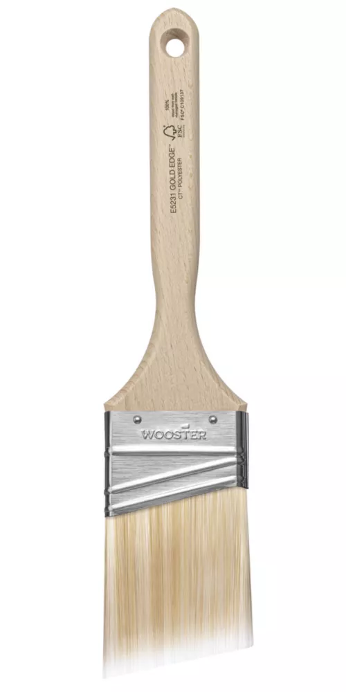
This Wooster brush is specially designed for cutting in. It has rave reviews and while it costs a little more, you're less likely to lose bristles and it holds a decent amount of paint. It's suitable for use with all paint types, including emulsions, gloss and oil-based paints.
4. Take care when moving to your next shade
“You always want to give your different shades enough time to dry before layering," says Michael Rolland. "Rushing your painting is the quickest way you will acquire smudges and uneven coverage, so the craft is really about being patient with the process. That said, to ensure you get the cleanest edges, always aim to remove the tape while your paint is still a touch tacky."
Marianne Shillingford has another smart trick when using multiple shades. "If you want the ceiling colour to come a little way down on to the walls as a band of colour, measure and mark with chalk and apply decorators masking tape along the line where the ceiling colour will meet the wall colour. Seal the edge of the tape that you are painting up to with a coat of the background colour (for example, if the ceiling colour is green, use a lick of the same green to seal the edge). This will ensure a perfect professional ‘how on earth did you do that?’ crisp line between the colours."
Just remember, colour capping is all about having fun with your walls and breaking away from the ordinary. Whether you go bold and dramatic or soft and subtle, it’s a trend that instantly adds personality to a room. So why not grab a paintbrush and see where a little colour play takes you? We dare you...
FAQ
Will I need to paint my skirting boards?
While some interior designers will insist on embracing the trend through to your woodwork, both Marianne Shillingford and Michael Rolland believe fans of white skirting and door frames needn't panic.
“If you happen to be a fan of white woodwork, that is absolutely fine, as it can help to sharpen the look," says Michael Rolland. "However, you want to ensure this is a fresh white shade and not an off-white, as that can make your shade choices appear more dull."
"If you like to colour cap with whites and neutrals or simply prefer white woodwork, definitely check out the Dulux Heritage whites tool ," suggests Marianne. "This helps you choose the perfect white shade for the type of light and aspect of your room."
However, Helen Shaw at Benjamin Moore prefers to embrace coloured woodwork. "Colour capping is all about cohesion rather than contrast so painting skirting boards in the same colour as the walls is a great way to maintain this feeling right down to the floors. Avoiding a harsh contrast here also ensures the eye is draw up to the main colour capping moment on the ceiling."
To help you decide which base colour you'll use for colour capping, find inspiration and advice in our guide to the best colour for a living room, and take a look at these kitchen wall colours, as recommended by experts.

Amy Cutmore is a UK-based journalist who has specialised in consumer tech and home improvement for two decades, covering everything from planning permission and paint colours to solar panels and soundbars.
She's been a writer, editor and head of content for sites including Ideal Home (as 'Girl About Tech'), Homes & Gardens, Livingetc, Saga Magazine, Grand Designs, The Guardian, The English Home, Tom's Guide, Expert Reviews and Trusted Reviews.
When she's not getting to grips with her overgrown garden or visiting washing machine factories (she can attest that they're not much different whether you're in Korea, Slovenia, Italy or Japan), you'll find her planning a new kitchen extension. Or boring people senseless about Formula 1 (and her triumphs in the F1 Fantasy League).


