Windows don’t have to be white uPVC — here’s how to choose a frame colour that suits your home
Window colours can transform the look of your home. From crisp white frames to bold brights, here’s how to choose the right shade for your style of property
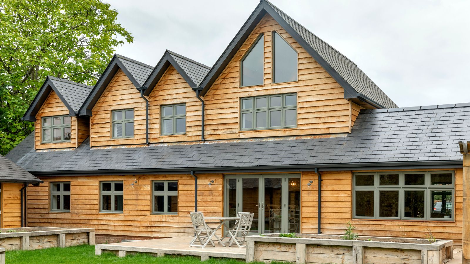
- 1. Embrace classic white frames
- 2. Opt for a contemporary black finish
- 3. Go for grounding grey tones
- 4. Use pops of vivid colour
- 5. Swap classic shades
- 6. Use stained glass
- 7. Use contrast for an extension
- 8. Try soft greens
- 9. Paint your window shutters
- 10. Paint and contrast
- 11. Colour drench your frames and walls
- FAQs
Bring your dream home to life with expert advice, how to guides and design inspiration. Sign up for our newsletter and get two free tickets to a Homebuilding & Renovating Show near you.
You are now subscribed
Your newsletter sign-up was successful
Choosing or changing the colour of your windows might seem like a small design decision, but it's one that can have a big impact on your home’s kerb appeal. If you're in the process of updating original timber frames, replacing older units, or simply starting from scratch, selecting the right shade can enhance your home’s character, complement the materials used, and even increase its value.
From soft heritage tones that suit period properties to deep, dramatic hues perfect for modern homes, there’s a growing appetite for window colour ideas that do more than just blend into your facade. And with expert advice on hand, it’s easier than ever to choose a finish that feels timeless, not trendy.
Here’s how to find a window colour that works with your home and stands out for all the right reasons.
Article continues belowWindow colours for your style of property
"When it comes to the look and feel of a home, window colour plays a bigger role than most people realise," says Steve Winscott, director at Nine Zero. "It’s not just about aesthetics either; it’s about respecting the architecture and setting of the property."
He continues: "We always encourage homeowners to think about the style of their property first. A Georgian townhouse or a Victorian terrace will naturally suit more traditional shades – soft greens, warm creams or subtle greys – whereas a more contemporary build might benefit from something bolder, like anthracite or even a deep blue."
"The surroundings matter too. A house in a rural or coastal setting may be better suited to softer, neutral tones that blend into the landscape, while darker, statement colours can work really well in urban environments."

Steve Winscott is Director at Nine Zero, a bespoke timber window specialist, with a background in carpentry, joinery, and sales spanning over two decades.
1. Embrace classic white frames
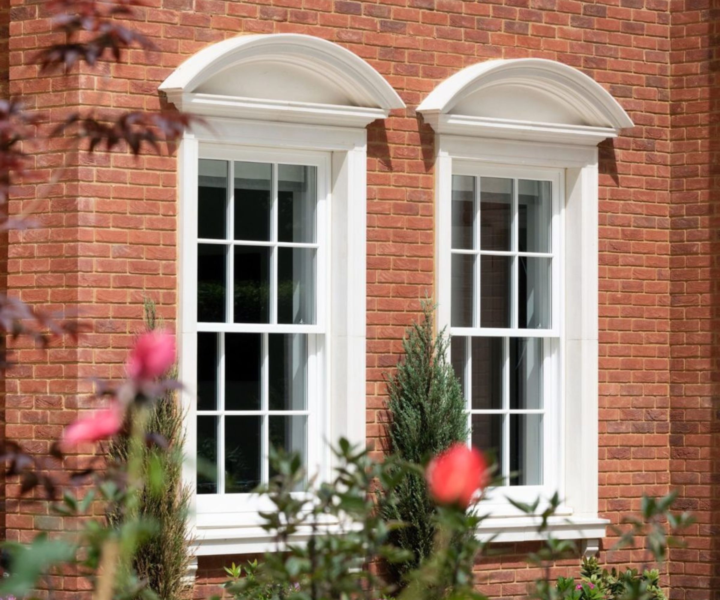
We’ve all heard the phrase, “If it’s not broken, don’t fix it”, and the same could easily apply to crisp white window frames. This timeless choice suits just about every style of property, and works especially well on traditional sash windows, as seen here.
Bring your dream home to life with expert advice, how to guides and design inspiration. Sign up for our newsletter and get two free tickets to a Homebuilding & Renovating Show near you.
It’s a versatile option that won’t date, and one that blends effortlessly with both red brick and rendered finishes. But if you’re painting timber windows, just be sure to sample a few different tones of white before committing to one specific shade. Some shades have cooler or warmer undertones, which can make all the difference depending on your brickwork or exterior palette.
2. Opt for a contemporary black finish
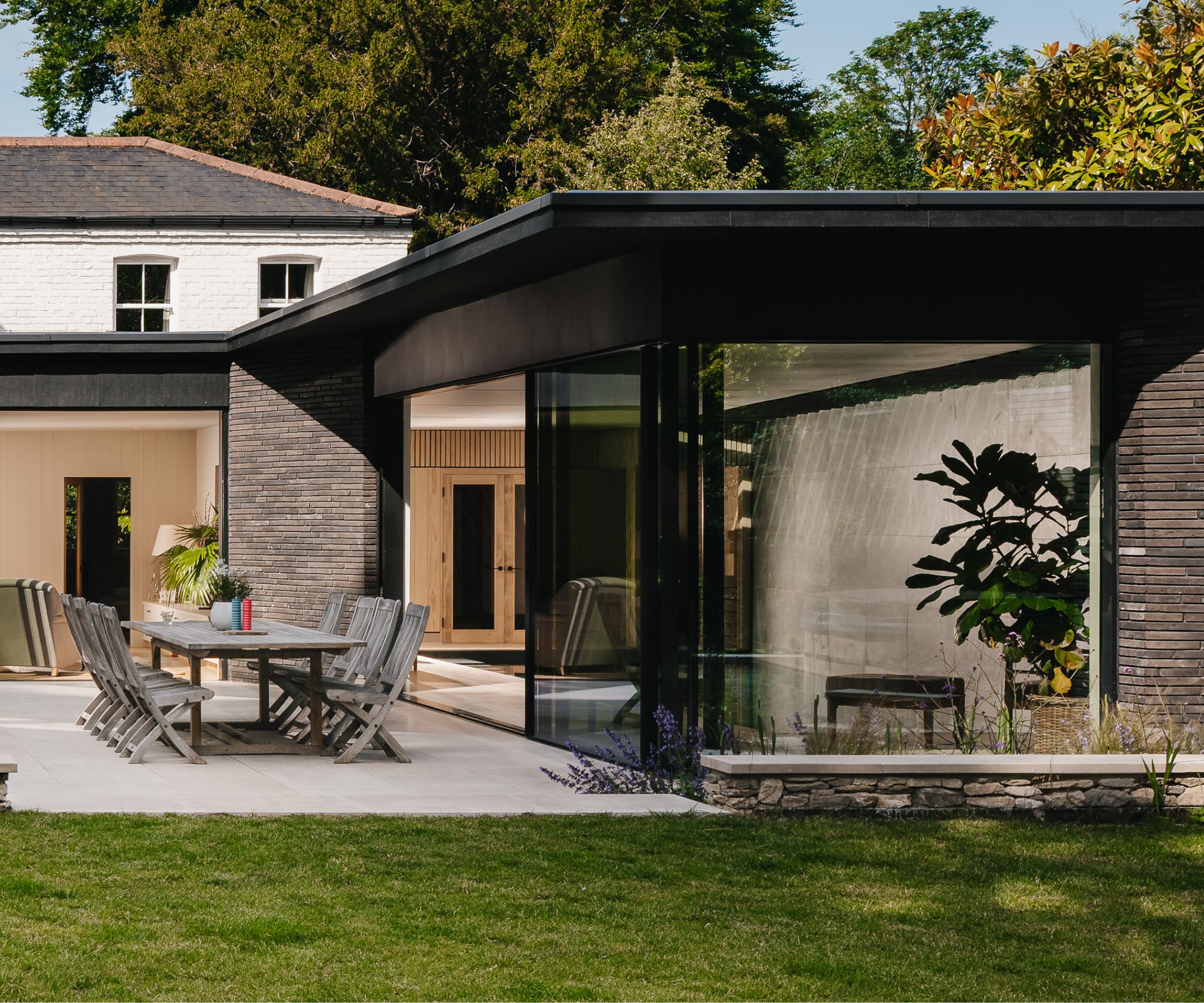
Want to give your home a sleek, architectural edge? Black window frames are another timeless choice – perfect for adding contrast and definition to both modern new builds and heritage properties with contemporary extensions. “Black can be a bold choice,” says Liam Spencer, MD at Northallerton Glass, “and when used well, it delivers serious impact.”
Black glazing works beautifully across different window styles, from slimline openings to large expanses of glass and even internal windows and Crittall-style doors. It’s especially effective when set against pale or textured materials, as seen here where black aluminium frames bring sharp definition to layered stonework.

Liam has over a decade of experience in the glass processing and glazing industry and enjoys embarking on unusual and bespoke jobs as well as your standard glass merchant services.
3. Go for grounding grey tones on windows and doors
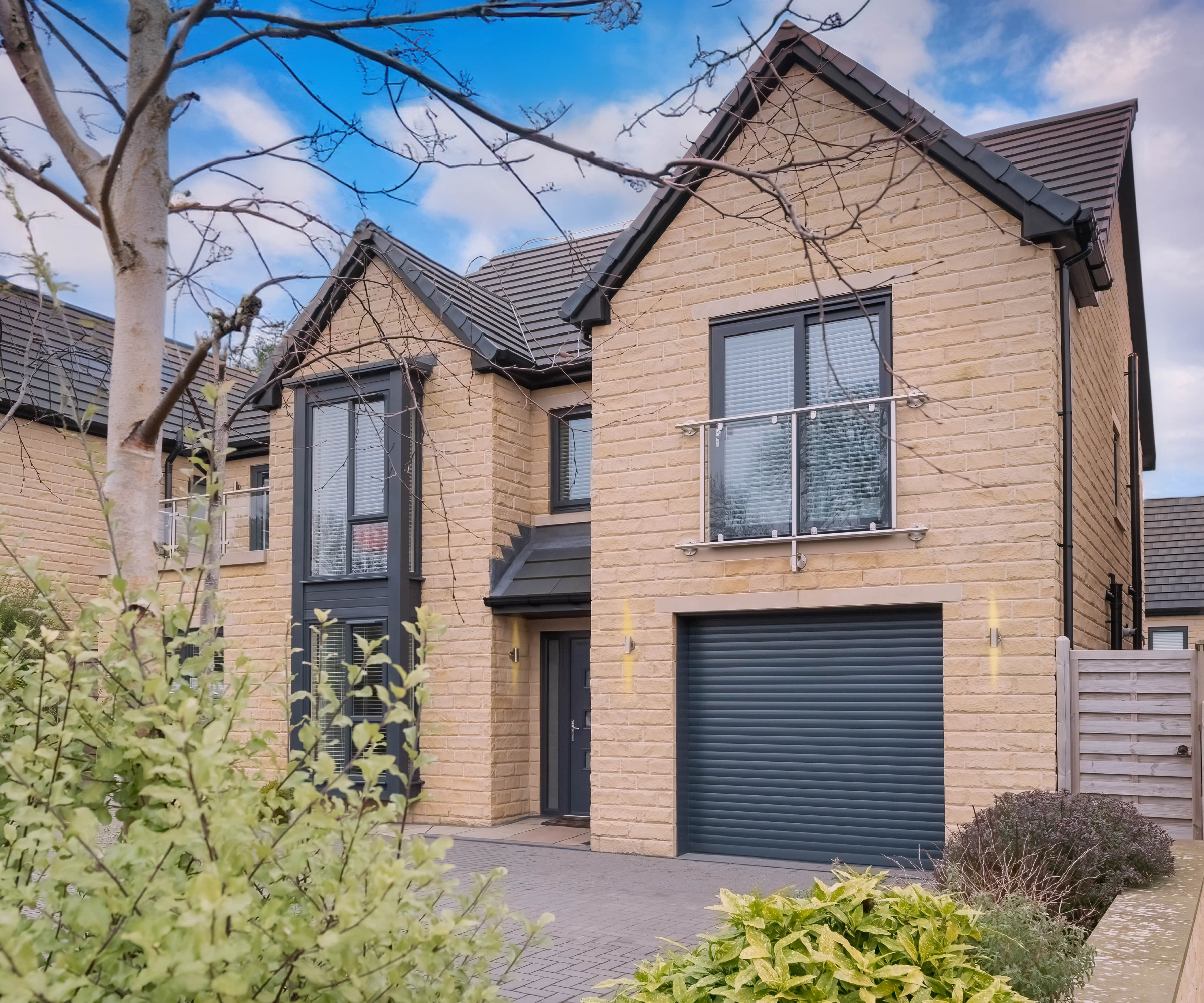
“Grey is still a popular option as it can contrast white or cream rendering,” says Liam Spencer, “and it can subtly complement a wide range of architectural styles while making a home look more modern.”
In this example by Hilarys, deep grey frames pair effortlessly with honey-toned stonework, grounding the façade and adding a sense of polish. A matching front door and garage door complete the look, creating a cohesive colour palette that feels smart yet understated.
4. Outline your windows with pops of vivid colour
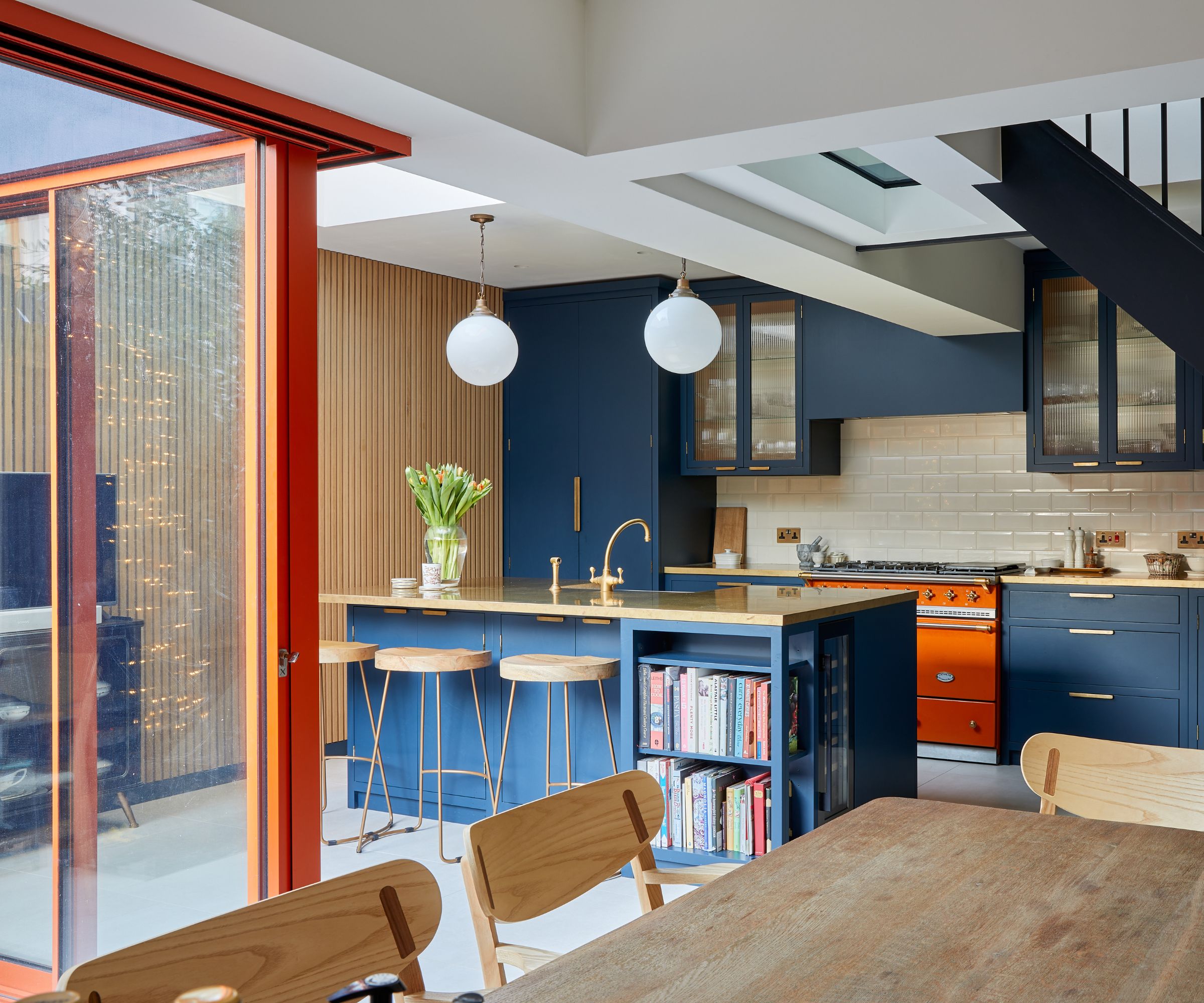
Outlining your windows in a vivid colour – such as orange, yellow or electric blue – is a brilliant way to add personality and impact to a contemporary space.
In this vibrant open-plan kitchen extension, it’s the bold orange-framed windows and sliding doors that really steal the show. The colour choice didn’t come out of nowhere, though. It was inspired by the homeowners’ dream of owning an orange Lacanche oven. Once that statement piece was chosen, everything else followed.
“The client fell in love with the Lacanche and wanted the doors to echo that statement shade,” explains Alex Main director at The Main Company. From there, they took the colour cue to the next level, choosing striking sliding doors in the same zesty tone from Maxlight. The result is a joyful, design-led space where the colour scheme feels completely intentional.

Alex Main is director at The Main Company, a family-run company that has been creating highly individual bespoke kitchens that are full of personality and unique style since the 1970s. The family business has built up its knowledge from the vast experience gained from trading within the national and international markets.
5. Swap classic shades for something more bespoke
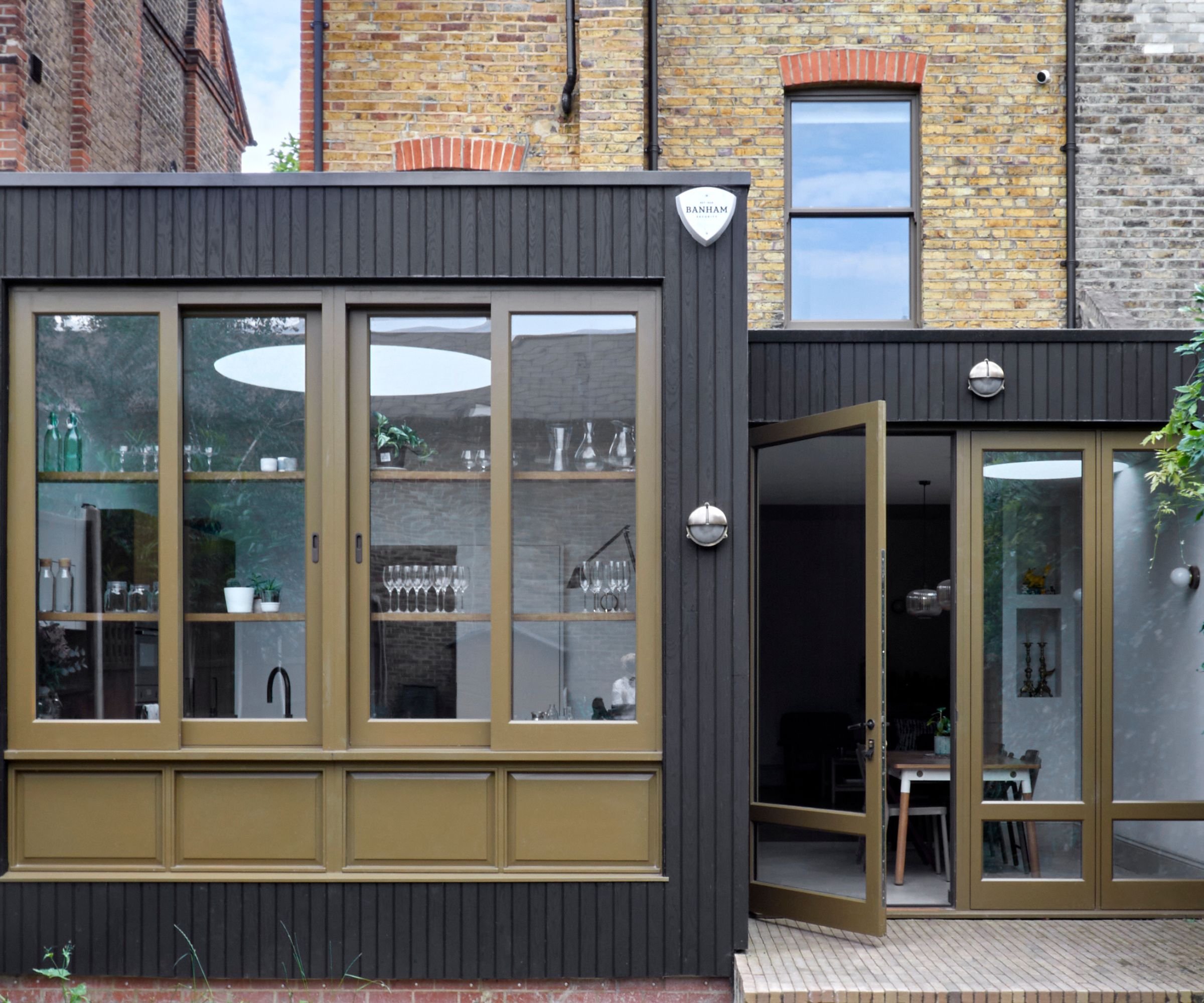
Choosing an offbeat window colour can be a clever way to make your extension feel more considered and design-led. In this example by Nine Zero, a bronze-toned window frame brings warmth and personality to an otherwise minimal palette. It’s a subtle but impactful way to contrast the windows and doors against the black cladding.
Colours like khaki, bronze, and olive are a stylish step away from the more typical black or grey, but they’re still earthy enough to feel timeless (particularly when picked up in surrounding details like planting, outdoor furniture or lighting). If you’re unsure about going bold with a primary colour, these more grounded hues are a sophisticated middle ground that still allows your glazing to stand out.
6. Use stained glass to add colour and character
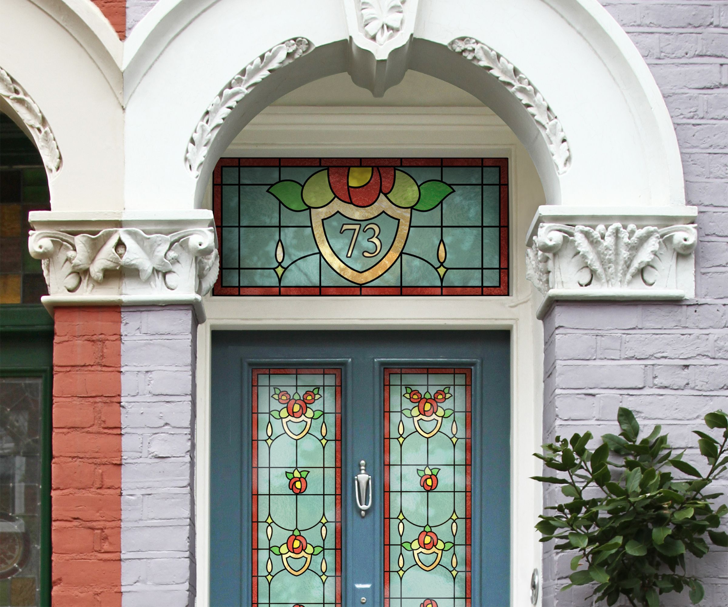
Who says colour has to stay on the window frames? Stained glass is a classic detail that’s enjoying a well-deserved revival, especially in period homes where it can echo existing features like tiled hallways, decorative cornicing or painted panelling. Even a small panel above a door can make a surprising impact.
If bespoke stained glass isn’t in the budget, there are plenty of DIY alternatives. Static cling window films and stained glass-effect stickers have come a long way, offering a surprisingly realistic finish without the high price tag. They’re easy to apply, easy to remove, and perfect for rented homes or anyone wanting to experiment with colour and pattern before committing to the real thing.
7. Contrast window colours between the main house and the extension
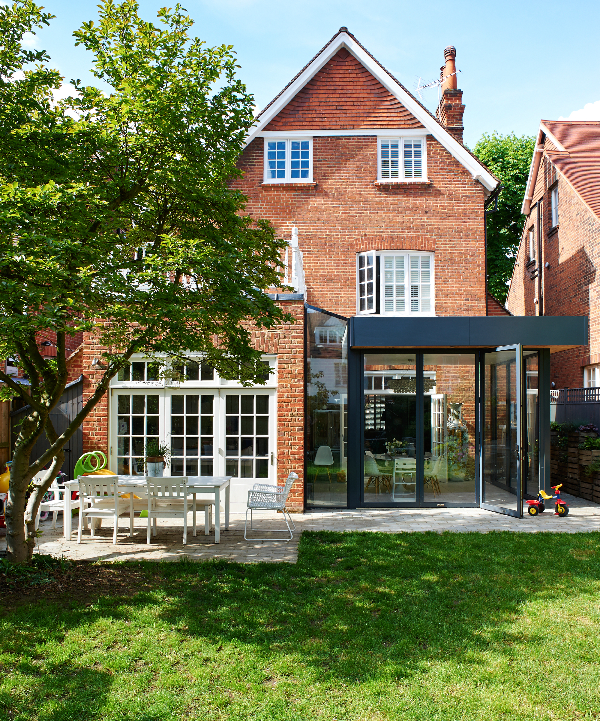
When extending a period property, matching old and new isn’t your only option. In fact, choosing a contrasting design – including a different window colour – can help highlight the architectural evolution of the home and draw a clear distinction between original and modern elements.
In this example, the traditional red-brick home keeps its classic, white-painted windows, while the modern rear extension introduces sleek black frames for a striking contrast. The mix brings a fresh, updated feel to the back of the house without losing any of the original charm.
8. Try soft greens for rural homes and cottages
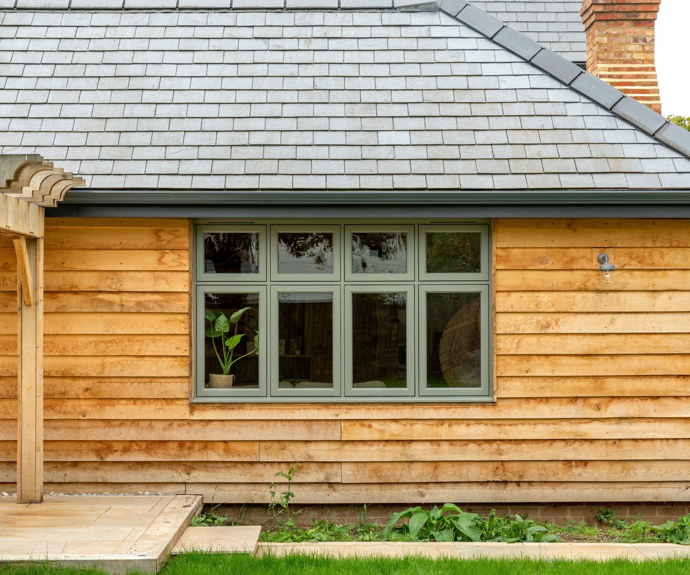
If you're renovating or extending a home in a countryside setting, soft greens can be a lovely alternative to white or grey window frames. These gentle, heritage-inspired tones – such as sage, olive or Cotswold green – sit comfortably within natural landscapes and often pair beautifully with timber cladding, stone or rustic brickwork.
“A house in a rural or coastal setting may be better suited to softer, neutral tones that blend into the landscape,” explains Steve Winscott, director at Nine Zero, “while darker, statement colours can work really well in urban environments.”
9. Paint your window shutters for a pop of colour without painting frames
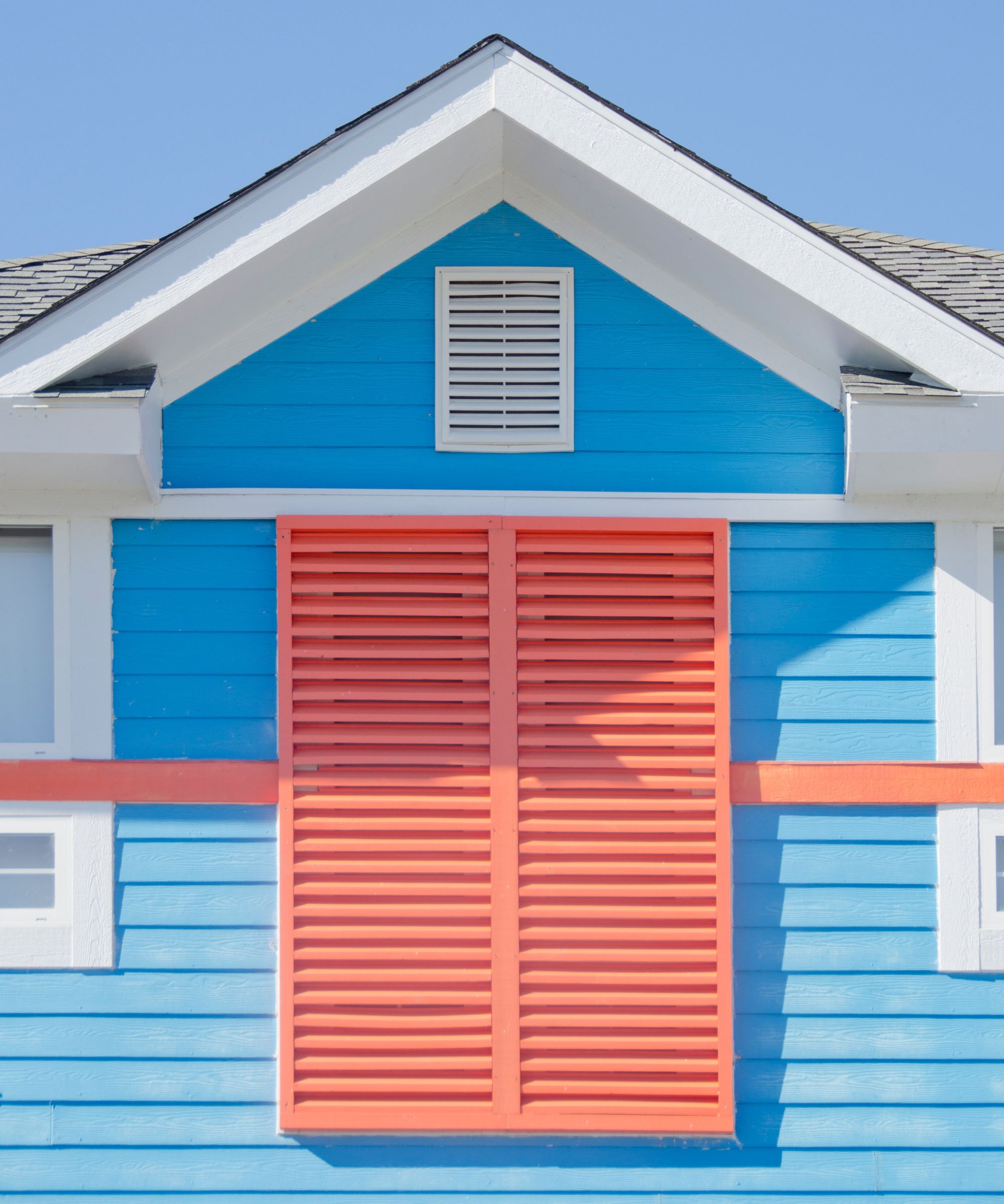
If you’re not quite ready to commit to full-colour window frames, painting your window shutters is a brilliant workaround. Whether you're dealing with a listed home, planning restrictions, or you simply want a more flexible approach, window shutters offer a fantastic blank canvas to work with.
This colourful coastal home features vivid coral shutters that contrast against the pastel blue cladding. But you don’t have to stick to sweetshop shades to make this technique work. Choosing a complementary tone that ties in with your front door or cladding can create a more subtle effect, or go bold with a high-contrast hue for a look that seriously stands out.
10. Paint and contrast interior windows to make them 'pop'
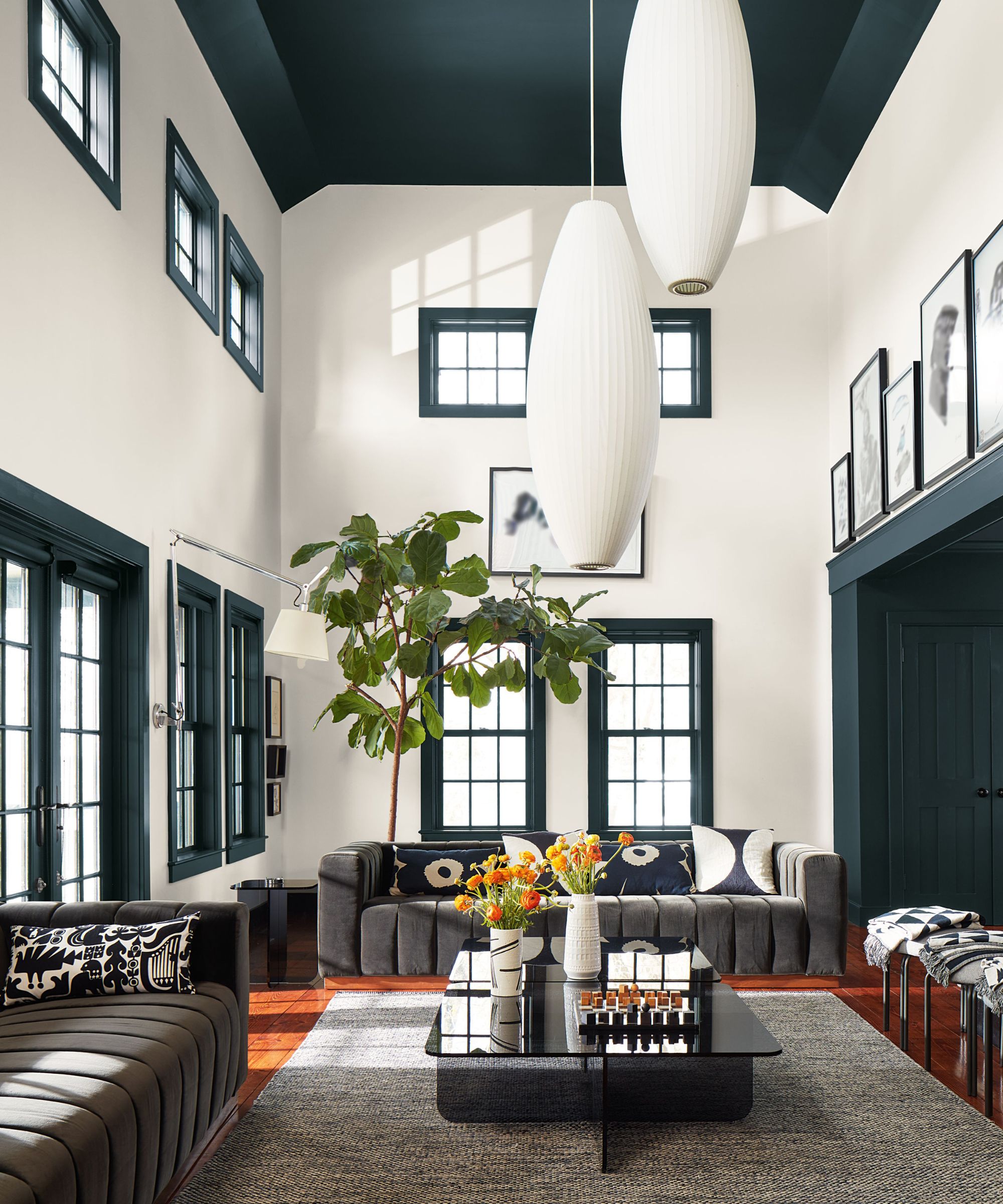
Painting your interior window frames in a contrasting colour is a brilliant way to add definition and depth to a room (especially if you're working with lighter walls). While many people default to white window frames on the inside of their home, choosing a deeper or unexpected tone can turn a functional feature into a standout detail. For example, in this high-ceilinged space, inky green-black frames mirror the dark ceiling, anchoring the room and creating a strong ‘visual rhythm’. Try this technique if you want to highlight original window shapes without relying on curtains or blinds.
11. Colour drench your frames and walls
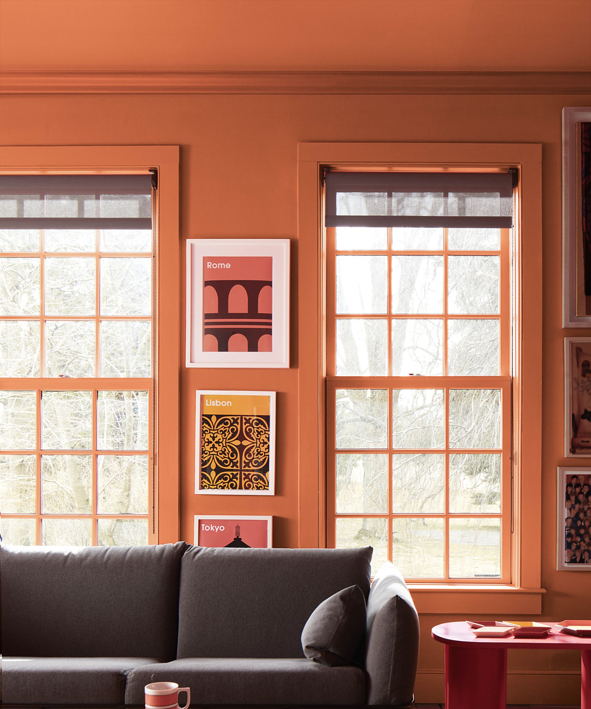
Colour drenching is a painting technique that takes a single shade across walls, window frames and trim for a strong, unified look. It’s an effective way to give your windows more presence – both inside and out – and can help tie architectural details into the overall design scheme.
In this striking living room, everything from the walls to the window frames is painted in a rich terracotta shade. The result is warm and enveloping, making the space feel calm and cocoon-like. If you’re drawn to deeper tones but unsure how to use them, carrying one colour across walls and windows is a smart way to dial up the drama without it feeling overpowering.
Outside, this same approach can help tone down fussy details or boxy shapes. One colour across exterior walls, windows and doors brings a sharper finish and lets the shape of the building do the talking.
FAQs
Are there rules or restrictions around window colours in conservation areas or listed buildings?
“Rules and restrictions often apply to listed buildings, which is why many homeowners opt for secondary glazing over replacing their windows," explains Kevin Brown, MD at The Heritage Window Company."This means they can improve insulation and make the internal window the colour/style they prefer without having to physically replace the protected window.”
"With all instances of home renovations and older properties, you must check with your local conservation team before making a decision," he adds. "You may find unique rules apply to your home that you were not anticipating.”
How do you maintain painted timber windows?
“Timber windows, when finished properly, offer more than just aesthetic appeal, they offer real longevity,” says Steve Winscott, director at Nine Zero. “Using a high-quality microporous coating that flexes with the timber helps protect against UV damage, moisture and general wear. With regular care – a gentle clean once a year and checks for chips or cracks – they can stay looking their best for decades. Catching small imperfections early makes all the difference when it comes to long-term maintenance.”
“Depending on the colour and exposure, a re-coat every five to eight years is usually all that’s needed – sometimes a little sooner with darker shades," he adds. "With this level of maintenance, timber windows can easily deliver over 40 years of performance and style.”
Can changing the colour of your window frames increase kerb appeal or even add value?
“They definitely can,” says Kevin Brown. “Your home’s frontage is its first impression on potential buyers, and beautifully renovated, expertly designed homes fetch a higher starting price. That’s why evaluators recommend you clean up your house as best as possible before putting it on the market, and freshly painted windows definitely fall into that category.”
That said, a bold or unusual colour choice could have the opposite effect, particularly if buyers see it as something they’ll need to change. If you're planning to sell soon, it’s often safer to stick to classic, neutral tones that appeal to a broader range of tastes and help your home feel move-in ready.
Thinking of painting your uPVC windows? It can be done, but proper preparation is key. You’ll need the right primer and paint made for plastics, and it’s worth checking whether it could void your warranty. Our guide to painting uPVC windows covers everything you need to know.

Gabriella is an interiors journalist and has a wealth of experience creating interiors and renovation content. She was Homebuilding & Renovating's former Assistant Editor as well as the former Head of Solved at sister brand Homes & Gardens, where she wrote and edited content addressing key renovation, DIY and interior questions.
She’s spent the past decade crafting copy for interiors publications, award-winning architects, and leading UK homeware brands. She also served as the Content Manager for the ethical homeware brand Nkuku.
Gabriella is a DIY enthusiast and a lover of all things interior design. She has a particular passion for historic buildings and listed properties, and she is currently in the process of renovating a Grade II-listed Victorian coach house in the West Country.
